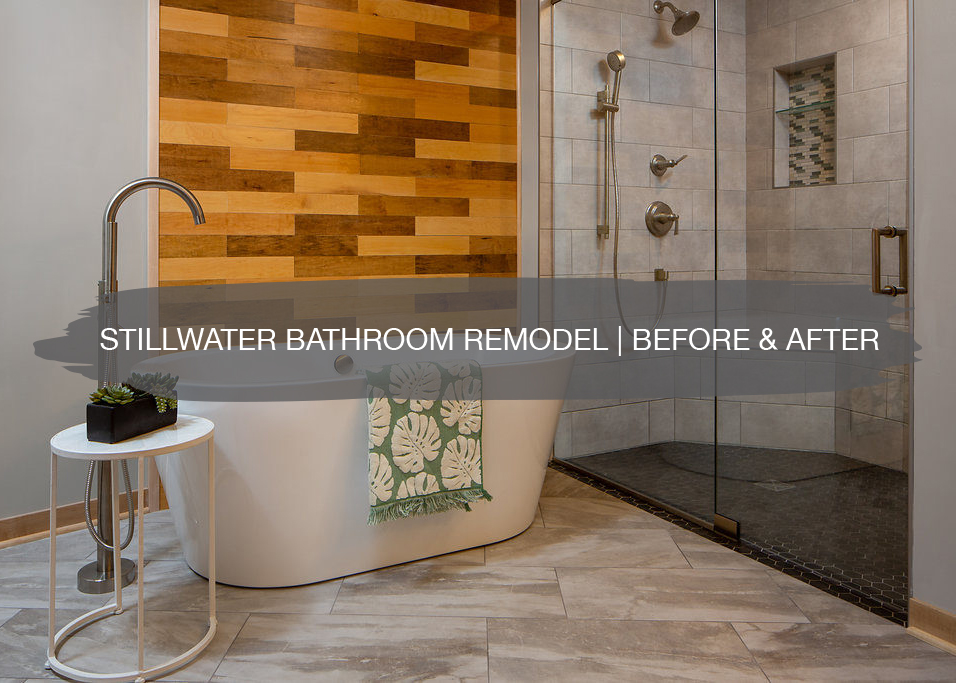
A couple of weeks ago, we wrapped up a master bathroom remodel in Stillwater for Morgan’s aunt and uncle and wanted to share the full before, after, and design process in detail. They live in a condo and wanted their master bathroom to have a spa-like feel and also be a space they can continue to use as they age, since they want to continue to live in the space, so a curb-less shower was a must have.
Since the remodel was happening in a condo on the third floor, it presented unique challenges like getting permits pulled, design plans passed, how to bring heavy materials to the space and around corners, making sure dust wasn’t getting everywhere in the hallways and elevator, and more permits than usual, but it was ALL worth it!
First, let’s rewind to the before…
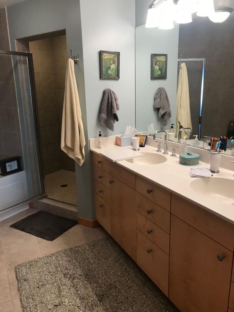
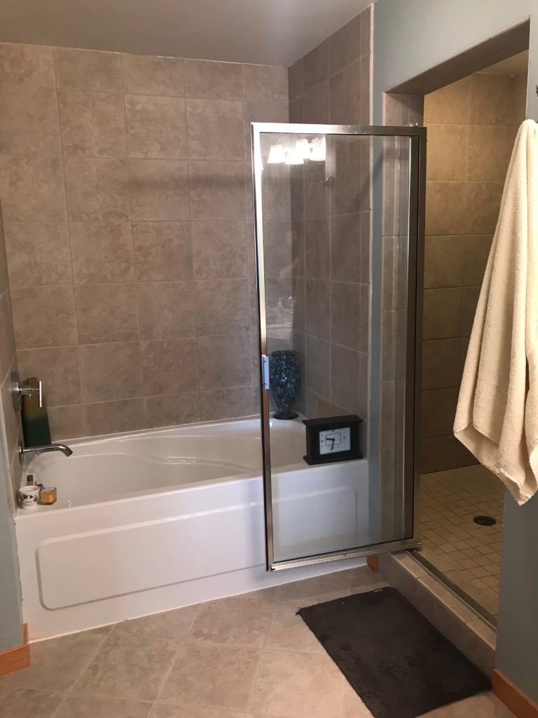
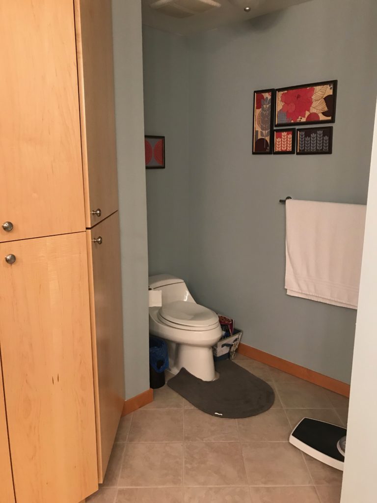
Before
Our clients wanted their master bathroom to feel more open and not dark and dingy, so right away we suggested taking out the shower wall and opening up the space. This would allow for more light to flow throughout the space and brighten the shower area too. They wanted the ability to roll each other in wheelchairs (jokingly, ha!) into the shower if and when the time came, so we also suggested keeping the shower more open with a glass door and no lip on the shower floor.
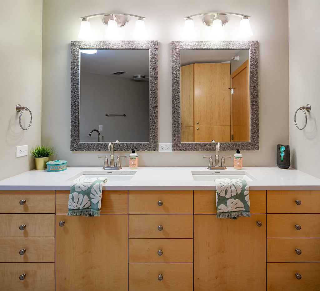
Since their vanity and linen closet are the same as their kitchen cabinets and they didn’t want to redo all of them, we suggested keeping the vanity cabinets and switching out the sink, faucet, and countertop for a refreshed vanity area, which also helped to keep costs down.
Design Phase
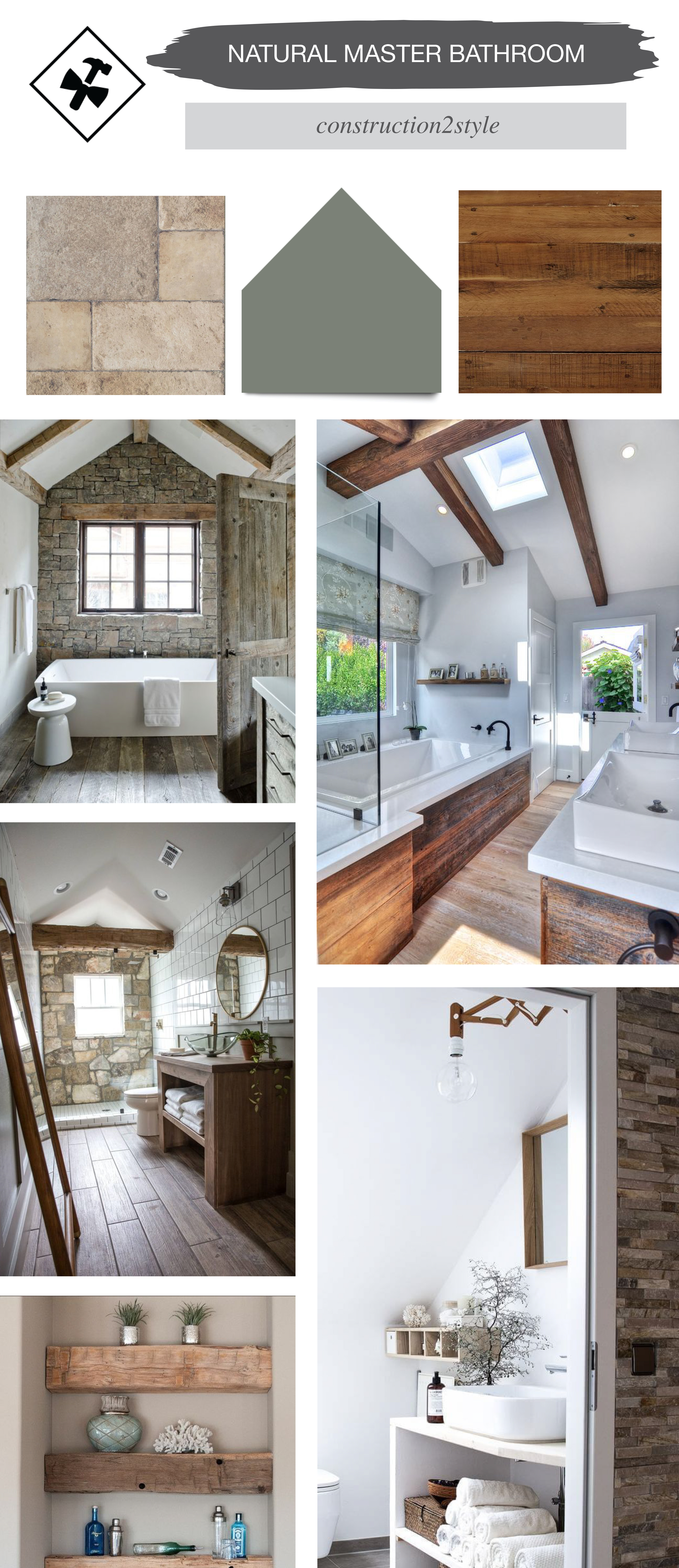
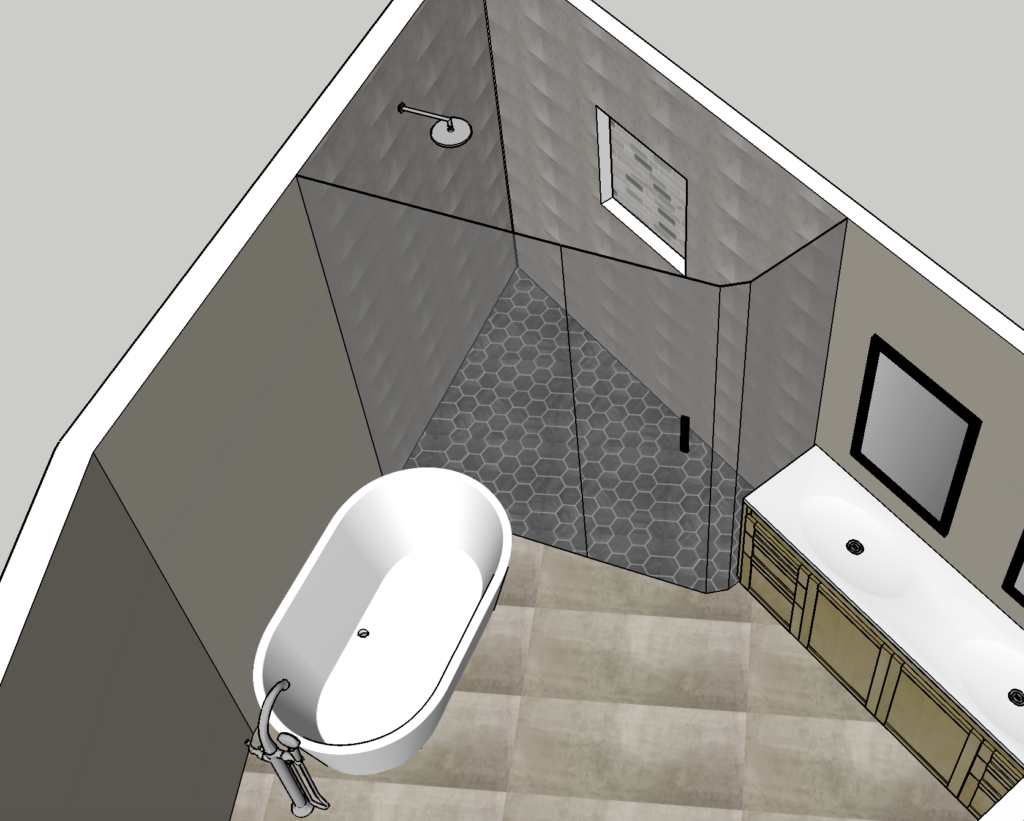
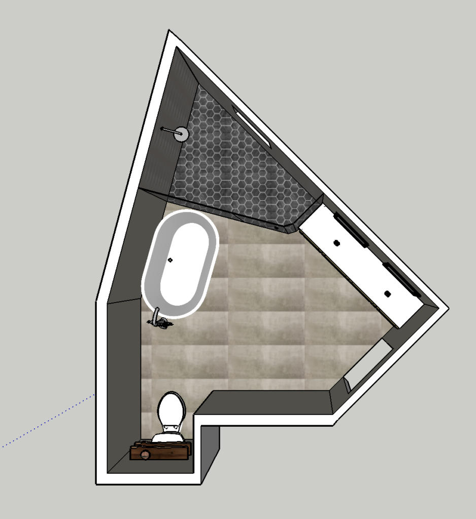
During the design phase, we created a mood board with the natural elements they were looking to incorporate. We also went back and forth on the selections and materials, bringing tile samples to their home and figuring out what would work best in the space. In addition, we created 3D models of a couple of options for the layout in the bathroom, so they could see how it would look with actual materials and selections.
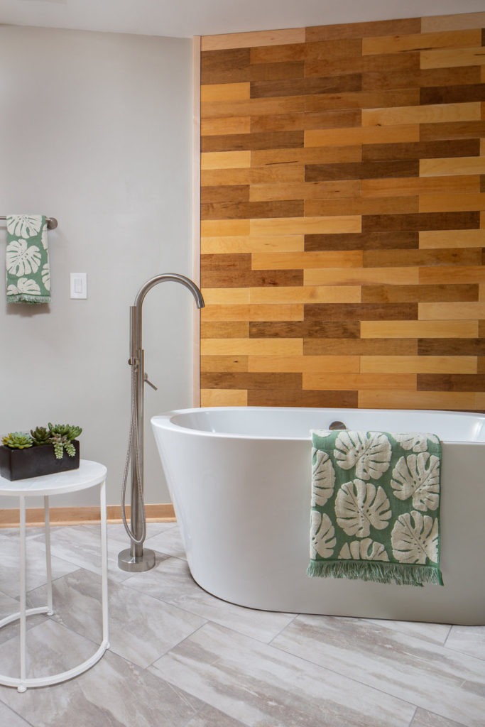
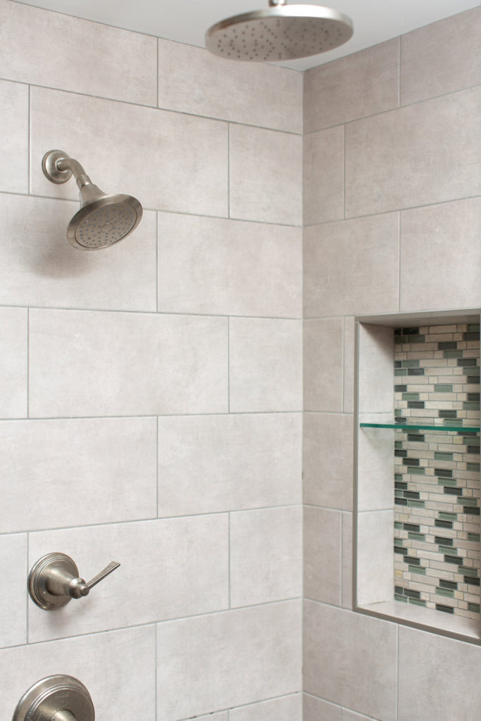
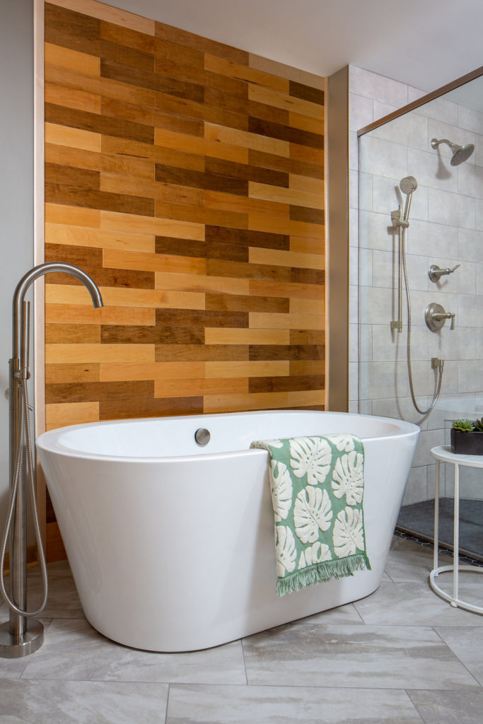
Here’s the design they ultimately chose that had a full glass shower wall and door, a niche for storing bathroom supplies, and darker floor tile. One of the other options was to create more of a wet room with the shower and tub in the same enclosed space, but having the freestanding tub on its own creates more of that spa look and makes a statement piece in the bathroom.
After
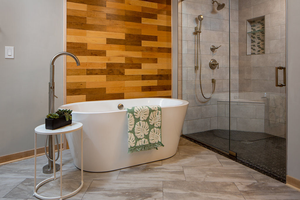
For the wood wall, Jamie custom mixed various stains to create a wood panel look which brings in a natural element, complimented their former woodwork, and also makes the freestanding tub a focal point. Having the glass shower door opened up the space and made it feel so much brighter and bigger.
To make the space feel bigger, we installed the tile at an angle, rather than vertically or horizontally.
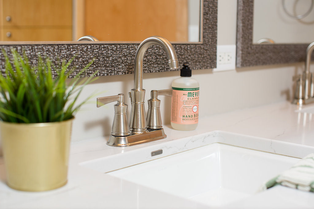
By replacing the countertop with a classic and timeless Cambria design and adding in Kohler faucets and sinks, this vanity has a completely different look. Simple updates like that can make such a difference in your bathroom, even if you’re not redoing your cabinetry. They also kept the lighting above the mirrors the same.
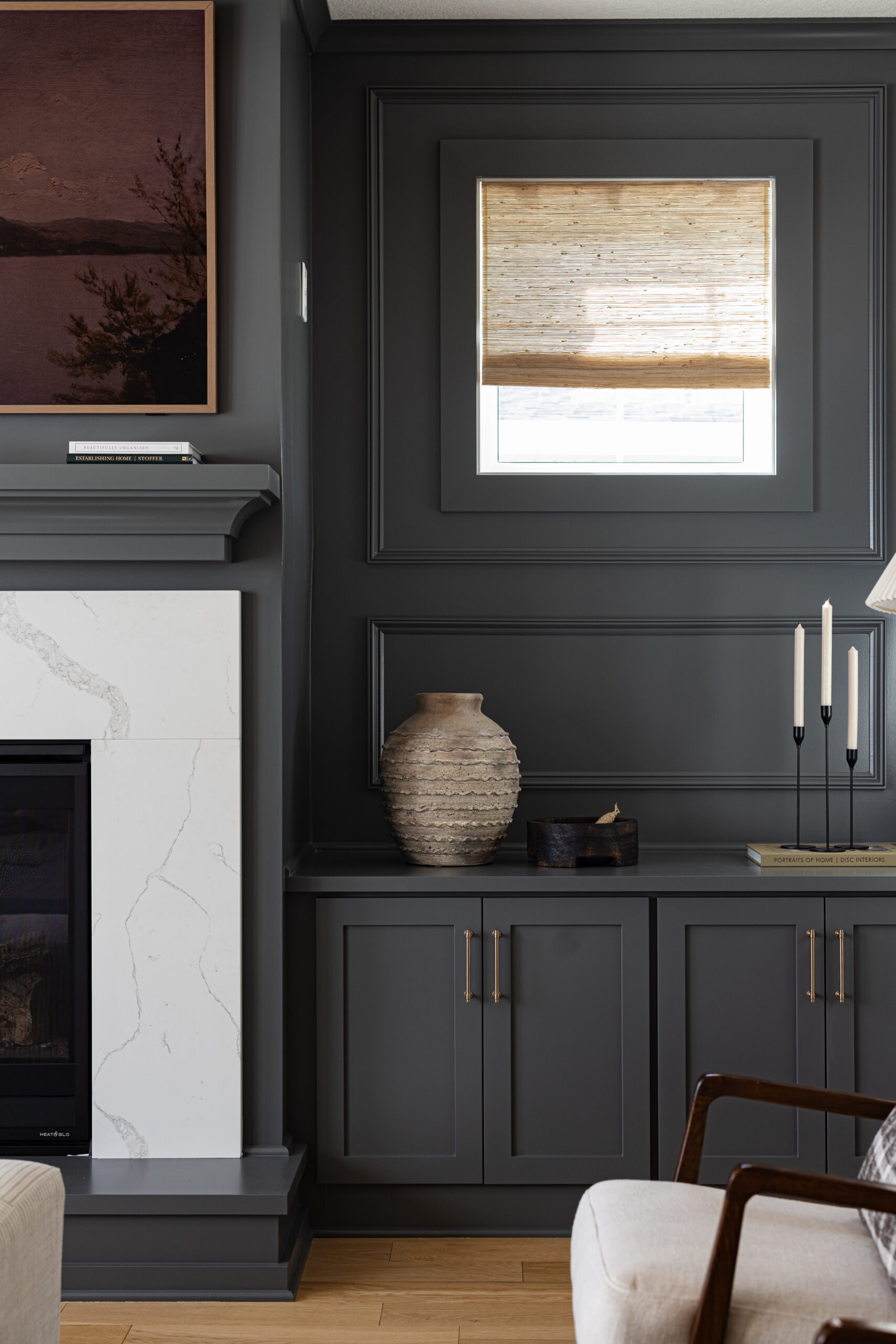
And there you have it, our latest master bathroom renovation. We also updated the kitchen with a new backsplash and the living room with a new fireplace tile and custom cabinetry built-ins, which we’ll share with you soon.
All the links to finishing selections that we used here. And if you have any questions, drop us a comment and we’ll be sure to get you the answer.
Niche Tile | Sinks | Faucets | Handheld Shower | Rainhead | Freestanding Tub | Tub Filler | Bath Towel | Hand Towel
After Photos: Emily John Photography
Thanks Patrick!
A masterpiece of bathroom remodeling project. I really appreciate you.