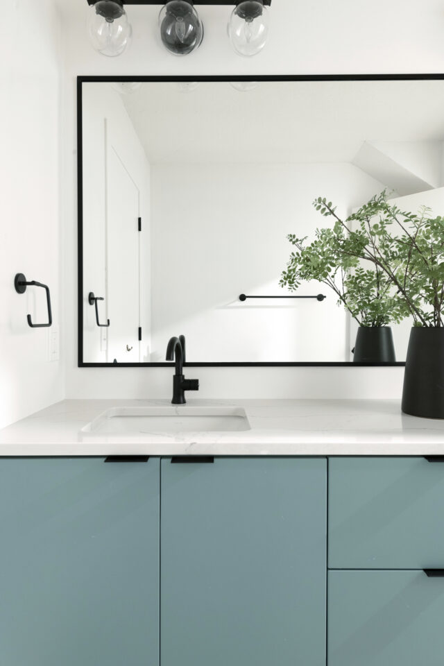
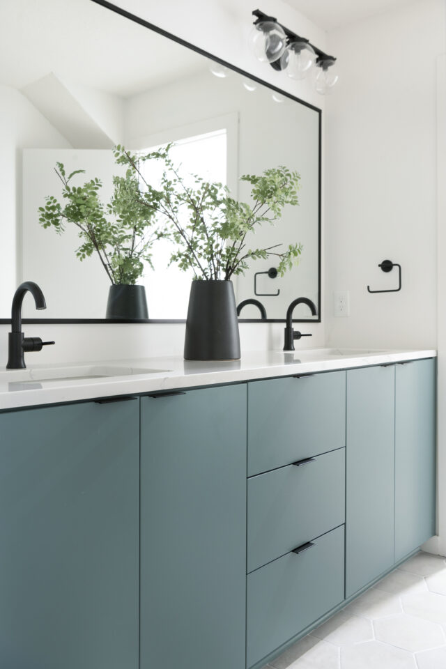
Underseas
Underseas (W 6214) is a color that seems to capture the essence of the deep ocean and bring it into your living space. This dark green, with its cool blue and gray undertones, creates an atmosphere of mysterious elegance. Its low Light Reflectance Value (LRV) of 25 means it absorbs more light than it reflects, making it an ideal choice for creating a cozy, intimate setting in larger rooms or adding depth and drama to smaller spaces. The color’s versatility extends beyond the walls; consider using Underseas for accent pieces, trim, or even furniture to add subtle sophistication to your decor. Its Hex Value of #7C8E87 ensures that integrating this shade into digital designs or visualizing it in home improvement software will capture its true essence. Whether applied in a teenager’s bedroom for a touch of grown-up glamour or used in an outdoor setting to complement natural surroundings, Underseas promises to bring a sense of tranquil beauty and timeless style to both contemporary and traditional designs.
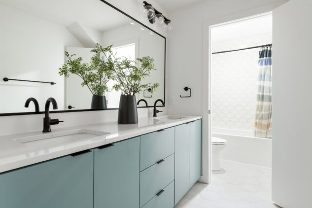
Underseas vanity color featured in our #ChartwellHillHome Kids Bathroom project. Perfect pop of color for a bathroom. Want to add color but not be too bold? This color is it!
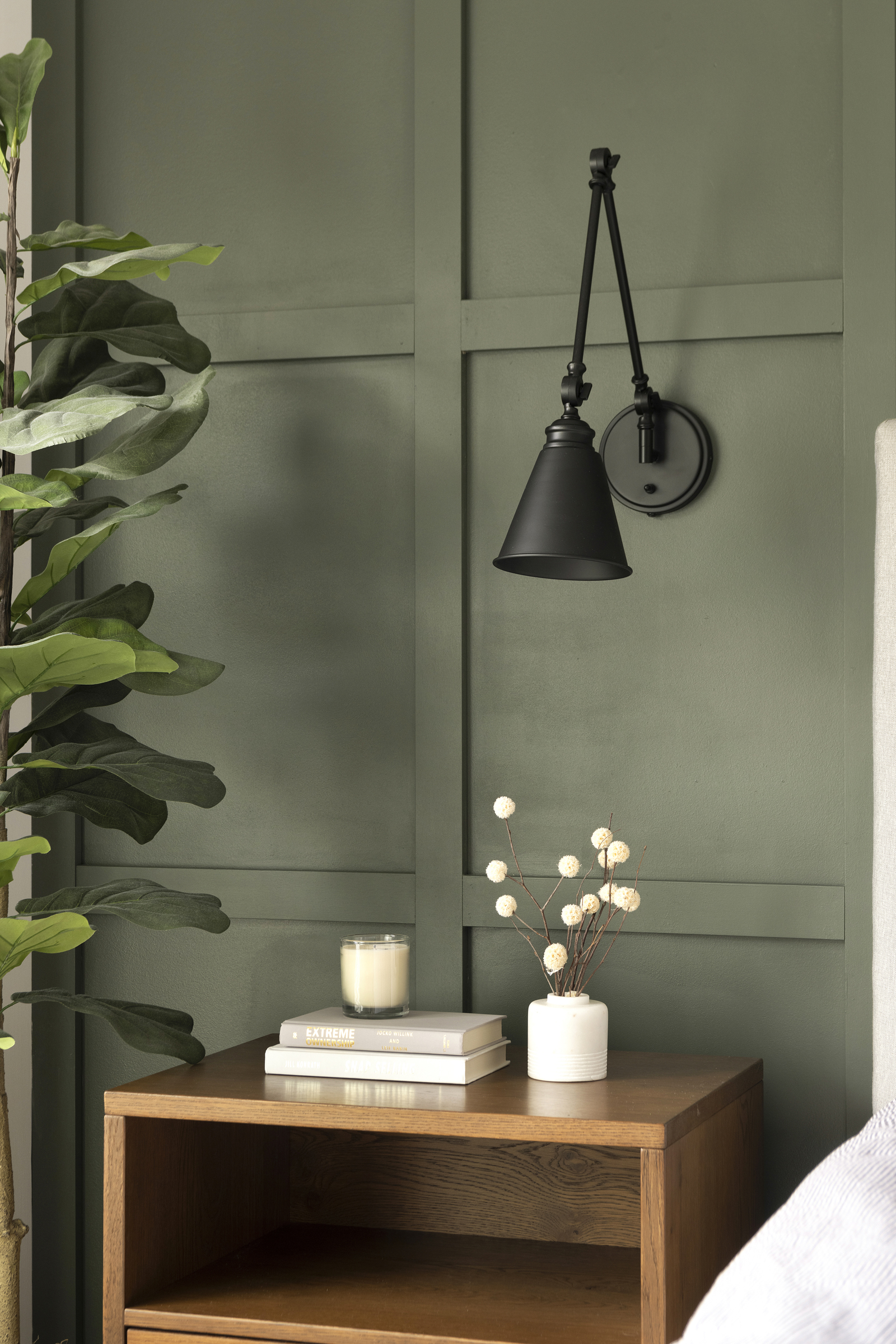
Dark Olive
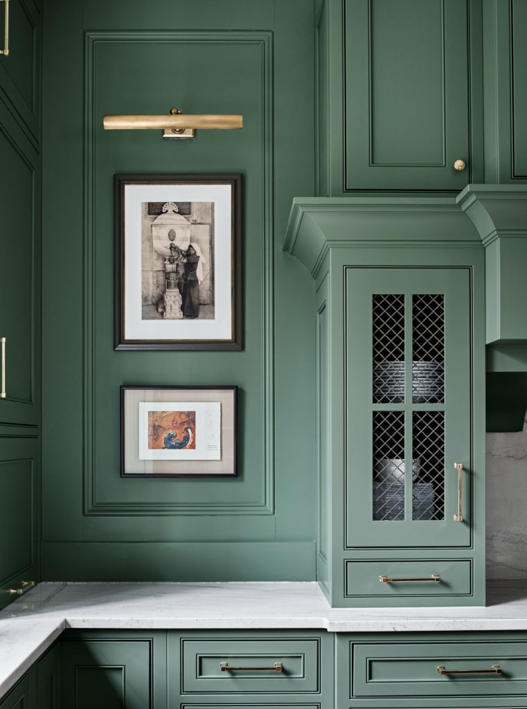
Dark Olive by Benjamin Moore is a captivating hue that effortlessly combines sophistication and earthy charm. Its rich, deep tones evoke a sense of tranquility and warmth, making it an ideal choice for those seeking a cozy yet elegant atmosphere. This versatile shade of green brings depth and character to any space, whether used as an accent or as the primary color. Its versatility allows it to complement a wide range of design styles, from modern and minimalist to rustic and traditional. Dark Olive possesses a unique ability to infuse rooms with a sense of calmness while adding a touch of drama and depth. Embracing this stunning color can transform your space into a sanctuary, exuding timeless beauty and inviting comfort for years to come.
This was The Styled Press Home, mudroom. You can find the reveal here because this wasn’t the only room we did throughout their home that has the perfect neutral colors to compliment this.
Hunter Green
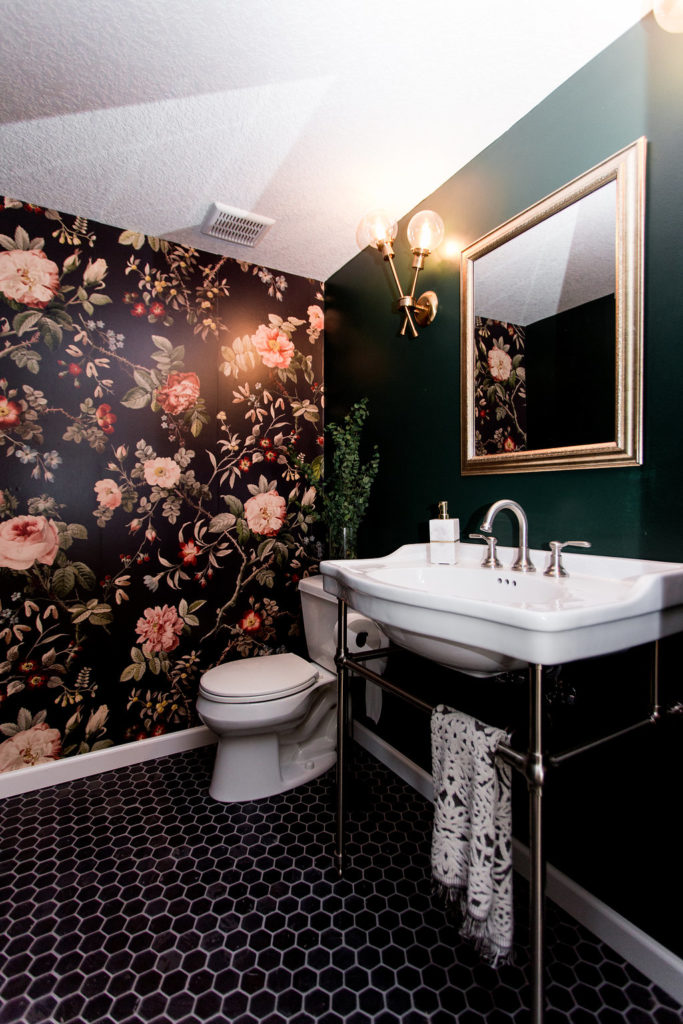
Let me tell you about Hunter Green by Benjamin Moore; it’s an absolute gem among deep, moody greens. In our basement bathroom, this color has been a revelation. Its rich depth and intensity have held our fascination steady for over a year now – a testament to its enduring appeal. This shade isn’t just green; it’s a statement. Its boldness and authenticity make it a standout choice for those seeking to infuse spaces with a profound sense of character. Hunter Green doesn’t fade into the background; it commands attention and admiration effortlessly.
What I love most about Hunter Green is its unwavering presence. It’s deep, bold, and authentically green, delivering an ambiance that’s both daring and comforting. Choosing this color for our space has been a decision we’ve never regretted. Whether you’re aiming for a cozy den or a stylish focal point, Hunter Green by Benjamin Moore offers that perfect blend of depth and boldness that sets the tone for an inviting and mesmerizing atmosphere
Tate Olive
Embracing a softer, pastel tone? Look no further than Tate Olive by Benjamin Moore! This hue is a delightful choice, especially for those aiming for a gentler, more subdued green. Our client’s kitchen island adorned in Tate Olive stands as a testament to its charm and versatility.
Tate Olive isn’t just a color; it’s part of Benjamin Moore’s esteemed Historic Color collection. Defined by elegance and steeped in tradition, this collection offers timeless hues suitable for both classic and contemporary spaces. Introduced in 1976 to commemorate the US Bicentennial, the Historical Collection comprises 191 colors inspired by America’s iconic landmarks. Tate Olive, in particular, exudes a refined allure, making it an ideal choice for infusing spaces with a touch of historic elegance while seamlessly blending into modern design aesthetics.
Caldwell Green
We decided to go with Caldwell Green by Benjamin Moore for the buffet area located on the right side in our Seattle Hill Sunset project. The choice was influenced by our client’s preference for blue palettes, as evident in the rug they provided. We aimed to select a green shade with subtle blue undertones to complement their existing decor.
Cape Verde
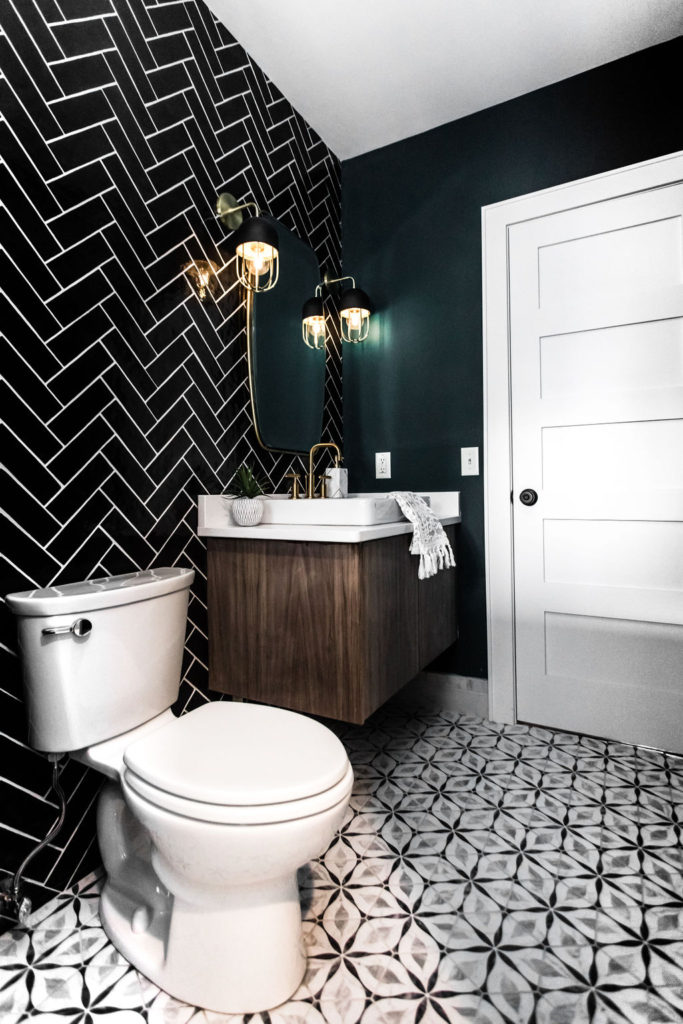
Cape Verde, Sherwin Williams SW 6482 is what we did in our Craftsmen St. Paul home design project. You can find the full home design reveal here.
This shade leans towards a brighter green hue, adding a touch of vibrancy while maintaining a dark and moody effect when paired with other selections. Our intention was to create a dark and moody ambiance with the black tiles, and we aimed to extend that vibe to the paint color. To balance the darkness, we chose a brighter and lighter green shade to infuse a refreshing contrast.
Green Smoke
Green Smoke by Farrow & Ball is a unique hue that effortlessly blends a smoky green with hints of blue, perfectly living up to its name. This color, reminiscent of the late 19th century interior design trends, exudes a timeless elegance and sophistication. When applied in exterior settings, it offers a sense of depth and a weathered charm that beckons nostalgia. On the other hand, when used indoors, it creates a tranquil and serene atmosphere, enveloping spaces with a calming aura that soothes the senses.
Source: Traditional Home
Northwoods
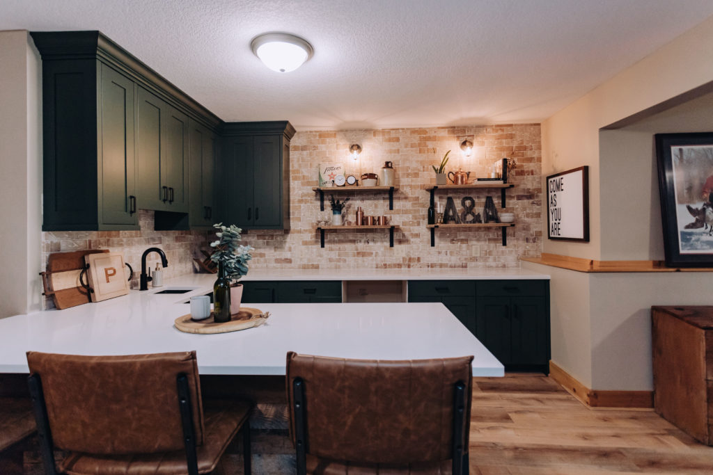
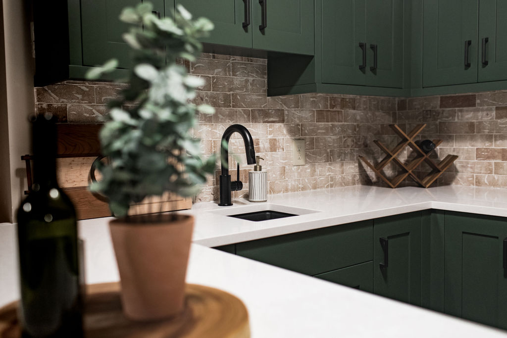
Northwoods by Behr is soooo dreamy and another new favorite of ours!! It’s the perfect deep and true green that will bring warmth to any space. We used this color in one of our basement projects where we hired Jkath to custom build the cabinets and finish them off in the color, Northwoods. And let’s just say, we’ve been pushing this color on every client since.
Hidden Falls
Hidden Falls by Benjamin Moore is part of their Classic Color Collection.
We used this color for the accent wall in our Wooded Way project. You can find the full lower level reveal with all of the details here. Another light and bright green color, with hues of blue.
Pewter Green
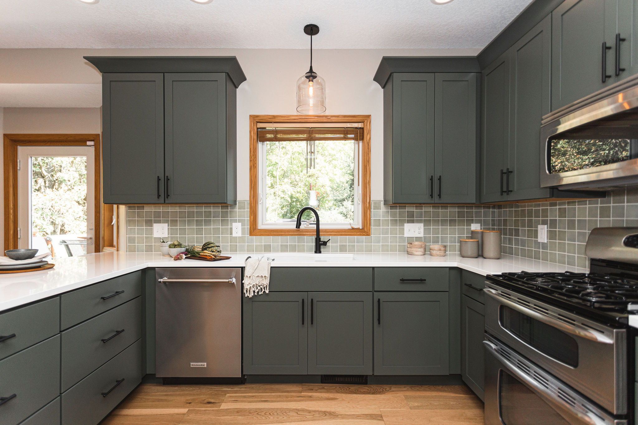
Pewter Green, by Sherwin Williams SW6208, is what we used for the cabinetry in our Duck Lake kitchen remodeling project. You can find all of the details behind this project in the reveal post here.
It was the perfect color to complement the handmade Mercury Mosaics tile. And we love how it complimented the warm wood tones. As you can tell, this client is a lover of green and we jumped at the chance when she said she wanted all green cabinetry.
Dried Thyme
If you’re in search of a soft and subtly neutral green hue that radiates a calming vibe, consider Dried Thyme by Sherwin Williams. This exquisite shade not only evokes tranquility but also harmonizes effortlessly with warm whites, soft grays, and gentle beiges, resulting in a color palette that imbues any space with a serene ambiance.
This color is perfect for a bathroom or kitchen remodel, adding a touch of nature and freshness to the room. It also pairs beautifully with natural elements such as wood and stone, making it a versatile choice for any style of home. Dried Thyme is part of Sherwin Williams’ Historic Color Collection, inspired by timeless colors that have stood the test of time. So not only will it look beautiful now, but it will continue to be in style for years to come.
To achieve this look in your own space, consider pairing Dried Thyme with warm brass fixtures and accents, as well as pops of greenery throughout the room. This will create a cohesive and inviting atmosphere that brings the outdoors inside. And don’t be afraid to mix and match different textures, as the earthy tone of Dried Thyme can easily complement a variety of materials.
If you’re looking to make a bold statement with your remodel, consider using Dried Thyme on an accent wall or even on cabinetry. This rich hue adds depth and character to any space, creating a focal point that is both unique and elegant. And for those who prefer a more subtle approach, incorporating Dried Thyme into smaller details such as cabinet hardware or throw pillows can still add a touch of sophistication to the room.
But it’s not just about aesthetics when it comes to this color. Dried Thyme also has a calming effect thanks to its soothing green tones. This makes it the perfect choice for any bedroom, laundry, mudroom, kitchen and basically every room in your home.
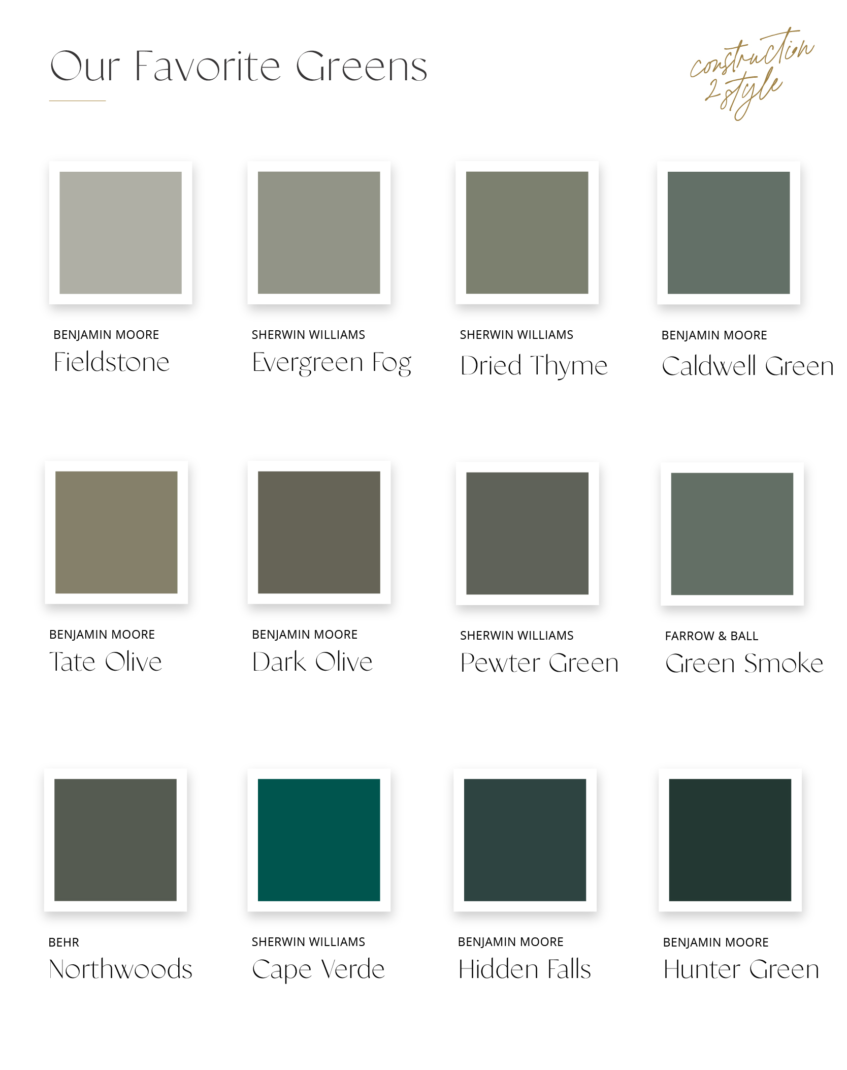
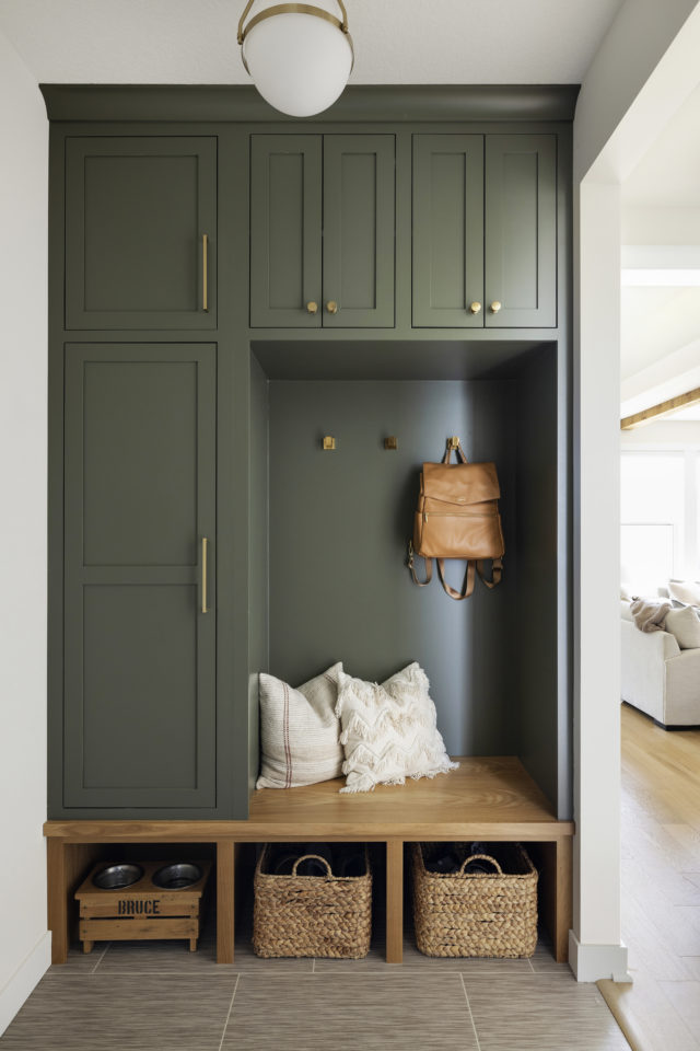
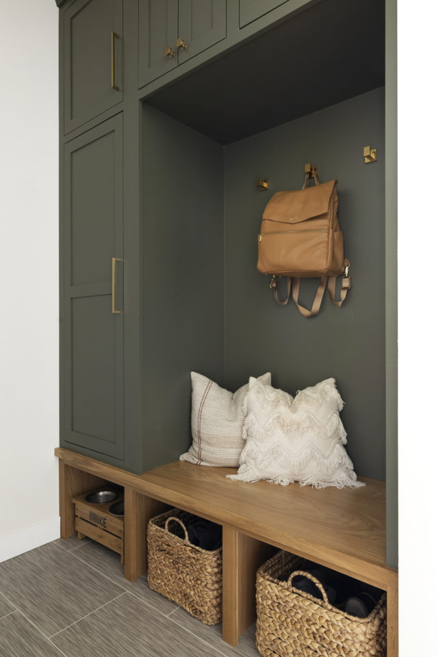
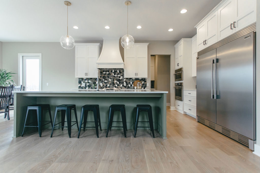
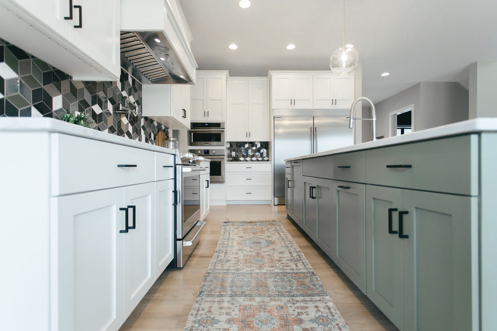
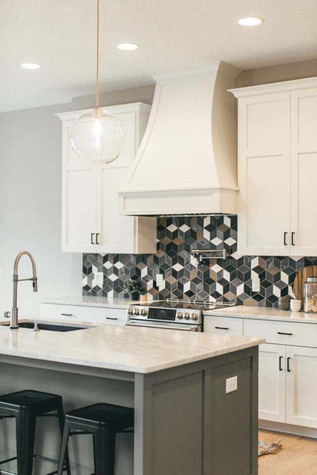
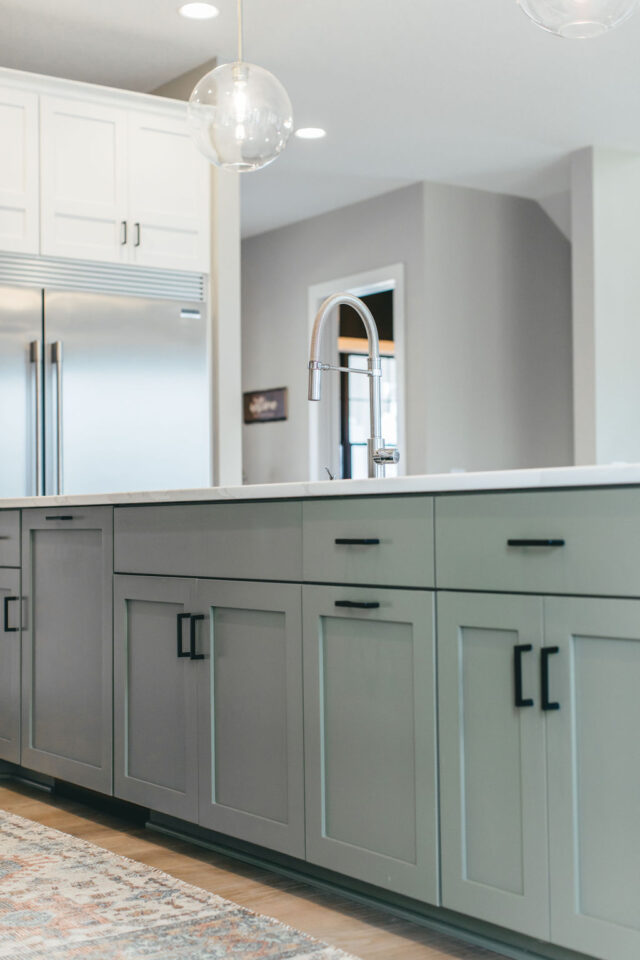
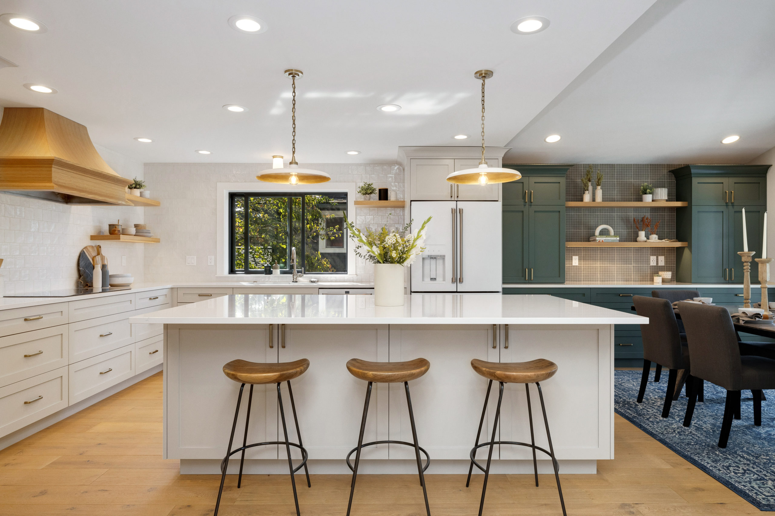
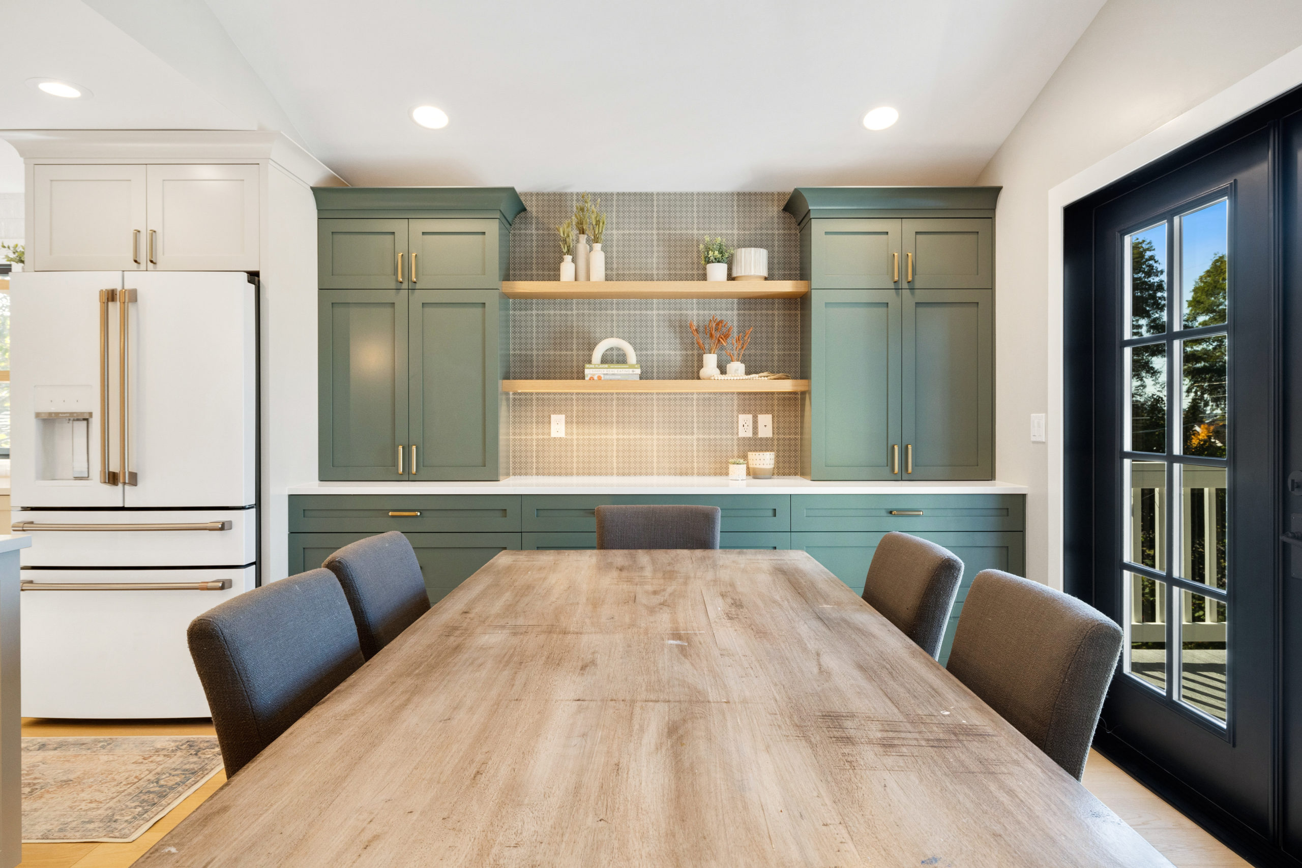
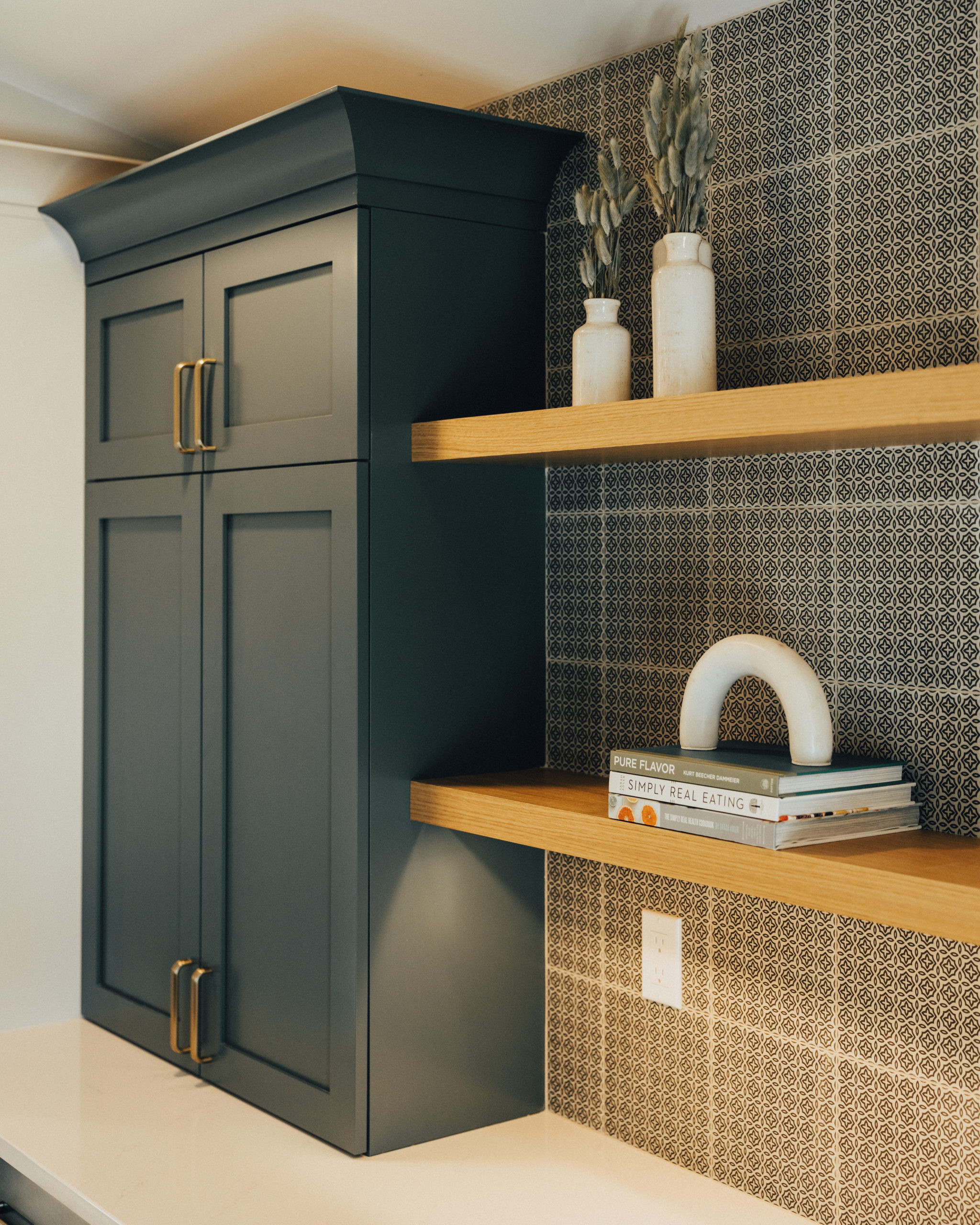
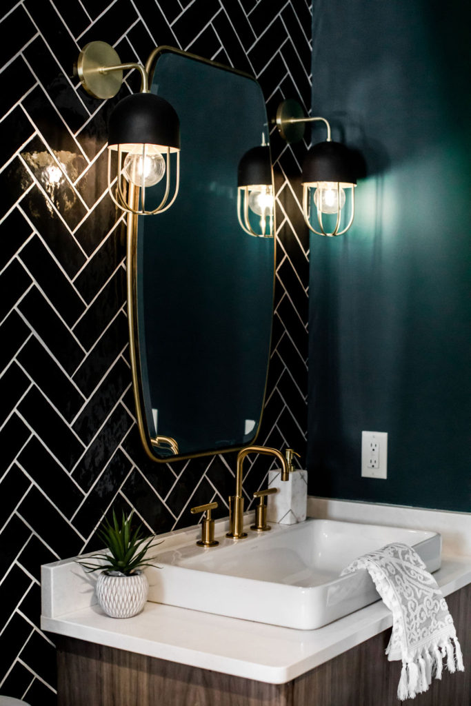
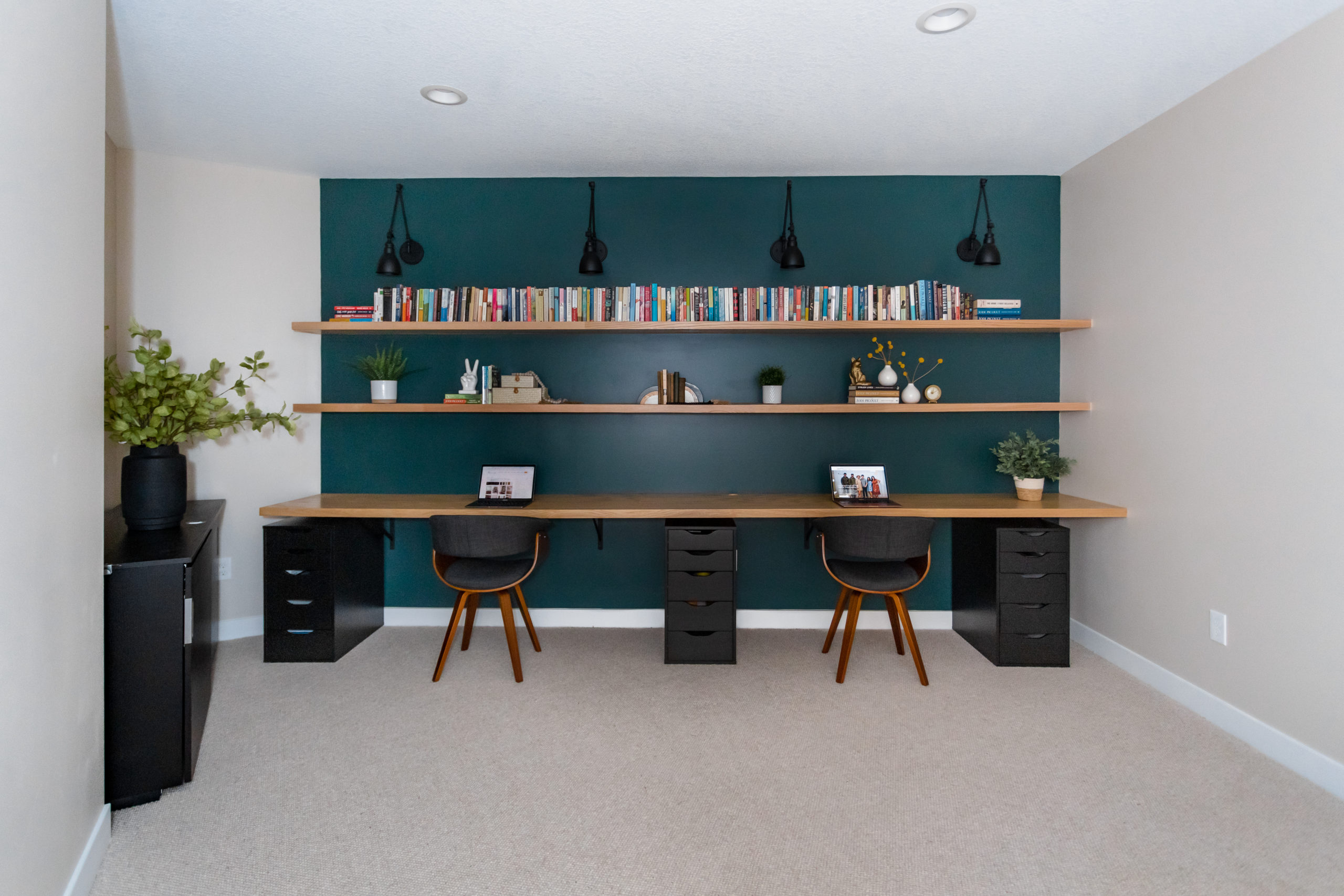
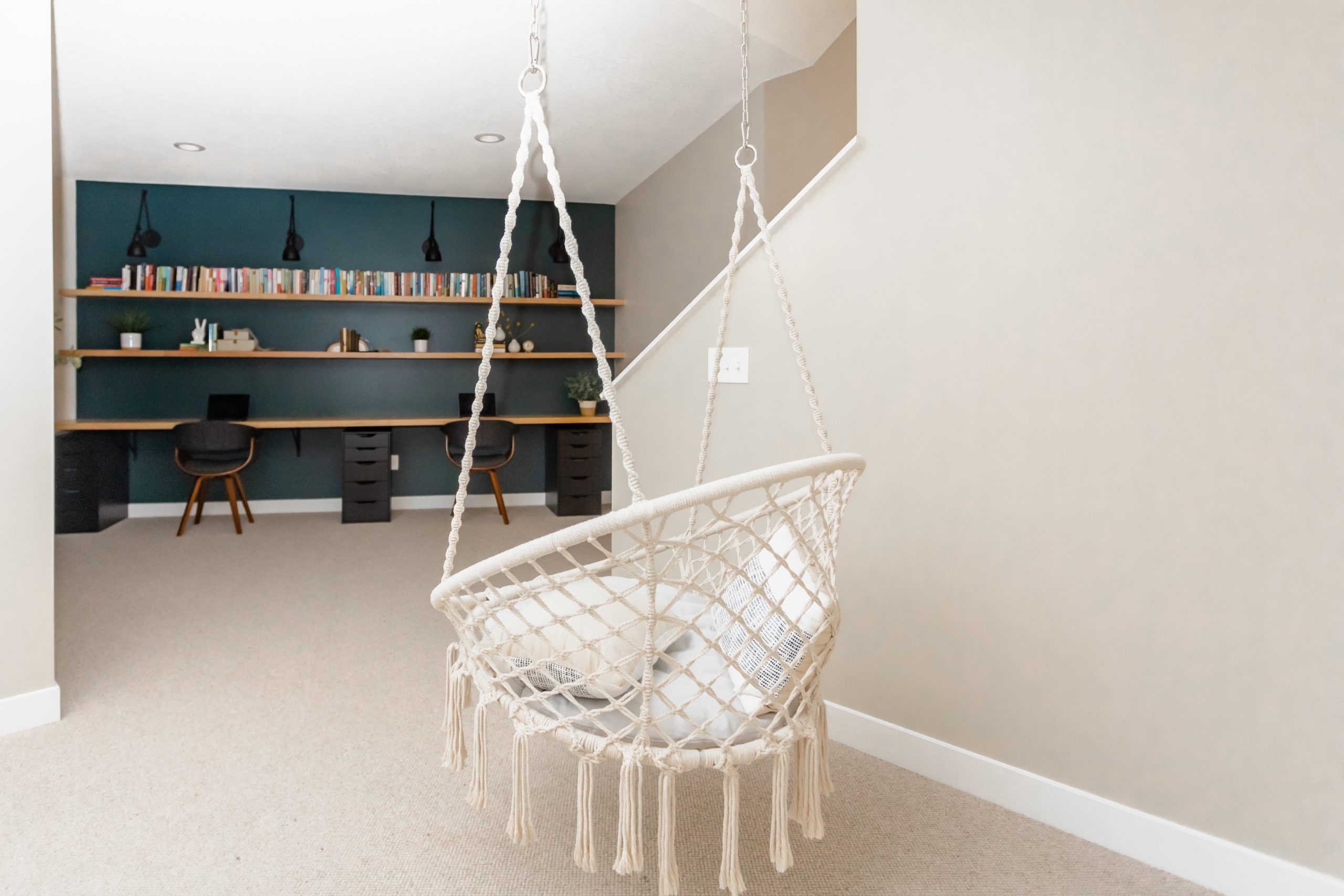
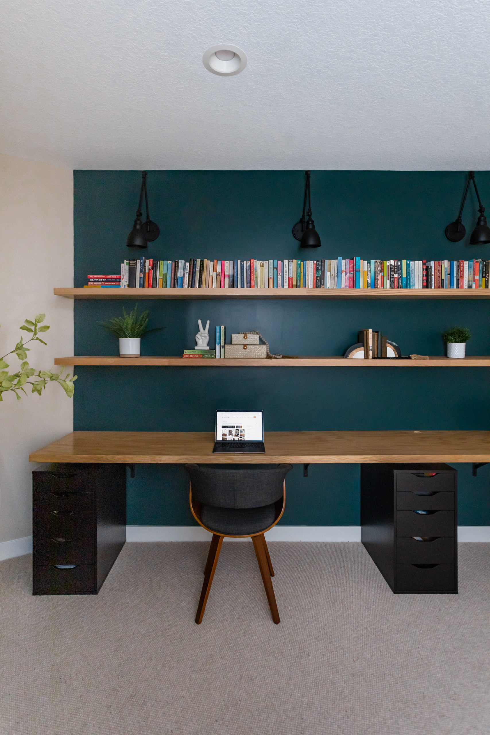
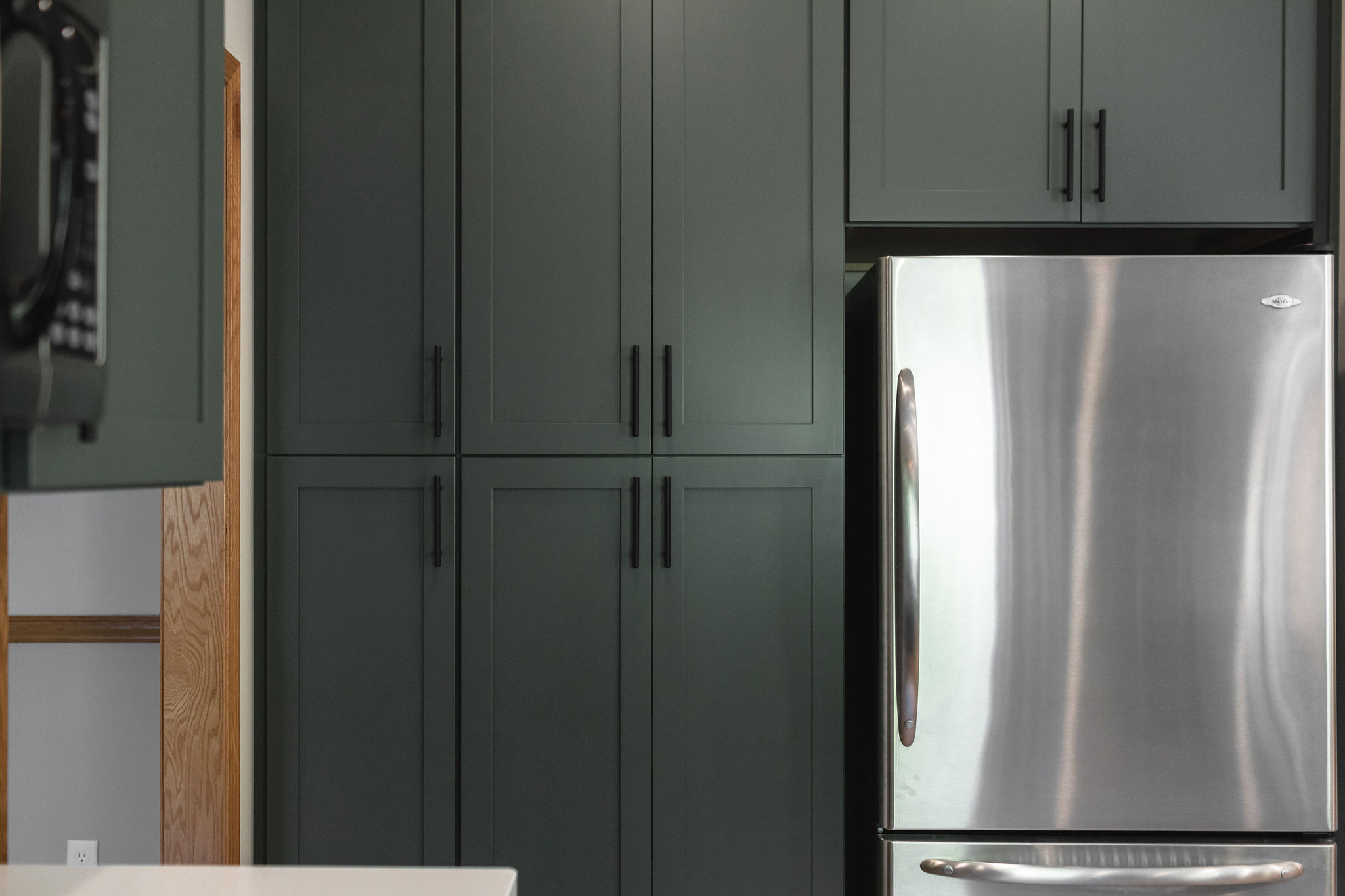
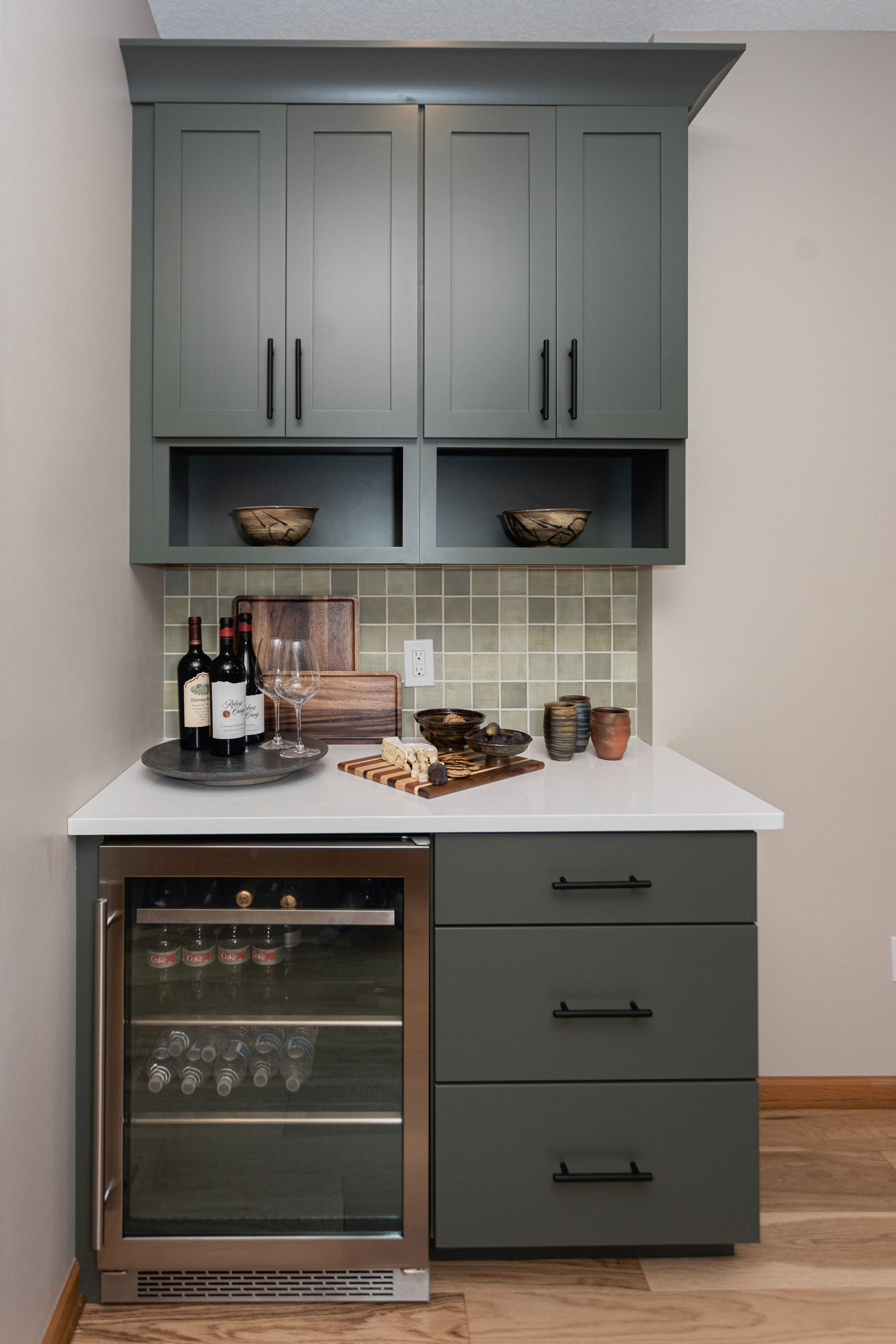
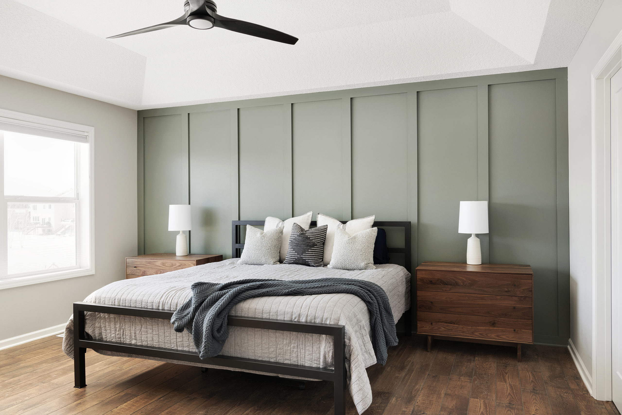
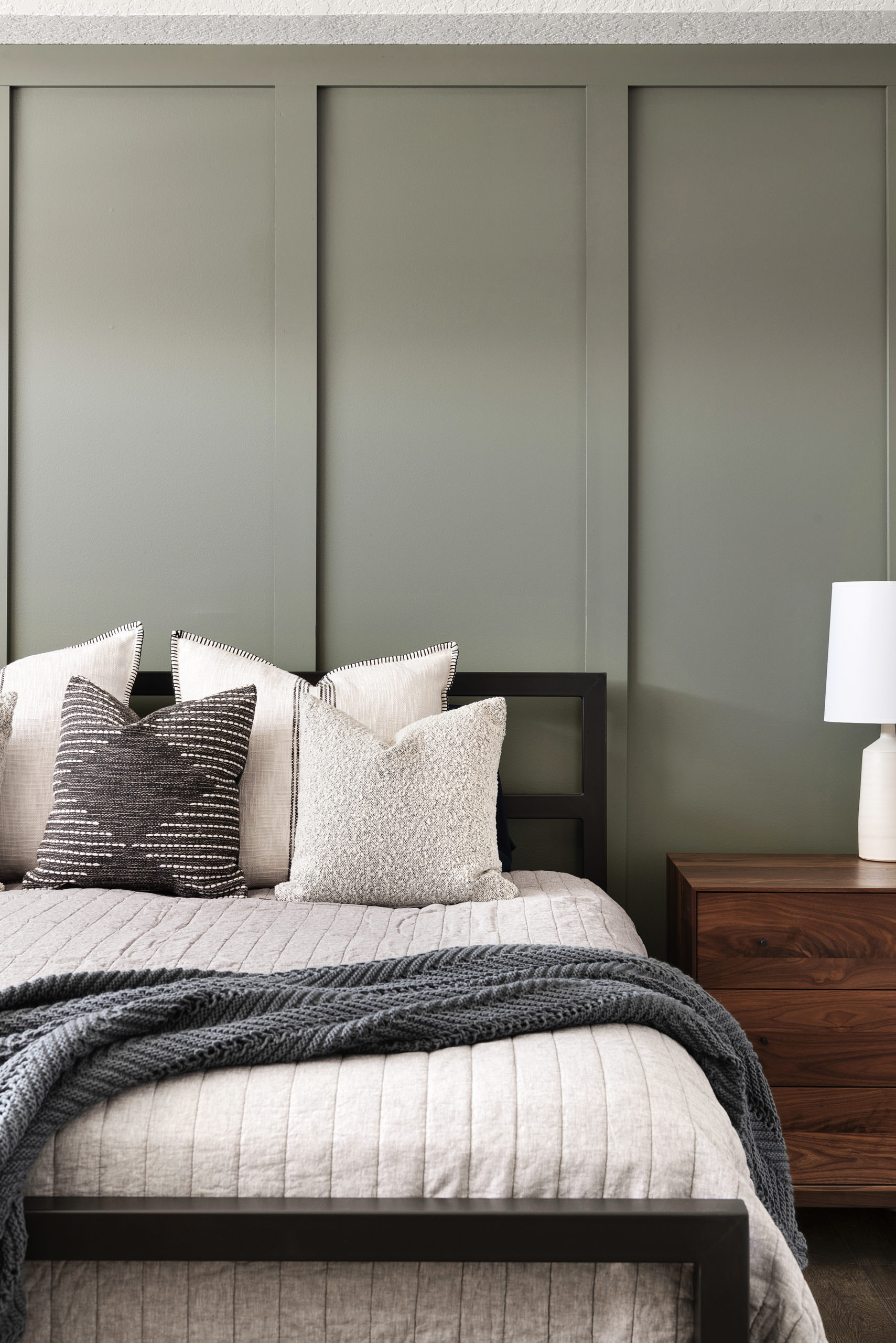
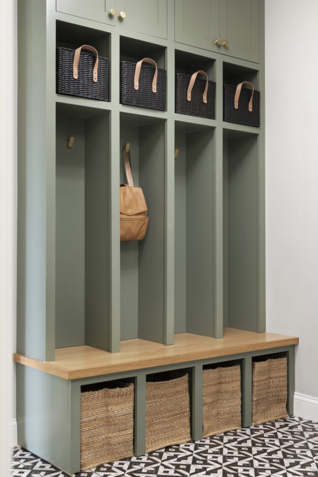
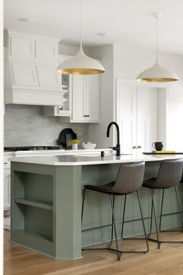
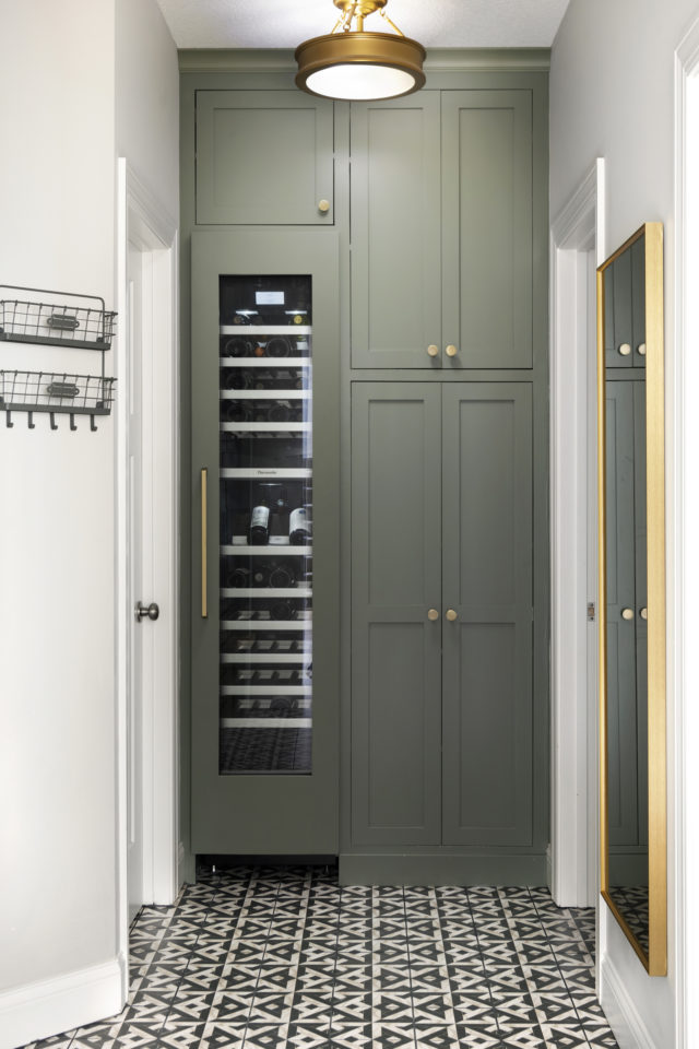
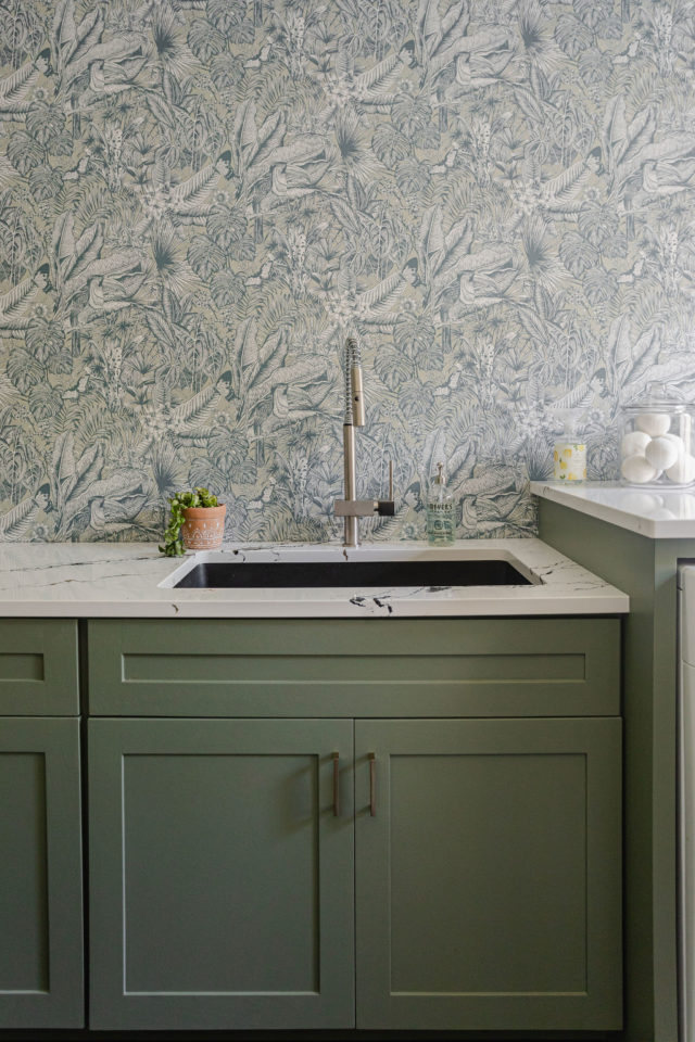
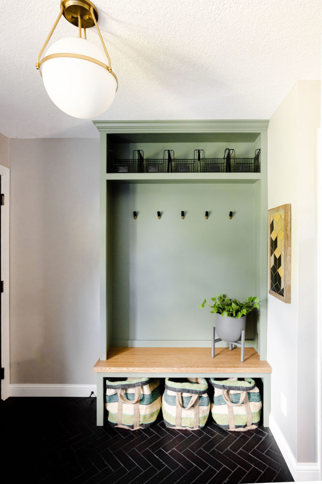
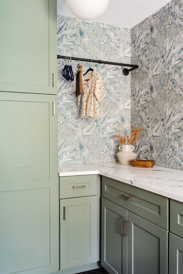

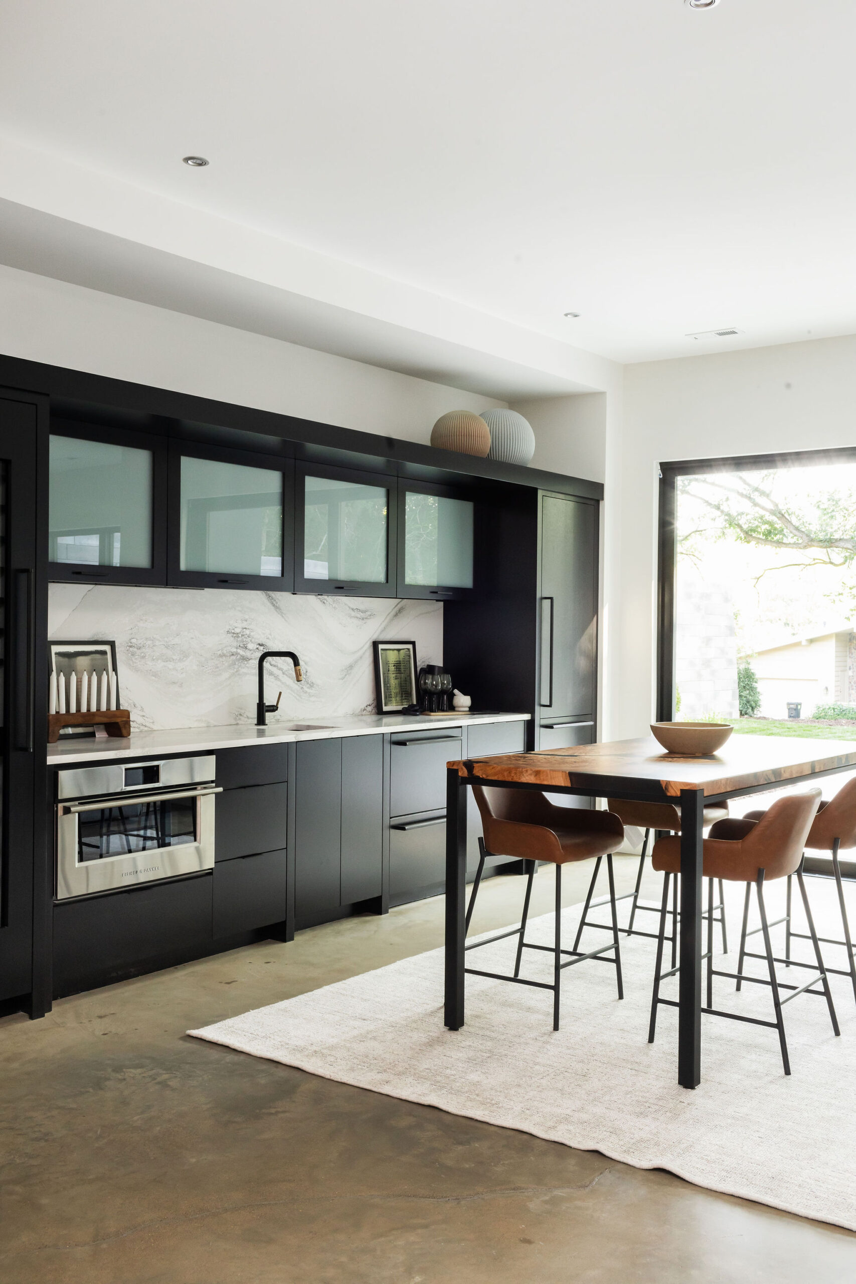
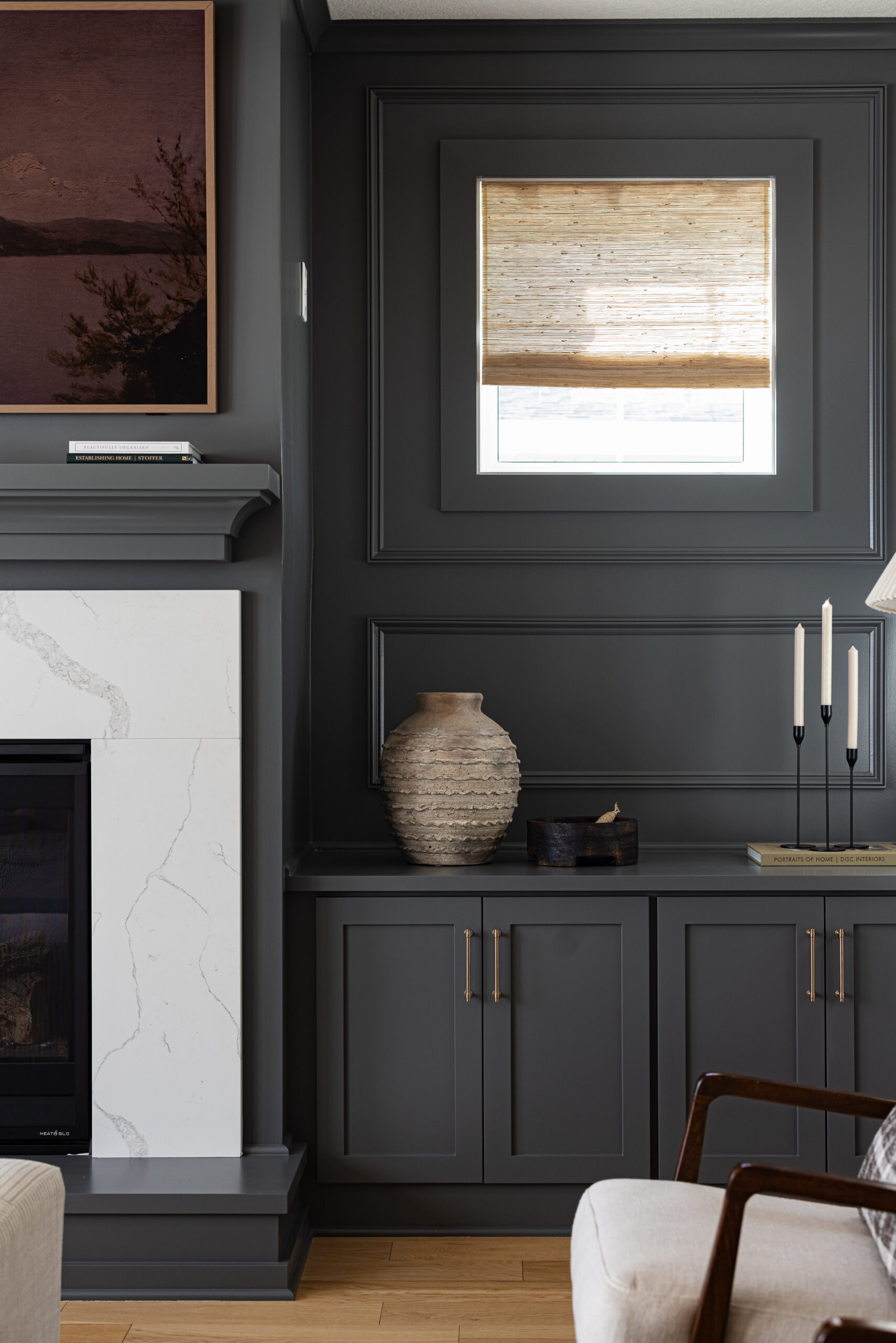

You’re so sweet, thank you. That means a lot to us. And Oh my goodness – thanks for calling this out. I can’t believe I didn’t have those photos in there. The color is in the graphic with our top 12 though. Added the actual house pictures now. It’s Dark Olive by Benjamin Moore. It’s a beauty!
I just discover your work and I’m obsessed!!! A green I was hoping you could tell me about is the green from The Styled Press Mudroom you did in St. Michael, MN. It’s such a beautiful shade and I don’t believe it’s on you covered on this post. Many thanks!
YAY! I love that!! I’d stick with something lighter. We have lots of green accents in our home and our walls are painted Snowbound by Benjamin Moore and Mindful Gray by Sherwin Williams. Another favorite we use in clients homes often is Revere Pewter. I’d recommend any of those three!
I’ve recently been more interested in painting our kitchen cabinets green, so it was nice to see this post. What colors would you recommend for the wall if we went with one of these greens?