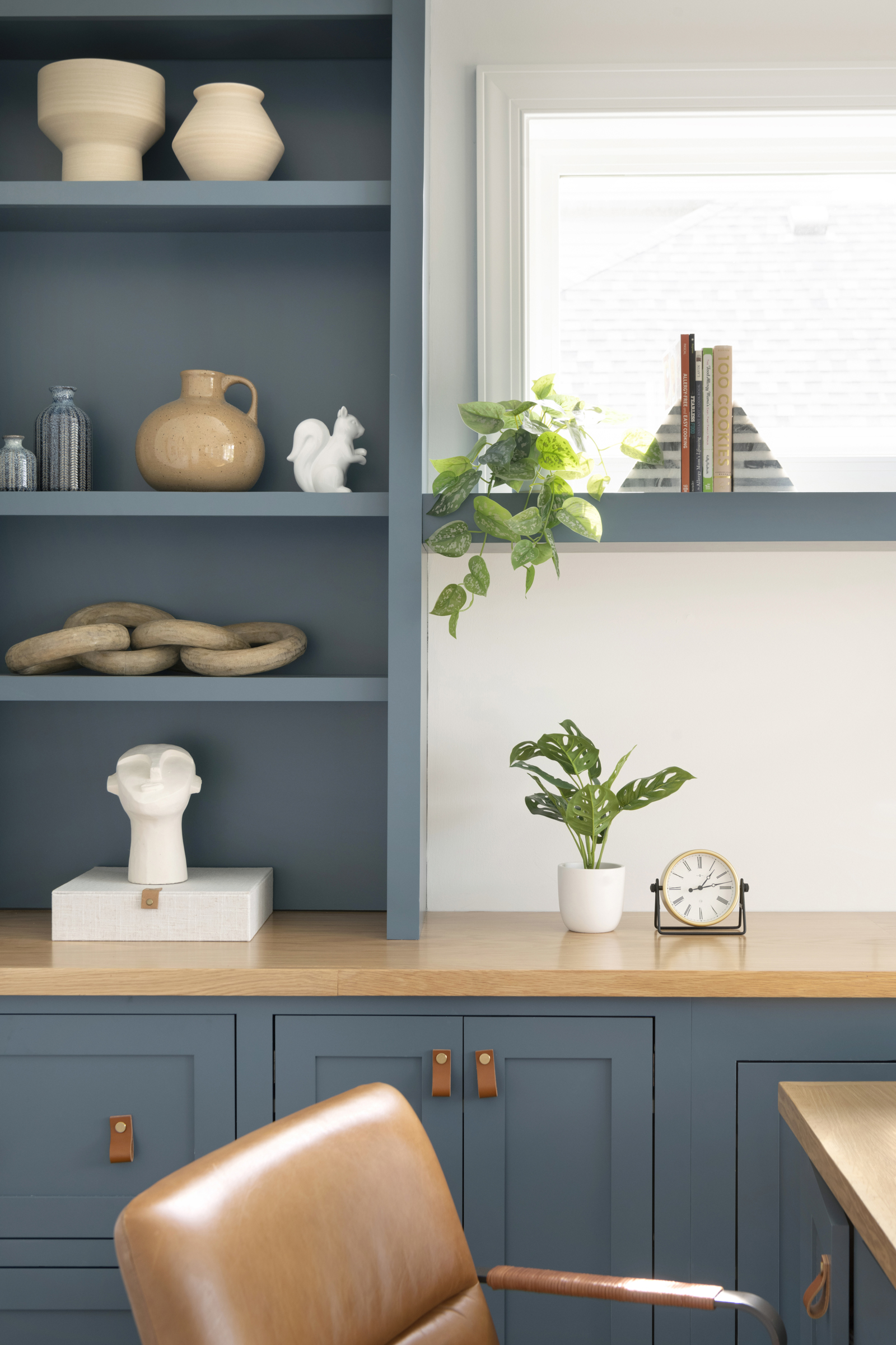
Step into the enchanting realm of blue paint colors with our comprehensive guide! Are you eager to explore a palette that beckons tranquility, sophistication, and enduring allure? Envision the transformation of spaces as blue tones weave elegance and adaptability, infusing rooms with depth, serenity, and a touch of timeless style.
As aficionados of design, we grasp the magnetic pull of this perennially beloved hue and its remarkable ability to metamorphose any interior. Within this extensive guide, we unfurl an array of captivating blue shades that transcend fleeting trends, unlocking the door to crafting enchanting and welcoming spaces. Join us on this journey to unravel the endless possibilities and subtle nuances of blue, guiding you to discover the perfect hue that resonates harmoniously with your distinct style and visionary aspirations.
And speaking of colors, if green resonates with your aesthetic, we’ve curated a complementary green paint color guide here for your exploration.
Moreover, have you ever encountered the fascinating blue light theory? It’s more than just a theory—it’s grounded in reality! Blue light possesses the remarkable capacity to enhance alertness, bolster memory and cognitive function, and uplift mood. Furthermore, it plays a pivotal role in regulating your body’s natural circadian rhythm, influencing your sleep-wake cycle.
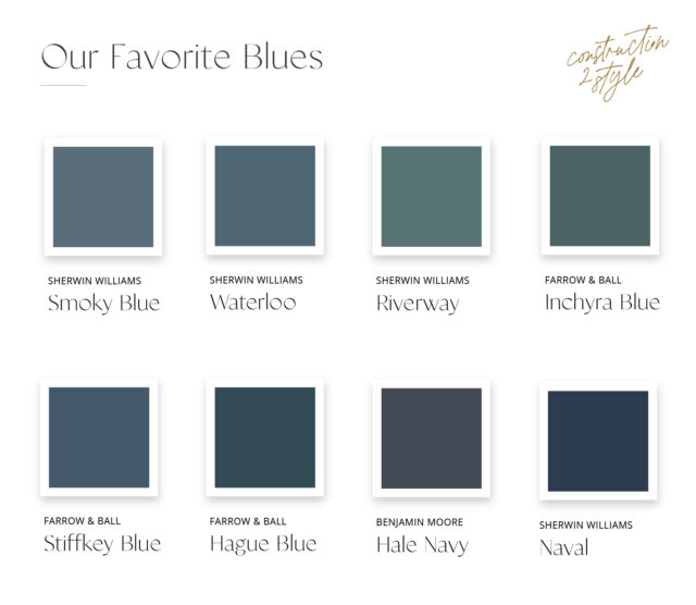
Smoky Blue (Sherwin Williams)
Smoky Blue embodies a delicate balance between softness and depth. Its subtle undertones create a serene atmosphere, making it an excellent choice for spaces aiming for a calming and sophisticated ambiance. This shade is versatile, pairing well with various design styles.
Waterloo (Sherwin Williams)
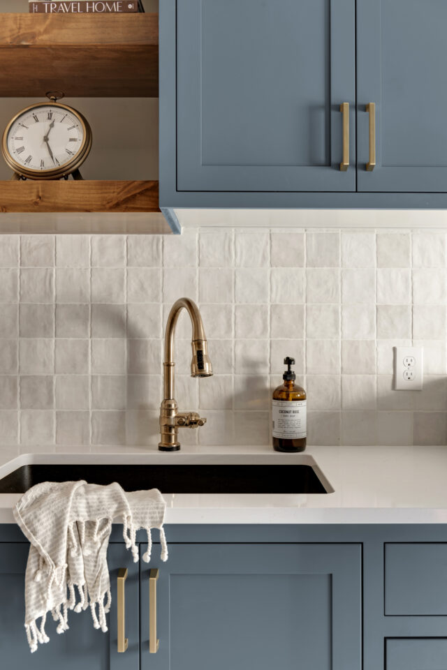
A refined blue-gray hue, Waterloo exudes a sense of tranquility and sophistication. Its understated elegance makes it a versatile option for both modern and classic interiors, offering a timeless and serene atmosphere.
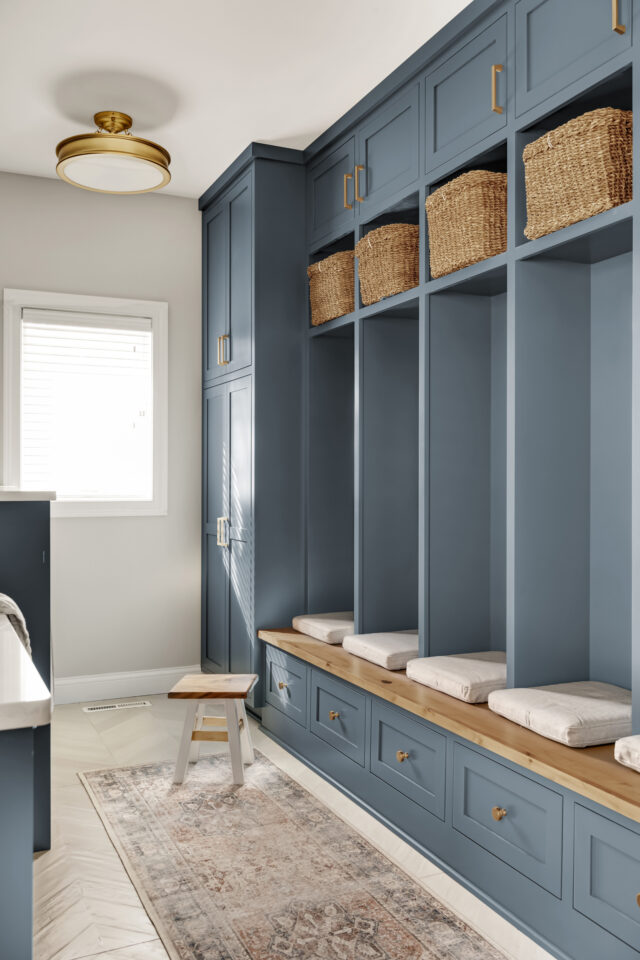
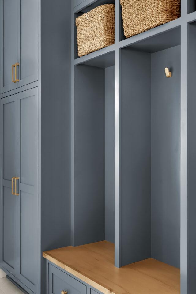
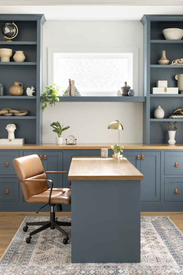
Sherwin Williams’ “Waterloo” invites you into a world painted with a deep, rain-soaked blue reminiscent of a peaceful post-storm tranquility. This exquisite hue, subtly tinged with comforting tones of warm gray, captures the essence of serenity following a downpour. Imagine stepping into spaces adorned with Waterloo – picture it in the Mill Street Mudroom, the Walnut Grove Home Office, or the Crystal Lake Main Level. In these settings, Waterloo by Sherwin Williams effortlessly weaves an atmosphere of calmness and quiet reflection, creating a sanctuary where the mind finds solace and creativity thrives amidst its soothing depths.
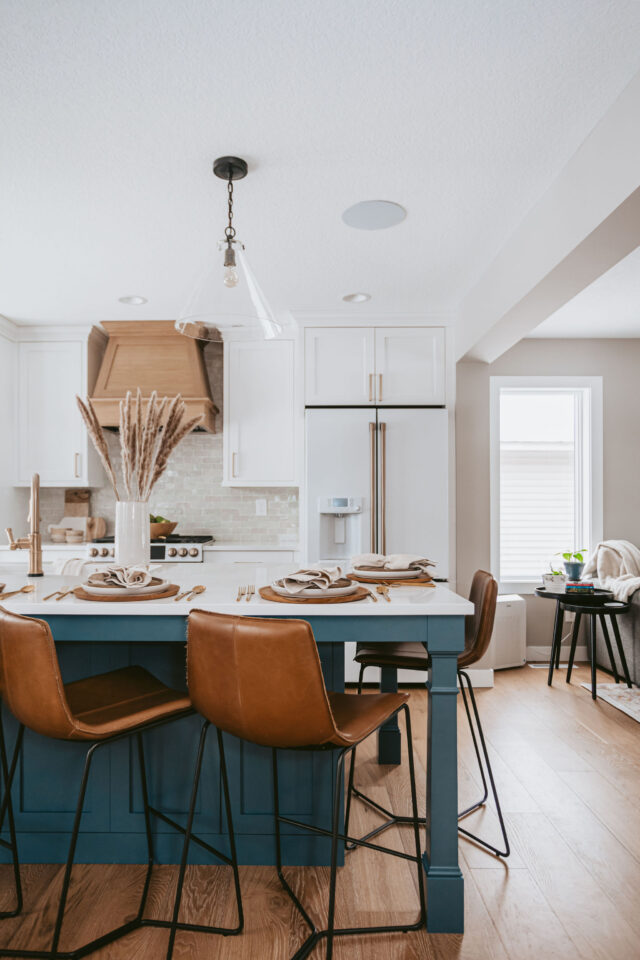
Riverway (Sherwin Williams)
Riverway is a rich and deep teal-blue color that commands attention. This bold hue adds drama and character to spaces, creating a luxurious and inviting atmosphere. It’s an excellent choice for making a statement or as an accent color.
Inchyra Blue (Farrow & Ball)
Inchyra Blue is a muted and moody shade that reflects a sense of depth and complexity. Its versatility allows it to appear either more blue or more green depending on the light, offering a unique and intriguing character to any space.
Stiffkey Blue (Farrow & Ball)
Stiffkey Blue is a bold and captivating navy shade with a rich depth that exudes confidence and sophistication. It brings a sense of drama and elegance to interiors, making it an ideal choice for creating a striking focal point.
Hague Blue (Farrow & Ball)
Hague Blue is a commanding and intense color that boasts a deep richness. Its boldness adds a sense of opulence and depth to the interiors, making it perfect for creating a cozy yet luxurious atmosphere.
Hale Navy (Benjamin Moore)
Hale Navy is a classic and timeless navy blue with a hint of warmth. Its depth and versatility make it an excellent choice for various design styles, from traditional to contemporary, adding depth and character to any space.
Naval (Sherwin Williams)
Naval is a deep navy shade that exudes confidence and sophistication. Its richness and versatility make it suitable for creating a bold statement or as a backdrop for highlighting other design elements in a room.
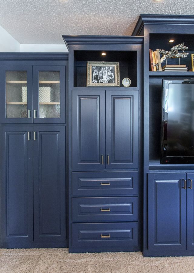
Sherwin Williams’ “Naval” is a profound and commanding deep blue shade that transcends the ordinary. Its captivating blend of deep blue and subtle gray-green undertones evokes a sense of serene tranquility that can transform any space into a haven of relaxation and focus. Imagine this hue adorning the walls of your study or office, infusing the atmosphere with a contemplative calmness that inspires productivity and contemplation. Discover how Naval from Sherwin Williams became the star of “Our Basement Reveal,” setting the tone for a space that harmonizes comfort and sophistication in perfect balance.
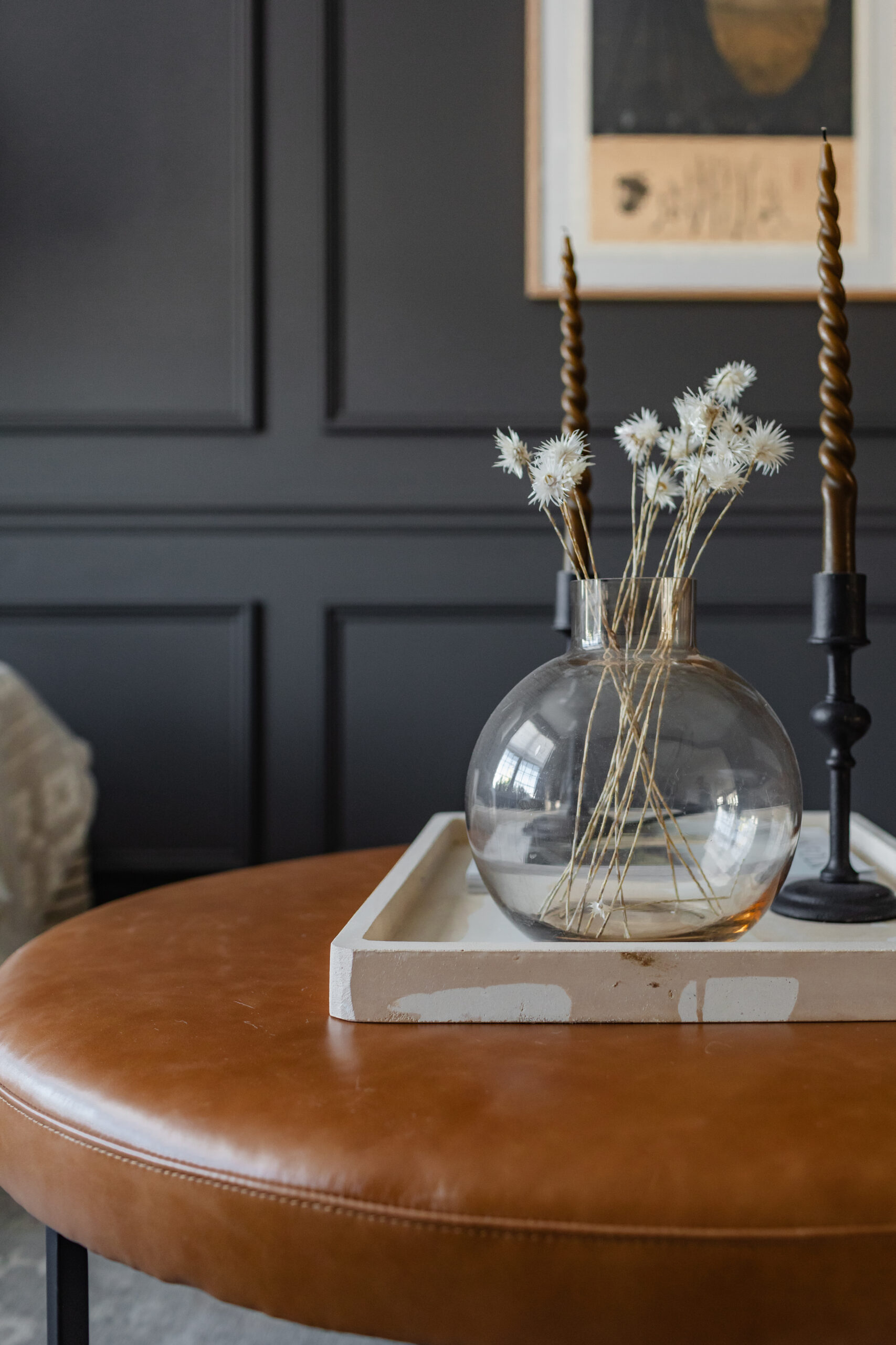
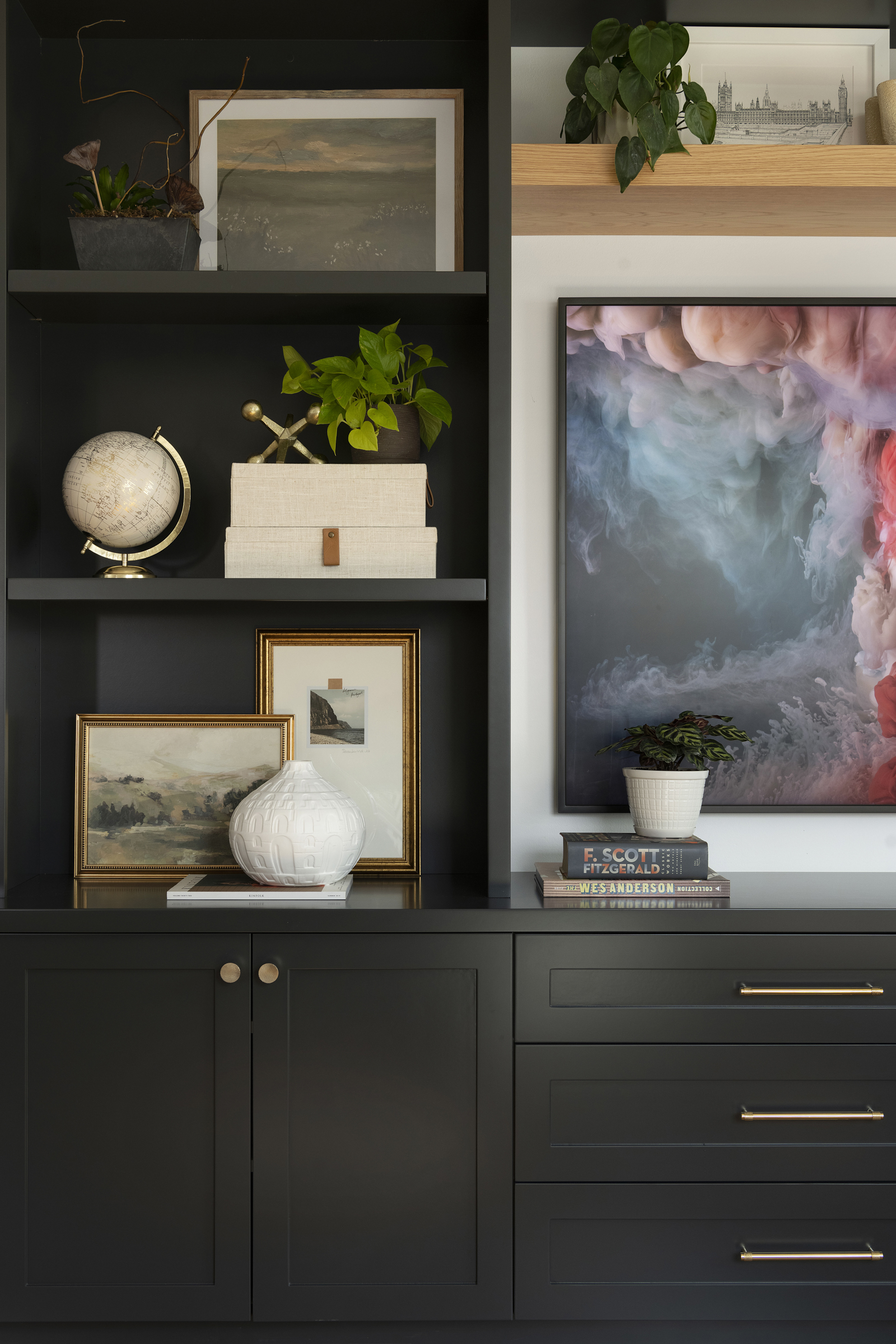
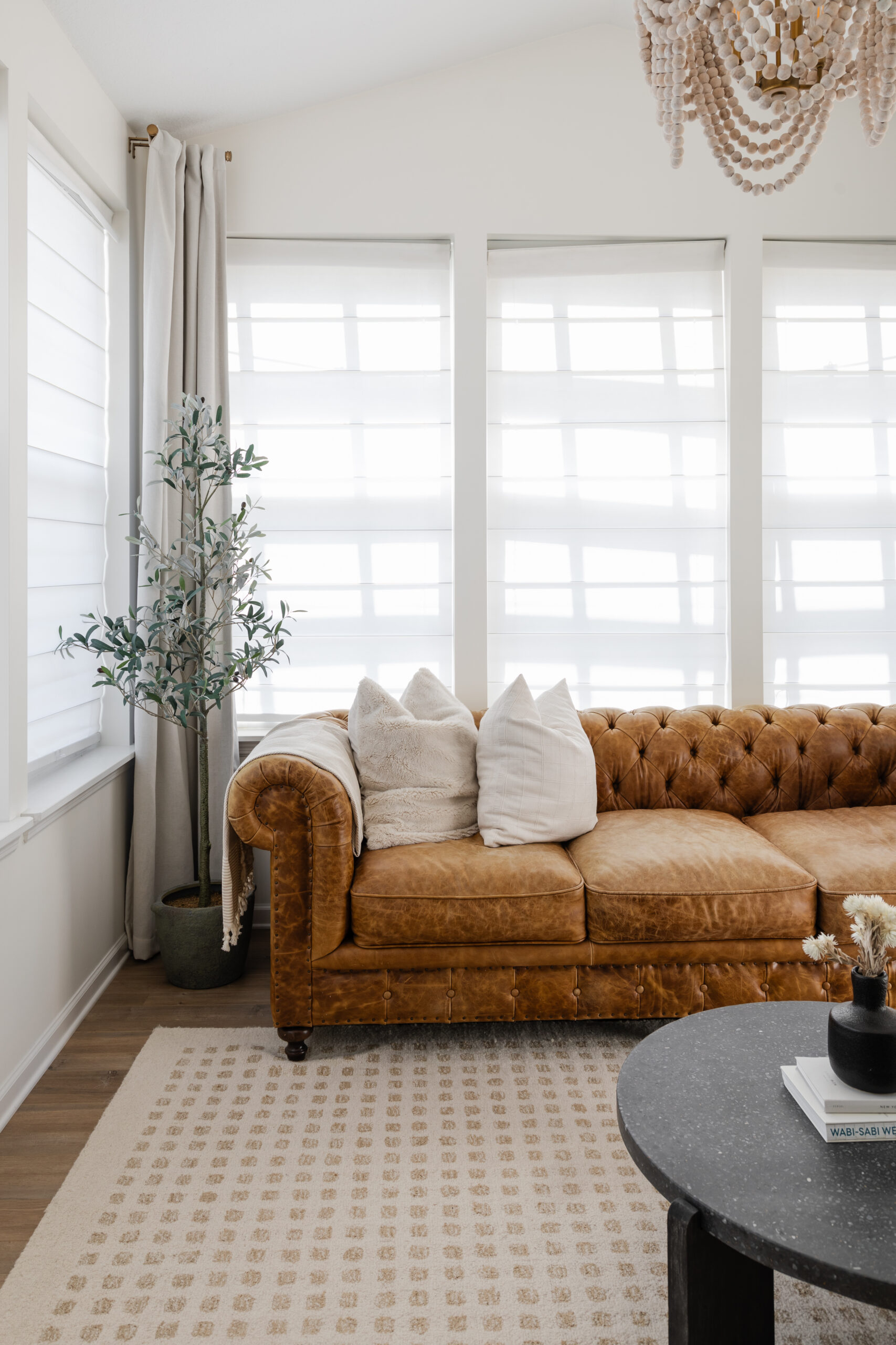
It’s wonderful to see clients gravitating towards such a versatile and enduring color that can transform spaces, making them feel more expansive, vibrant, or soothing as needed.