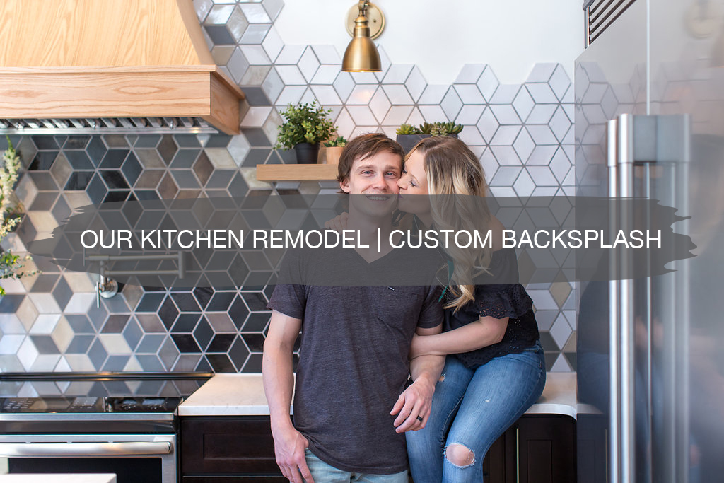
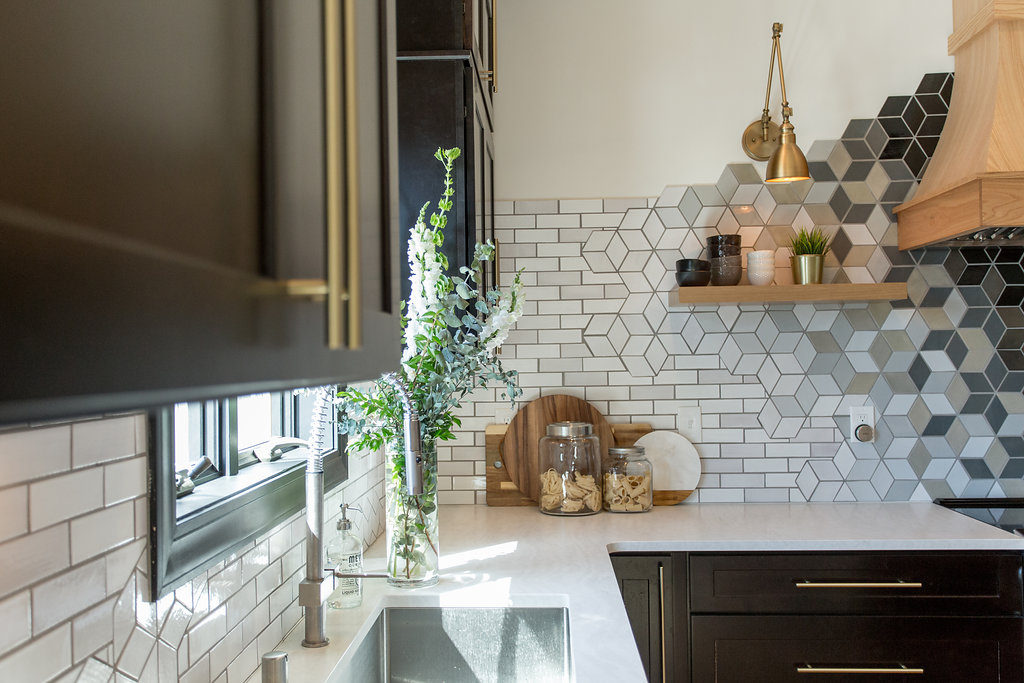
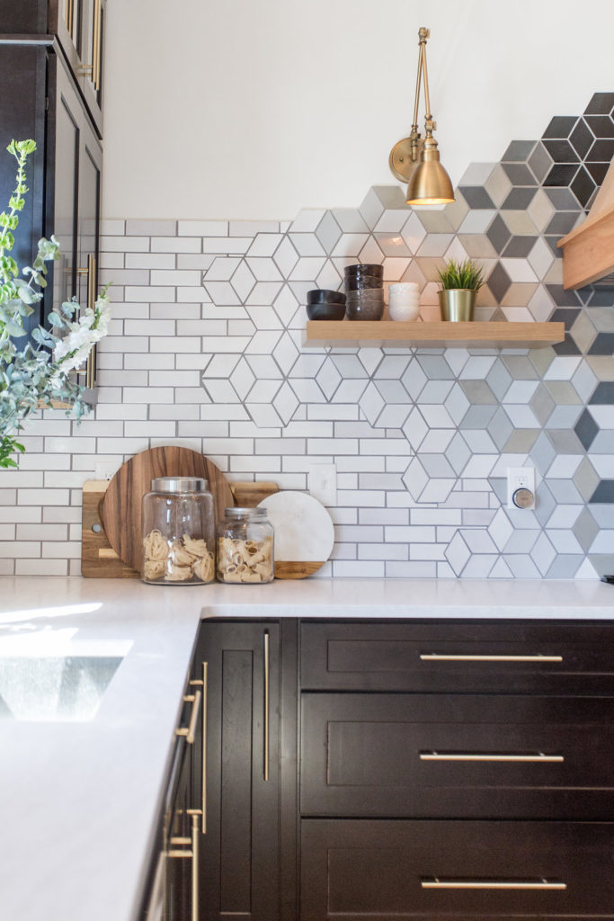
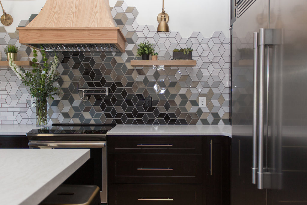
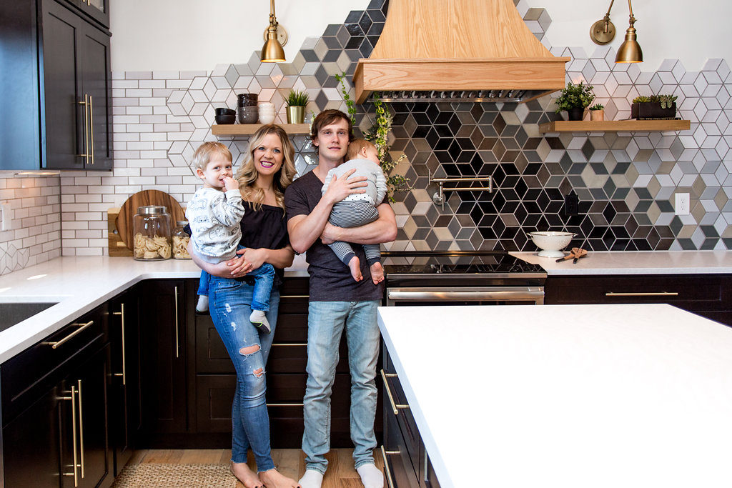
Our backsplash post for our kitchen remodel is here, and we are so freaking pumped to share the entire process of working with Mercury Mosaics on this custom backsplash with you guys!
We’ve got a lot of questions and comments about it. All good ones but some that have made us laugh really hard. Such as…
“Your poor tile guy” or “Did you design the backsplash” and “How in the hell did you put that all together?!”
We’re going to answer it all for you today.
About Mercury Mosaics
We’ve been working with Mercury Mosaics for a few years now.
We’ve used their custom tiles in a handful of our client’s homes from bathrooms to kitchens and even made a tutorial on how to tile a backsplash using their handmade tiles.
They are a local Minneapolis-based company, and we love supporting our local makers. For our home, we got to collaborate directly with the owner, Mercedes Austin, from start to finish.
Super cool! And no joke, I now feel like a new woman!
Jamie and I both learned so much through her about tile, overall design aesthetics, and even ourselves. It was exciting to tap into and dig deep with Jamie.
Mercedes pushed us out of our comfort zone in regard to our styles. She opened us up to conversations we hadn’t explored in regard to growing our business and the direction we wanted to take it.
We’re now thinking differently about client work and the brands and products that we use and collaborate with. After all, all of that is a reflection of our brand.
I’m not exaggerating when I say we were creatively inspired every day by opening up and reading her emails while working with her on this piece of art that we created together.
If you haven’t heard of Mercury Mosaics, head over to their website and I promise you’ll get lost in it for hours.
Mercury Mosaics began as a boot-strapped operation in Mercedes’s art studio. After working in a handmade tile shop in Minneapolis, and refining her trade in Italy, Mercedes knew it was time to forge her path to Mosaics.
She scraped up enough money to buy her first kiln by selling her jazz CD collection and using her tax refund. From this first kiln and her entrepreneurial spirit, she started creating her first works of handmade ceramic art.
I can’t even begin to imagine how many people Mercedes has mentored and inspired over the years in their own small businesses. We for sure are one of them! If you’re local, this lady is one to get to know. With her in your tribe, there is no way you’ll ever fail.
The Custom Design Process for our Kitchen Remodel
Best piece of advice I learned from Mercedes throughout this process…
“When choosing colors and designs for your home, always remember that colors and trends will come and go, so create a space that makes you happy, and your life will launch off that.” – Mercedes Austin
When we started this collaboration we knew we wanted to do something a little different.
The one thing Jamie wanted was diamond-shaped tiles turned hex, and all I wanted was a raw edge and no cabinetry, only floating shelving to create a conversation piece in our kitchen.
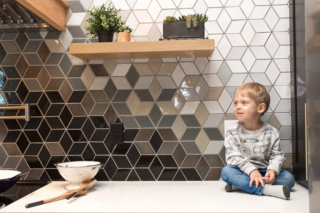
What we love about their tiles is that they have so much personality, and since every tile is hand-cut and hand-painted which means no two tiles are ever the same. Some tiles may appear a bit darker or lighter even when they have the same color glaze.
But that’s what we love about them! The texture of the color and clay also makes so the color reflects light, unlike any machine-made tile which, as Mercedes says, adds to the magic!
Tile is personal, so Mercedes wanted to get to know us before diving into every little detail. This all happened over email.
Her business model is set up to work on custom design whether you’re local or you’re halfway across the country or on the other side of the world, they just shipped custom tile to the Middle East last week! Super cool.
And she’s just as much fun working with via email as in person. She made me go to bed smiling and wake up happy!
With our busy schedules, client work, and two young children in tow, our email correspondence was typically after hours and how we rolled on this scope of the project.
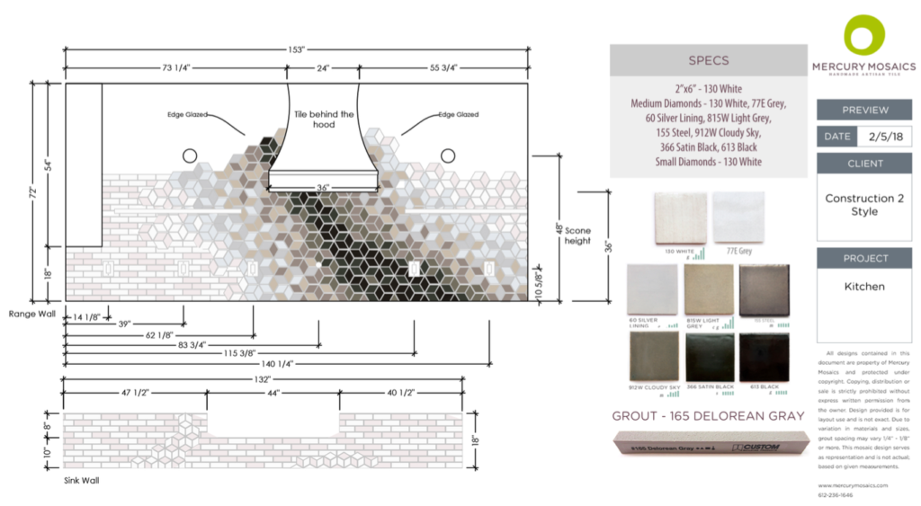
In order to figure out the tile, we needed to share every finishing selection we were putting into the space down to the brands, colors, shapes, sizes, and specs. This got pulled into a mood board that informed the direction of the tile.
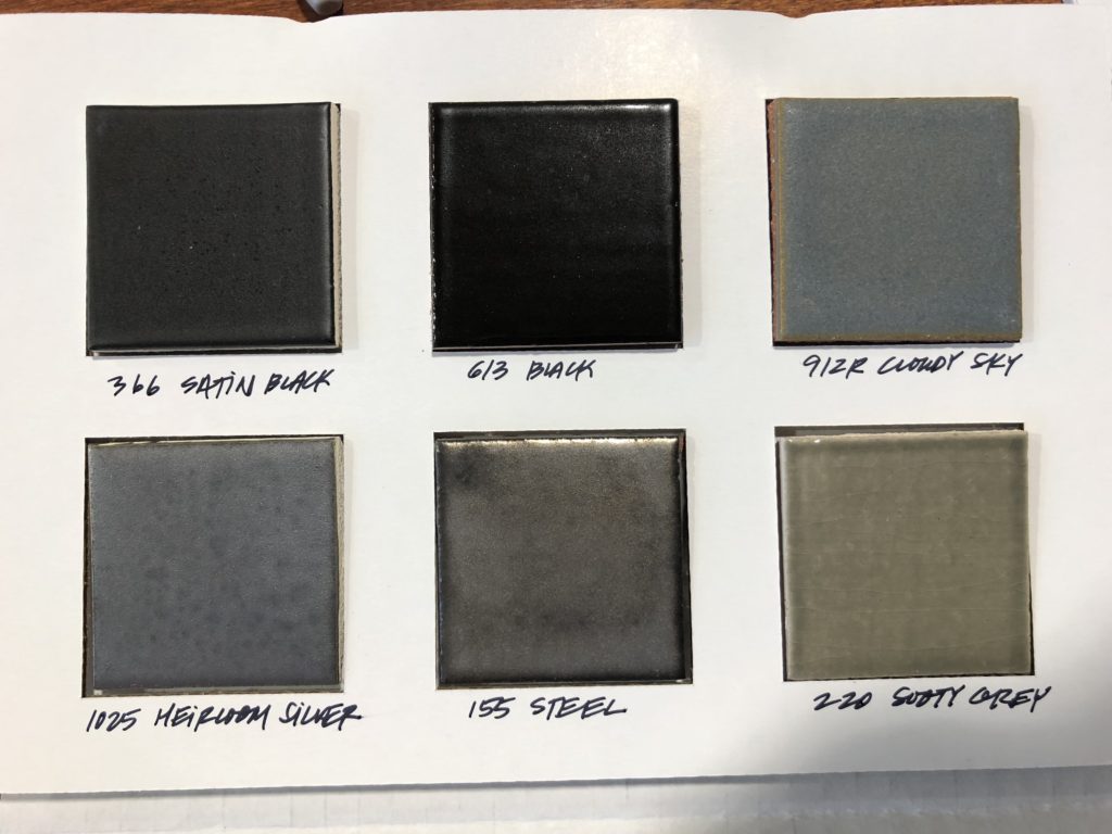
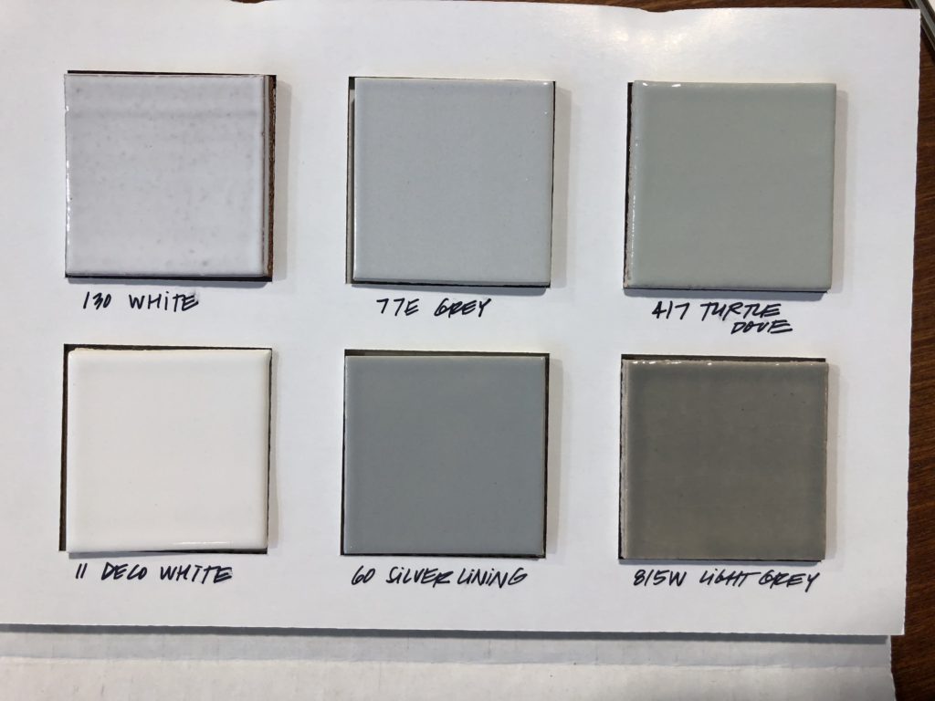
The first thing, once all the other finishes were established, was to choose a color. This kept it all fun, we were in the driver’s seat and never overwhelmed. We ordered a sample pack to look at tile sizes and color palettes.
And how can you say no to any of these colors?! We wanted them all!
So she incorporated almost all of them…
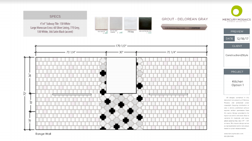
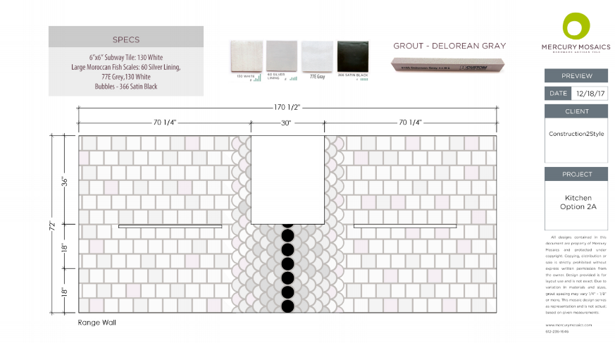
And then she sent us the first couple of design concepts.
She wanted to put something together that covered these bases:
- Give us the depth of one main color of glaze.
- Something that is timeless: staggering a classic shape, but adding a personal touch.
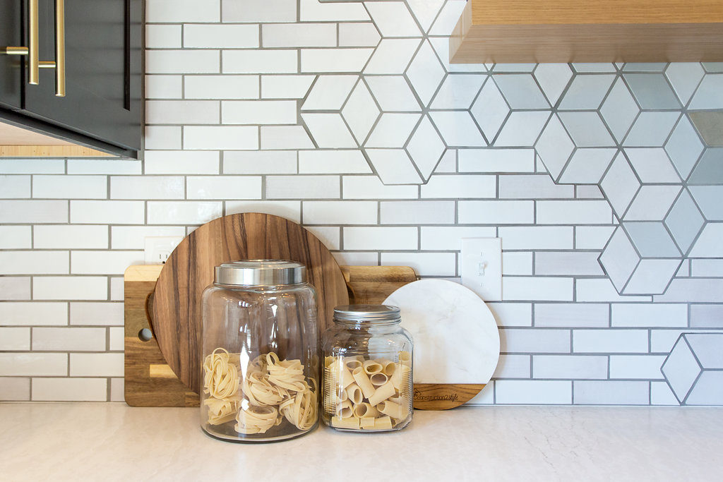
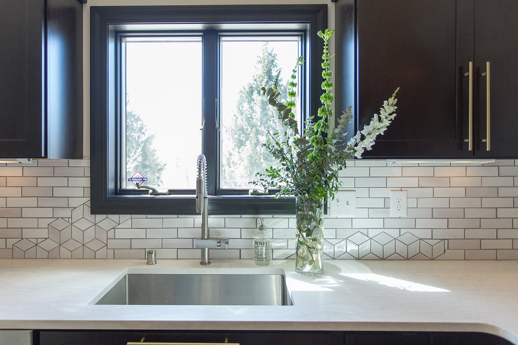
- The personal touch: put something together for Morgan and Jamie that we haven’t done yet, give them something that can be uniquely linked to an expression of them in their home, while still having the ability to talk about components of the project her audience can relate to as well. (Simple geometric Diamond Tiles paired with classic, handcrafted Subway Tiles).
- The kitchen is one of your family’s most important spaces.
- Blooming flowers can be associated with health, happiness, and success – all things I’d love to be in the backdrop of your kitchen.
- Patterns in both options – the focal patterns – can be found in architecture dating 1,000s of years ago, but with these fresh, clean color palettes, we’re adding a modern element to them – they’re relevant to your tastes now.
We were absolutely in love with the direction of it all. We loved that the focal point was centered around the hood, but we (as in Jamie and I) weren’t on the same page for the overall design.
We both laughed really hard about this because nothing is more uncomfortable when we go to one of our client’s homes and they aren’t on the same page with their significant other. And here we were thinking that we were.
But, Mercedes made us tap into where our love for design comes from and why we weren’t willing to change what we wanted in our home. It brought a whole new perspective! Something we’ve never done with our clients.
We decided we wanted to break it up a bit more, making it uneven but still flow together and make sense. We suggested the focal being at a slant, almost like an ocean wave. We also suggested the top of the tiles, being all uneven and not one flat edge.
Here’s the catch with Jamie & me.
When it comes to craftsmanship, he likes more of a modern traditional design, clean and straight lines.
While I look at style and love the eclectic look…things that don’t match, different eras of styles and trends, and well, things that are hung not perfectly straight. I also came from an art background, so that could play a major role.
I also was hesitant on so much subway tile. I’m not gonna lie, we have grown to dislike subway tile because so many of our clients put the cheap subway tile in, tile with no character and have become bored with it. Mercedes pushed us, educated us, and really opened our eyes to a whole new way of understanding subway tile.
“Long ago, before China took over tile making with their horrendous factories with less-than-ideal-working conditions making cheaply-produced tiles with no soul so people could buy them for a quick buck, the attention to detail, the nuances of soul in a tile… those things got lost somewhere along the line. I think it was during the days of honey-oak, hollowed, veneer, Menards-made trim, and laminate that peels over time with honey-oak cabinetry that warps – home-building was turned into a McDonald’s model of sorts.” – Mercedes Austin
Through many conversations such as that and being educated by one of the best tile makers in the world if you ask me, I am now in love with subway tile again. But not just any subway tile let’s be clear.
“Handcrafted objects transport me to another place and remind me of my global travels. I’d like to think we’re adding a little bit of that magic to each tile. If you think about it – with food “they say” to never eat something prepared by an angry chef…. That the anger translates into the food and then you consume it and….
Well, I feel the same about tile. We are here, we are making this raw clay material into a shape, we’re adding color, we’re making the tile come to life. If you ever come in and visit the studio atmosphere – you can really feel the passion and dedication and happiness. THAT goes into the tile. No bull. Go stand in front of a sterile, commercially, machine-made wall of tile and “listen to it” and tell me what speaks to you. Now, go stand in front of an installation of Mercury Mosaics – handcrafted tile and “listen”… you’re going to feel something. There’s a story behind it. It’s this energy that we bring to the table which each tile we make. This is what we’re bringing to the table. We’re not trying to compete with big box. Our aim is to add to a meaningful, curated environment. We aim to add value to beautiful places. We want our tile to be part of the backdrop of your life and your friend’s lives.” – Mercedes Austin
Which you can tell by their culture right here…haha!
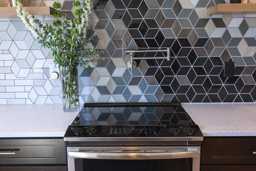
And through many conversations and multiple rounds of revisions, we came to this…
And we couldn’t get it ordered and up on our wall fast enough!
The Install
As Jamie shares in the video, the installation process was a piece of cake. Mercury Mosaics did all the hard work for us and as Jamie said, made him look really good.
Yes, he installed all of our tiles.
They knew our exact measurements of the space, where the cabinets were placed, down to where the outlets were going to be. Not gonna lie, Jamie thought that was all a little overkill when we were going back and forth to get those measurements but those details made the world of a difference he realized when it came to the install.
He hardly had to cut a thing besides where the outlets were. With the Mercury Mosaics team knowing where everything was going to be placed, including outlets, they ensured that a specific tile in the design wouldn’t be cut out to ruin the overall look and made for minimal cutting on Jamie’s end.
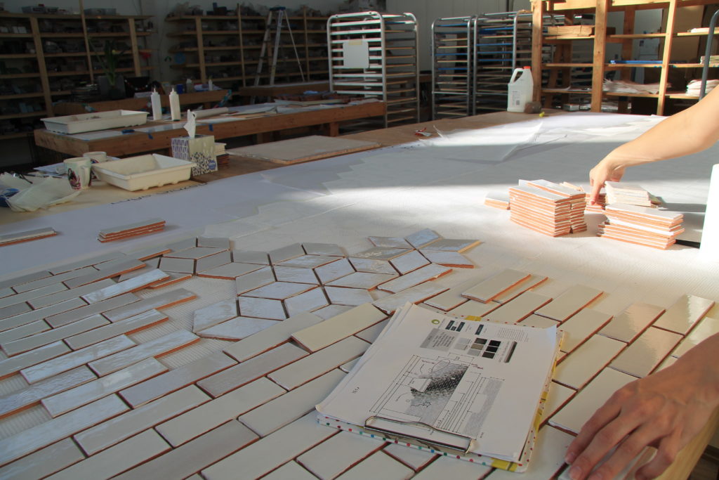
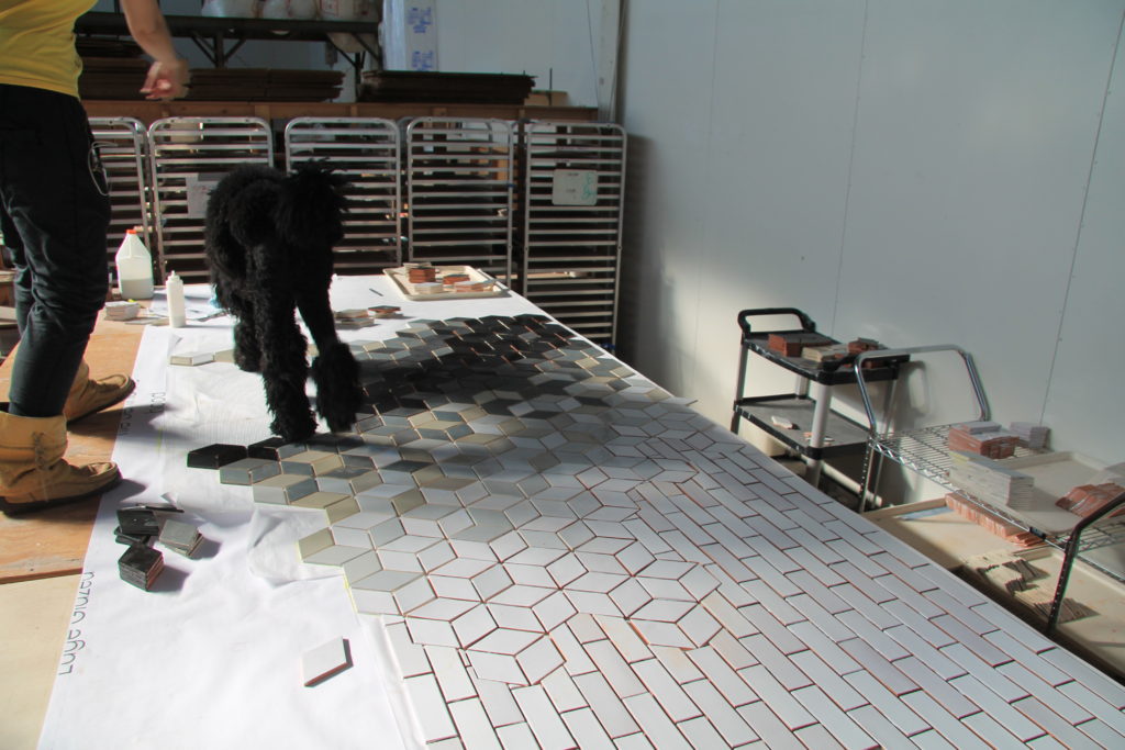
It’s literally taking the time Jamie would have had to take – laying each piece of tile and those many trips to the wet saw, but instead, with sharing measurements over email with marked-up drawings, we were able to get the template perfect so the artisans could layout the tile per the vision & I didn’t have to rely on Jamie to be the artist during install.
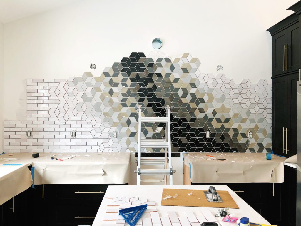
Once the design plans were finalized, they mesh-mounted the tile, then cut them into sheets and numbered them for us. These sheets came with an easy-to-follow, numbered map. It was like putting together a simple puzzle when it came to the installation.
Typically, like the other spaces we’ve done using their tiles, they come in standard sheets and then we measure and cut the sheets as we install. Not with Mercury’s custom backsplash, it’s already fit to scale. Check out their custom design process here. We dare you to try it!
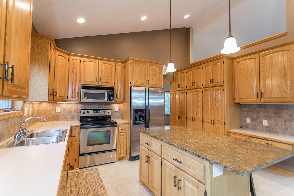
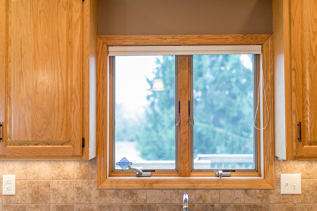
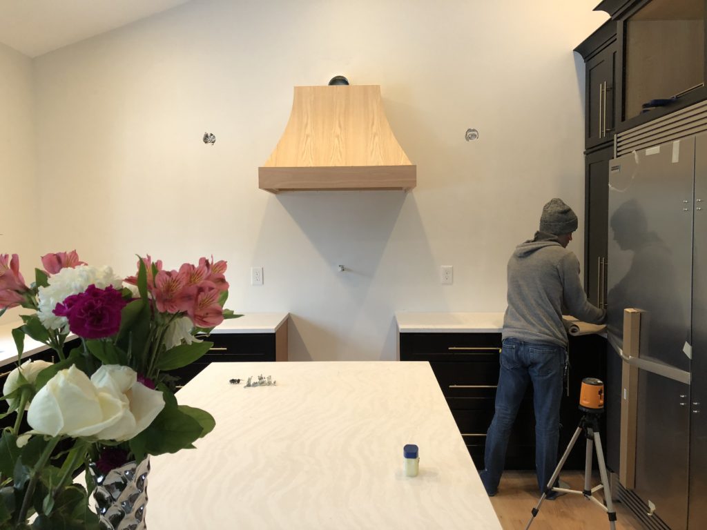
The before…
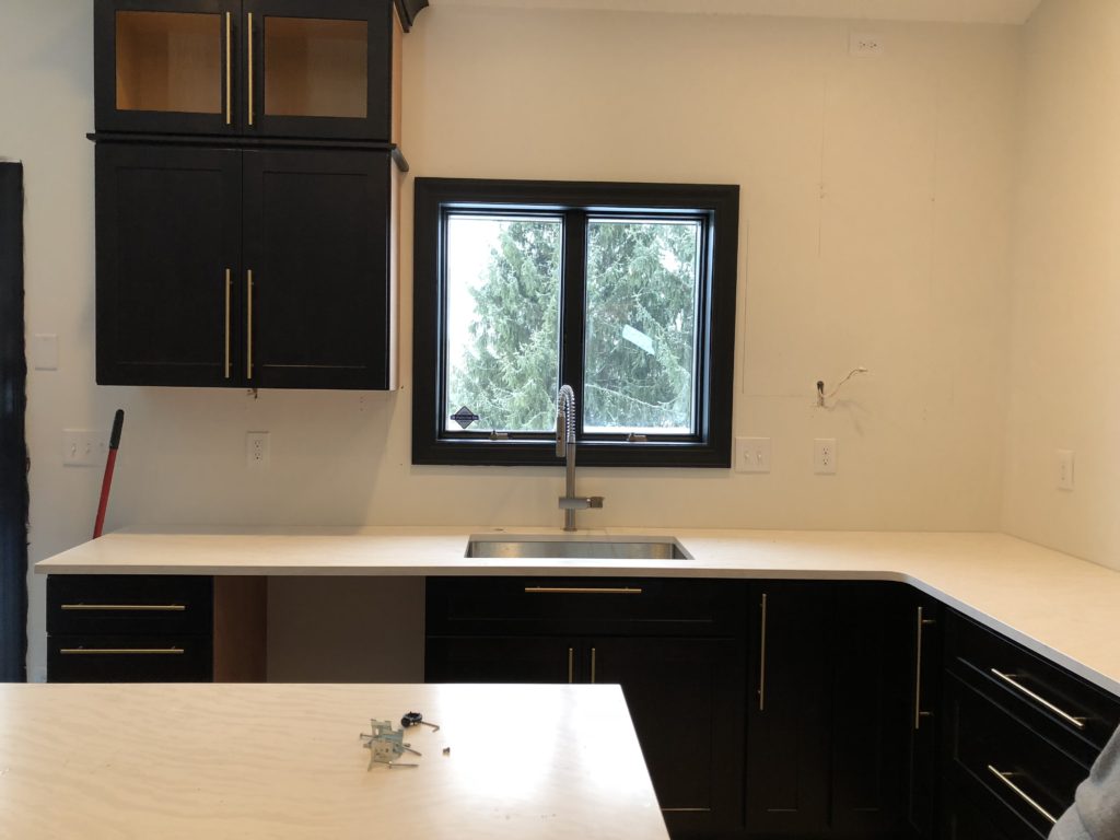
during install…
Jamie got this tile up in a few hours where typically it takes him an entire day for a tile installation.
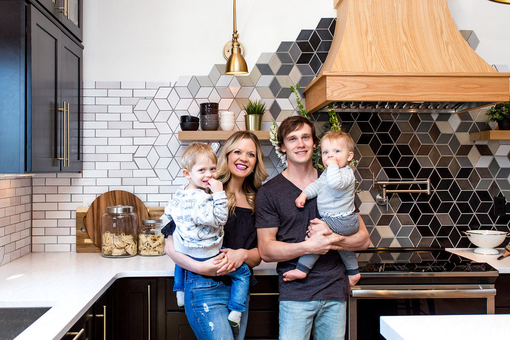
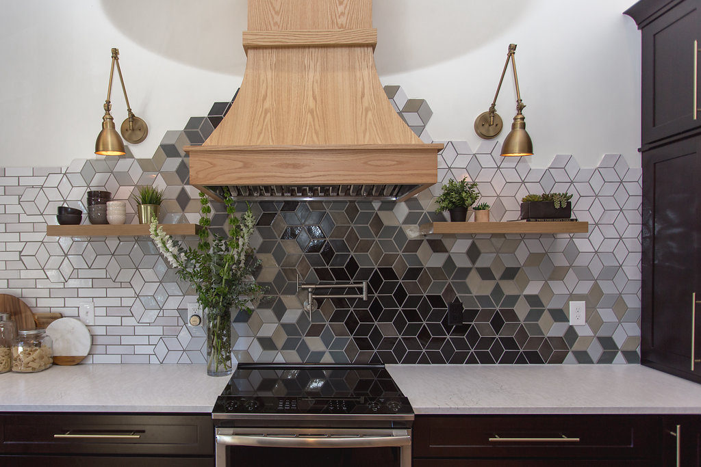
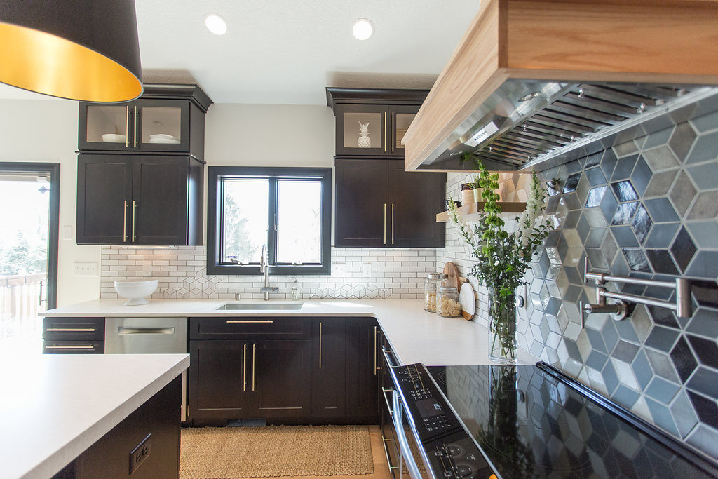
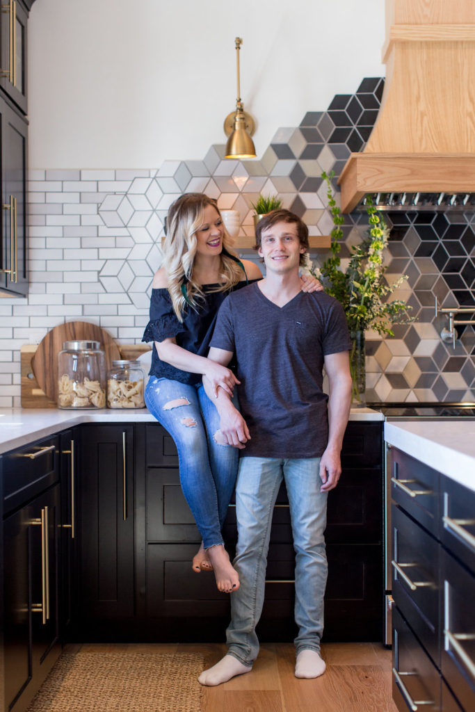
and the final reveal…
We couldn’t have been happier with how it turned out and enjoyed the entire custom tile design process. We’re eager for a client to take on this same concept so we can work with them to design another custom backsplash again.
The Mercury team killed it with the designs and Jamie killed it at the install.
If you guys are thinking about a custom one-of-a-kind backsplash for your home, Mercury Mosaics will not disappoint. You can read all about this fabulous team and their work here.
{ photo credit: Chelsie Lopez }
The custom backsplash in our kitchen remodel exceeded our expectations. The craftsmanship was top-notch, and the design perfectly complements our aesthetic. The tile selection and installation were flawless, giving our kitchen a distinct and luxurious look. It’s now a focal point, receiving numerous compliments from visitors. We highly recommend this custom backsplash service for anyone looking to elevate their kitchen’s appeal.
Thank you so much!! And so sorry, I missed this. Here’s the link where we talk about our hardware. 🙂 https://construction2style.com/kitchen-remodel-cabinet-hardware-sponsored/
YA! That makes us so happy!! We got them from Wayfair!
http://go.shopyourlikes.com/pi/95e9ab444ade448ccbce1f1891018a1abfa21d2b?afId=633726&afCreativeId=2996
So beautiful – we’ve got samples in hand from Mercury Mosaics and are so excited! One question: would you mind sharing where you got those incredible cabinet pulls? Thank you!
haha, we’d be flattered! Thank you so much! Cabinets were from Cliqstudios and we did Birch Sable in Dayton style.
This is sooooo lovely!!! I may have to copy this exact design!!!! Would you mind sharing your cabinet color?
Yes, Mercedes is indeed the best. I’ve attached a pic of the wonderful mosaic that she designed for my kitchen.
Wow, Jamie built that hood! It is beautiful. Congrats on your gorgeous kitchen.
https://uploads.disquscdn.com/images/95af3d206aeac6ddb4146ba41f0adb0d8e1872940311aaf8bb2a95eb9994d459.jpg
Hey Carol! Awe, that is so fun! Isn’t she just the best?! You know it’s going to be a fun experience when you get to work with her and get a beautiful end product. I know, we were and still going back and forth on the hood. I do think it looks better in person than in pictures. Jamie custom built the hood so we like that it stands out as well to showcase his work. We are still debating on doing a little bit of a darker stain. We did black in photoshop and it didn’t look good. But we thought mine as well keep it natural for now and then when we get sick of it, we’ll stain it darker. 🙂
I have worked with Mercedes on bathroom, kitchen, and wall-art projects. She is every bit as amazing as you say. This tile design is absolutely wondeful! I figure that you wanted a wooden hood to go with the shelves, and to provide warmth to balance the sleekness and monochromacity of the other materials. Are you happy with the degree of contrast between the hood and tile? (To me, it seems a bit much.) The shelves are in an area of tile that is lighter, and they seem to fit in well. Might a darker stain on the hood fit in and still coordinate with the shelves? Or would having different colored woods look incohesive?