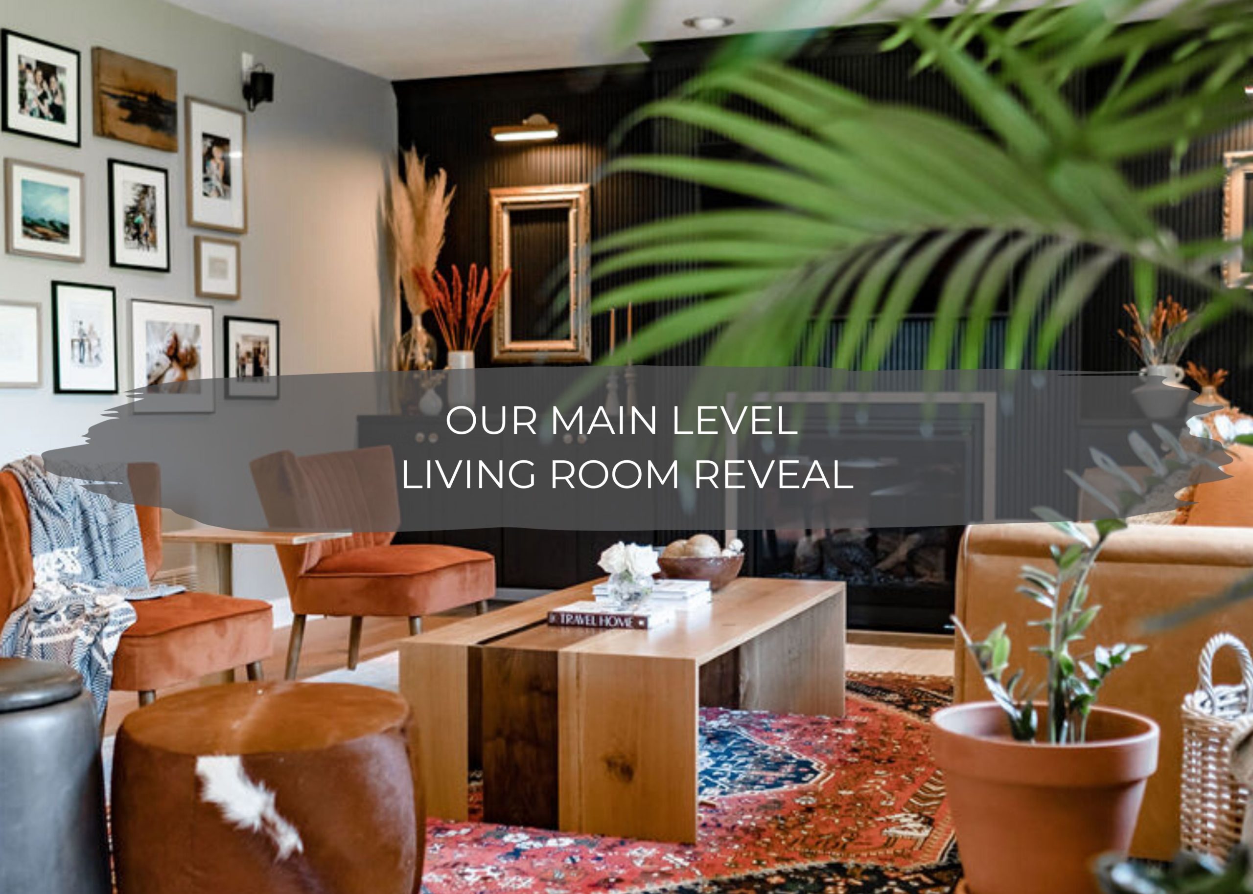
Have you guys been following this looooooong journey of remodeling our living room over this past year?
The one good thing about Covid-19 is that it pushed us to finish this living room. That’s for sure. July 8th, 2019, we demo’d our living room.
One whole year ago, and we’ve been living in a construction zone ever since. We spent the last Fourth of July weekend working hard, and it feels so good that this year we’re cabin bound to relax and not spend the weekend working on our house.
Sit back and grab that cup of coffee or glass of wine because this is going to be a long one. But we don’t want to miss any of the details that went into this space to give your inspiration for your home.
We tried our best to document and put together full tutorials behind every step of the process.
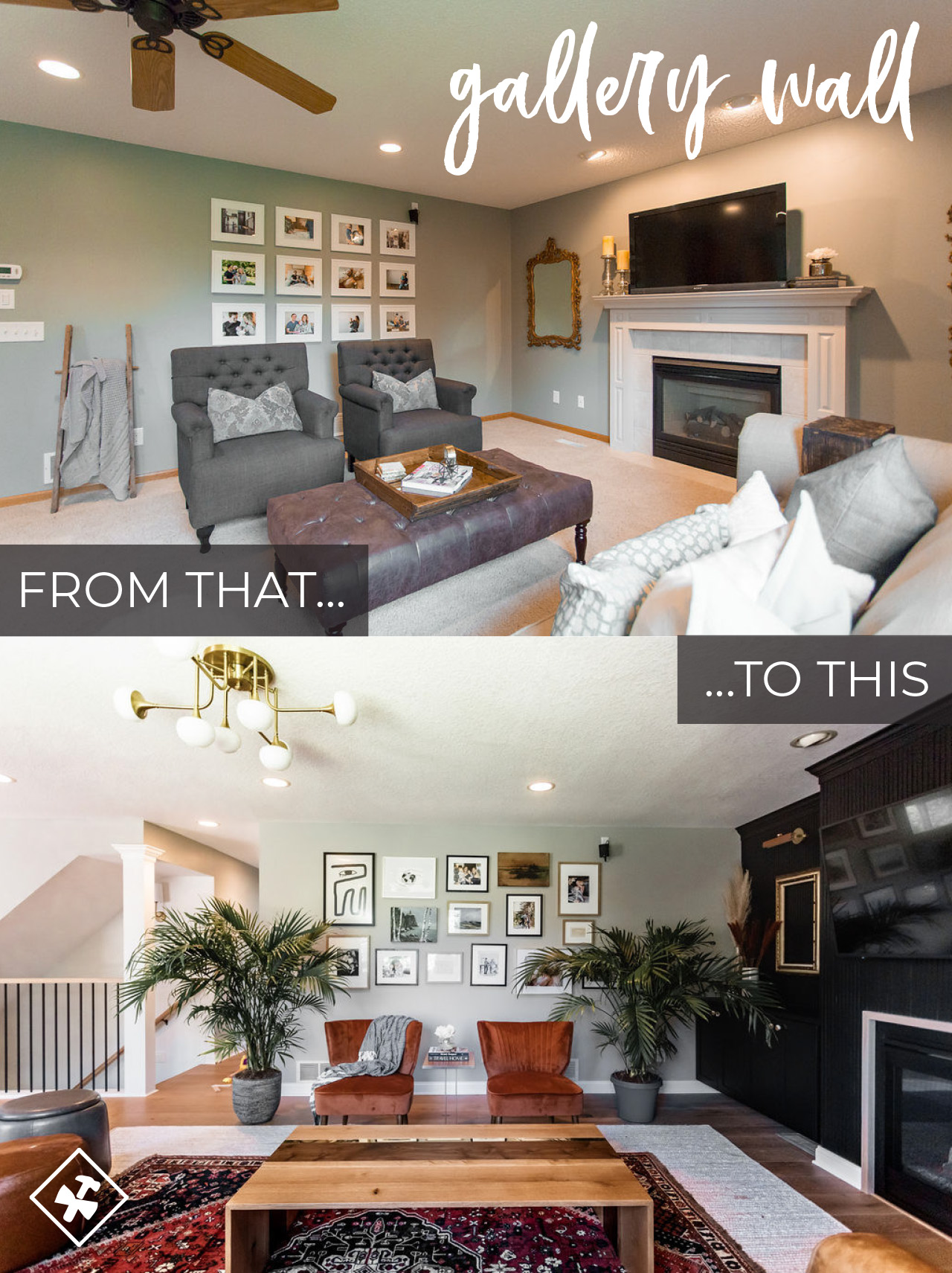
So here we go, but first, let’s jump to some of the best parts, the before and after pictures, before we dive into the nitty-gritty details!
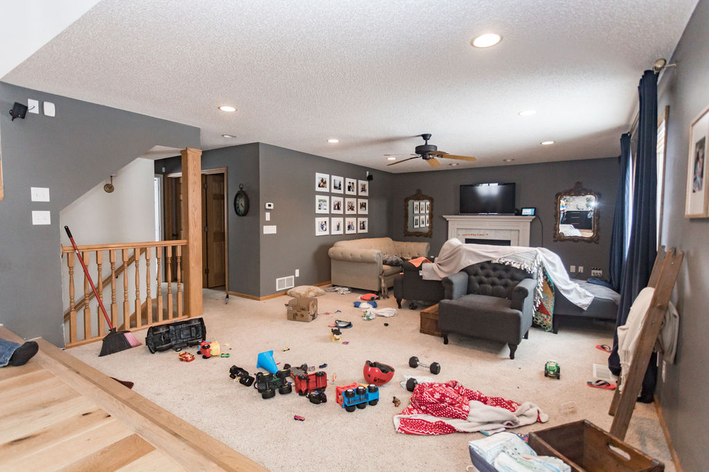
We bought our home a few years ago, and right when we moved in, we did a simple update by painting the mantle white, the walls gray, and added some wall art.
But we knew we would end up totally remodeling the room, just weren’t sure quite how we wanted it designed, when we could financially, and when we’d have the time! So those simple uptakes held us over, and boy are we glad we waited until we knew exactly what we wanted to do.
One of our favorite things to remember when creating your home is this is a marathon, not a sprint if you truly want your home to be a reflection of your happy place.
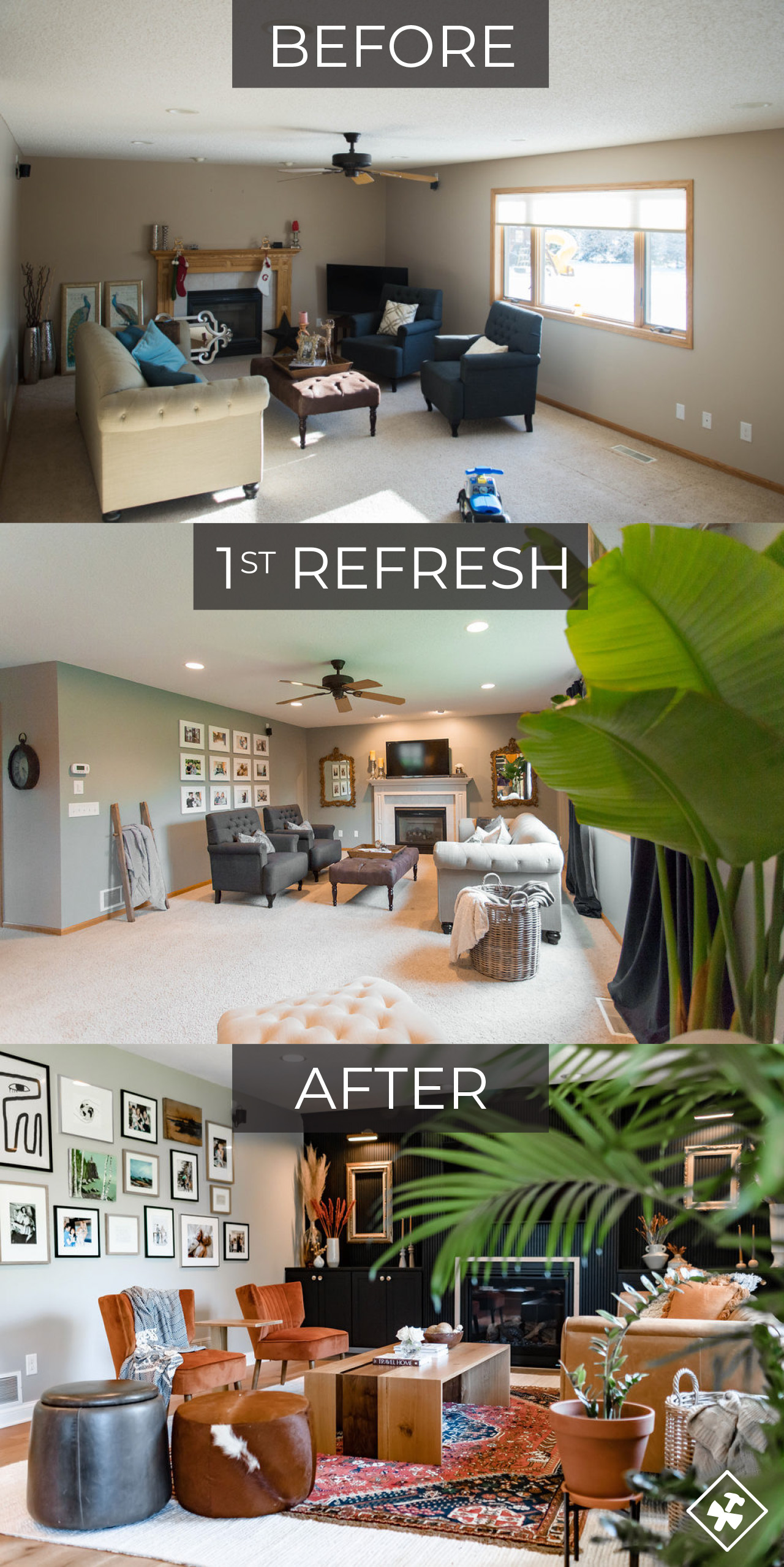
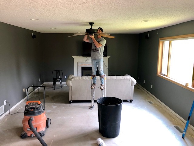
BEFORE…
FIRST PHASE…
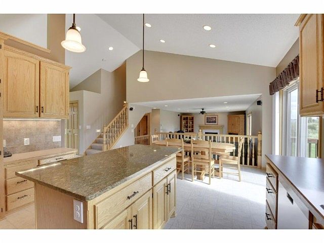
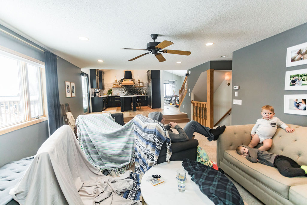
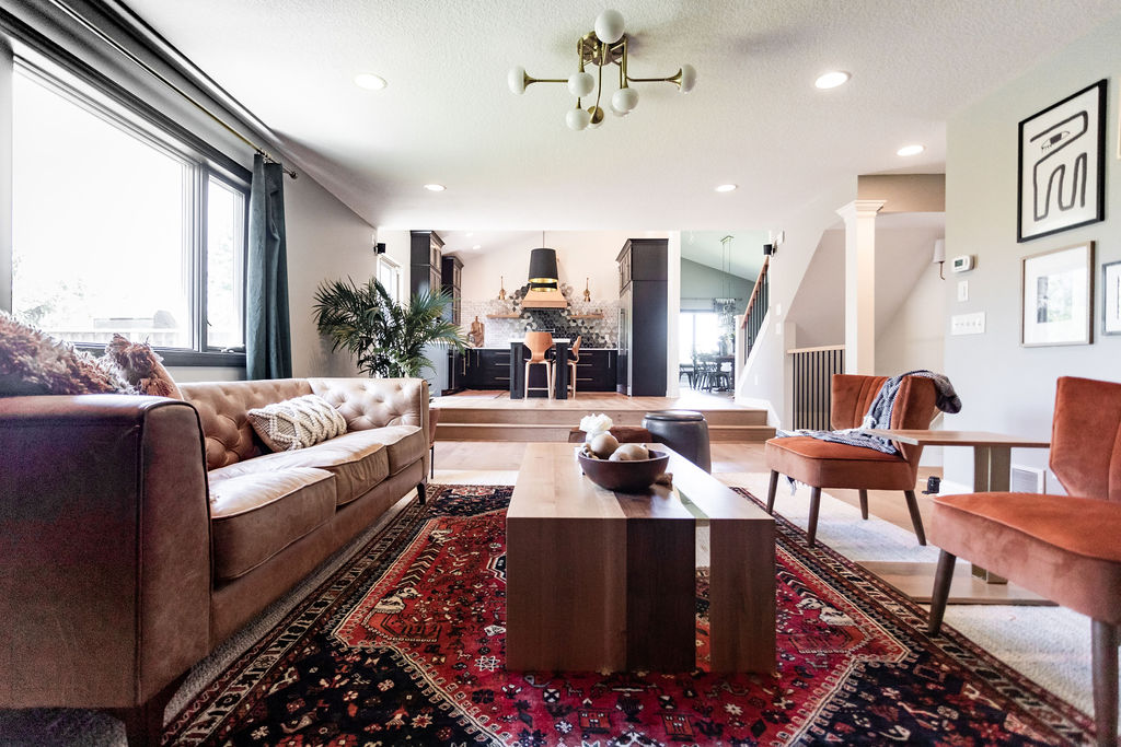
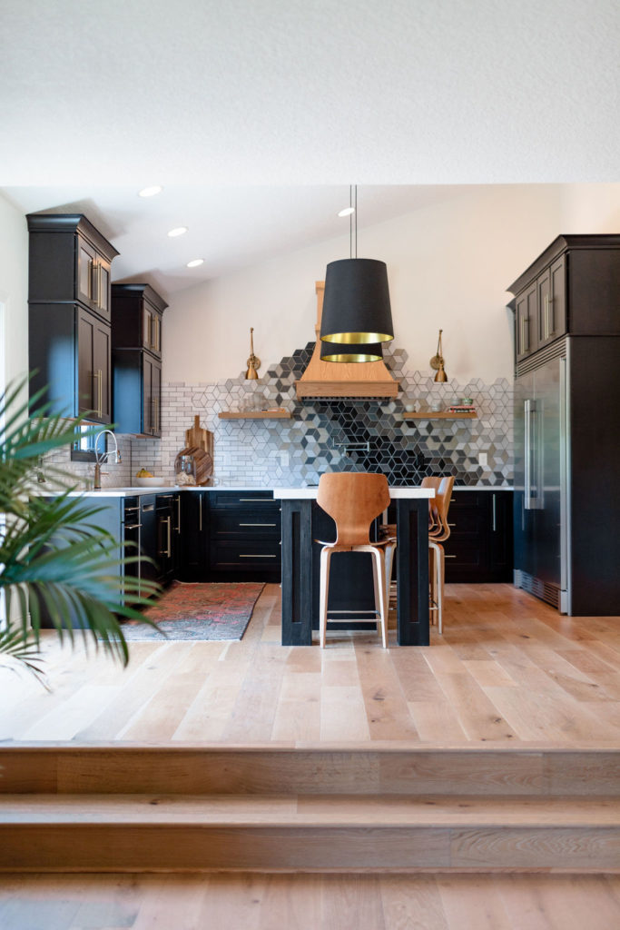
As you can see, we removed the railing that separated the living room from the kitchen and created a step all the way across.
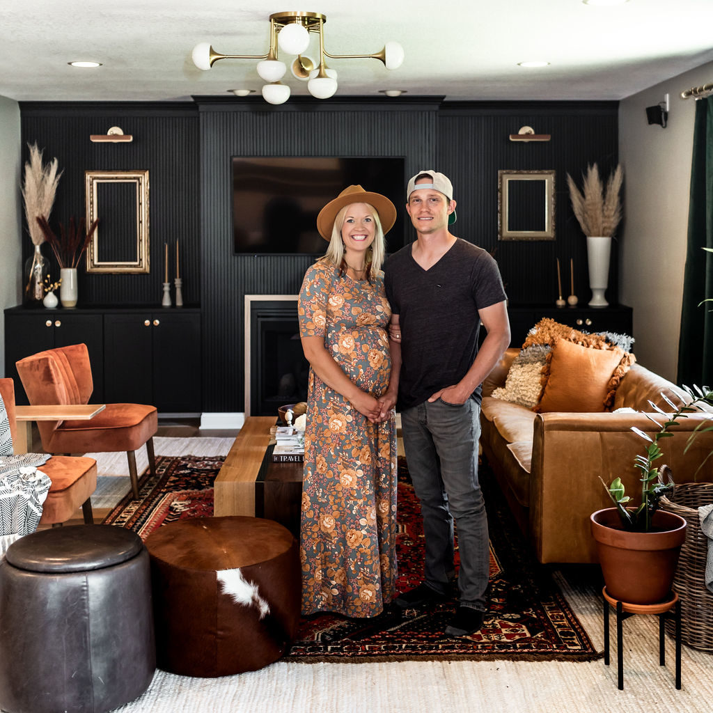
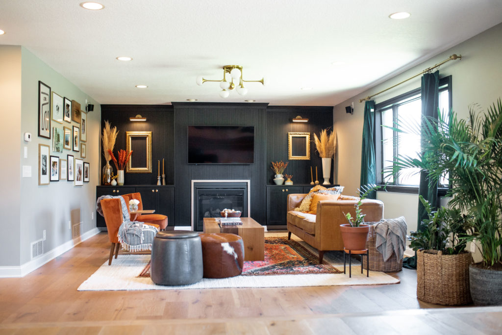
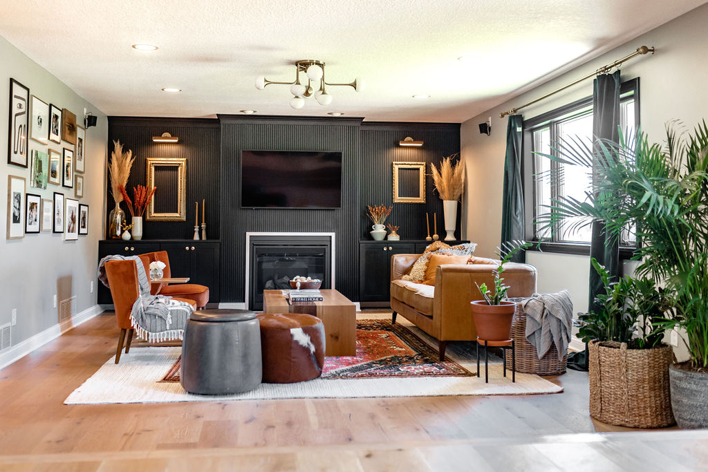
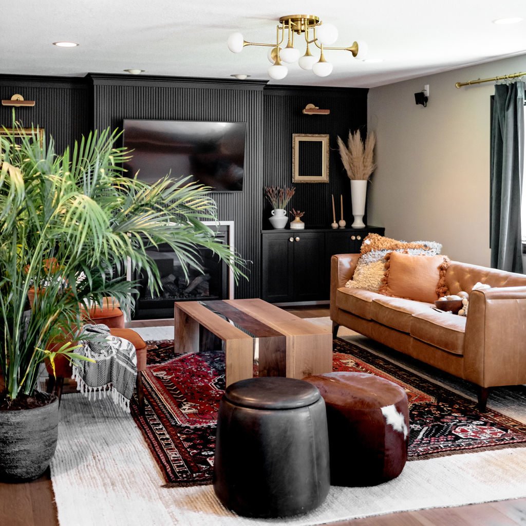
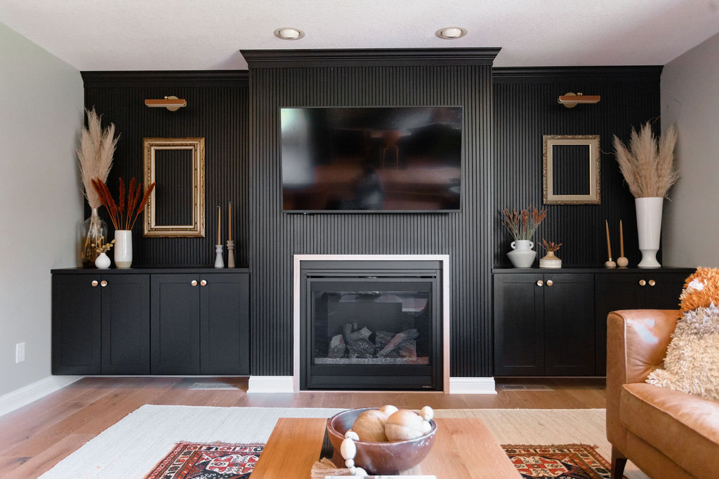
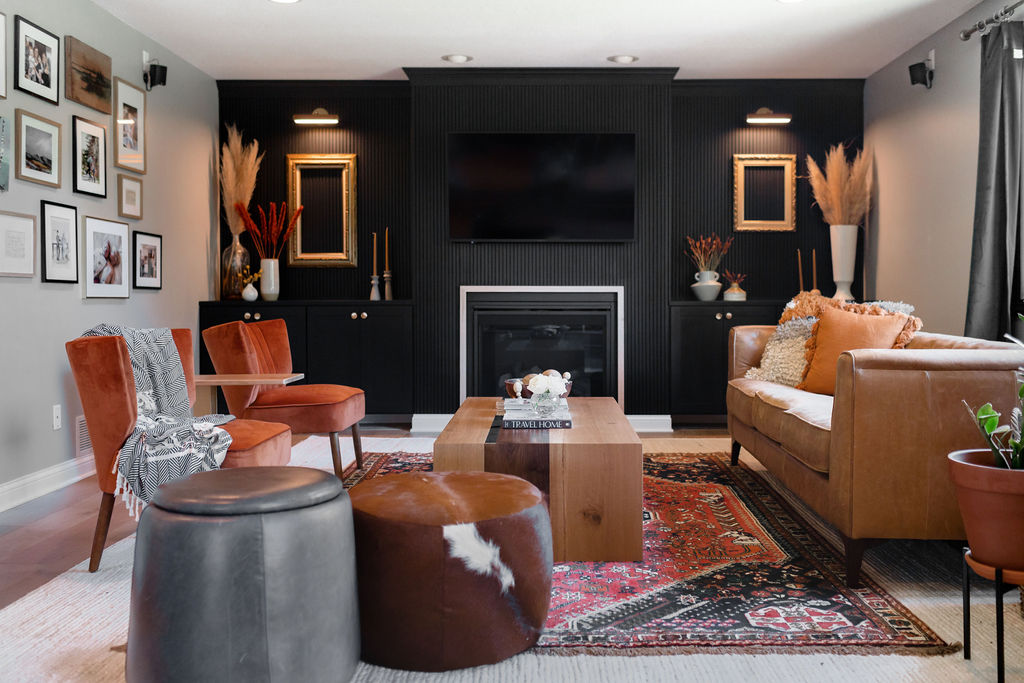
AFTER…
BEFORE…
AFTER…
Flooring
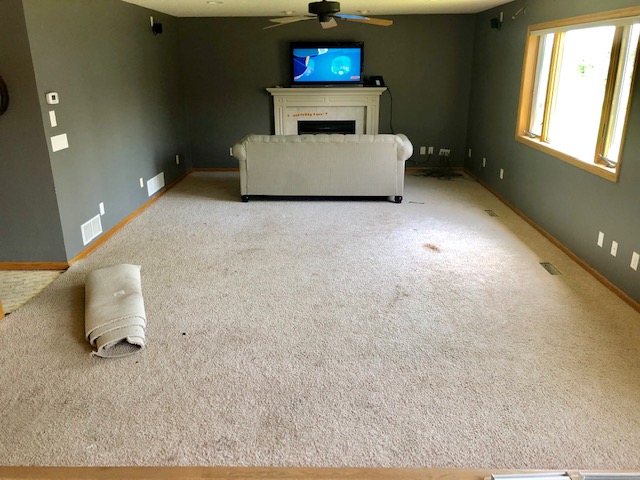
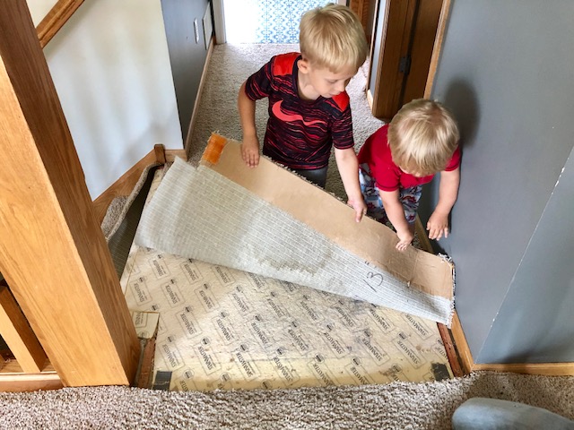
First up, is the flooring. If you read our demo day blog post, we said goodbye to our baby poop-stained and cereal-infested carpet!!
The day we tore this out was one happy day. We also wrote a full tutorial on how you can remove carpet from your home—an easy DIY to save a buck or two.
We went back and forth on whether we should replace it with new carpet or do wood flooring throughout. This is a high-traffic area; we walk through this space when entering from the garage to get to the kitchen and the rest of our home.
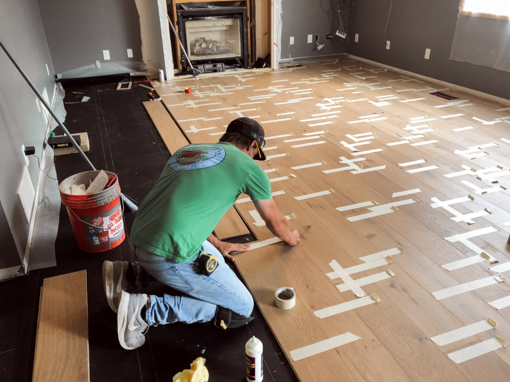
In the end, we decided to carry the same engineered hardwood floors that we laid in our kitchen and dining room last year into this living room area.
To be honest, we both prefer carpet in our living room areas; we like to make it feel a bit warmer and cozier. And underneath this carpet was cement, so Jamie wasn’t certain at first how he would even lay the wood flooring.
But like everything, he always figures it out, and being this is a smaller space and we already have a lower level living room to get cozied up in I wanted a more clean look and I was tired of cleaning our carpets, so engineered hardwood floors it was!
The engineered hardwood floor throughout our home is from a brand called Urban Floors, and this line is called Lambrusco. We’ve done this same flooring in a number of our client’s homes, and it’s one of our favorites.
Light enough and has the perfect touch of the character of wood grains throughout to hide the dirt and dust. Not too gray, or too yellow.
Urban Floor has been a great brand to work with throughout the years.
You can also rewind and check out the full blog post on how we laid our hardwood flooring here.
Ceilings
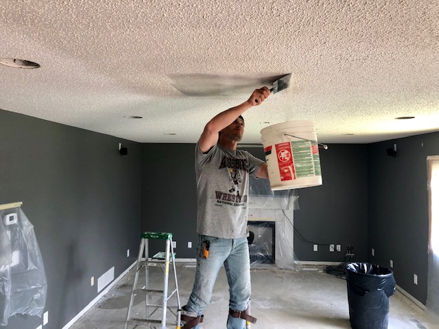
After we removed the carpet, we worked on scraping all of the popcorn off of our ceilings. And you bet we have another full tutorial for you on how to do this, How to Remove Popcorn Ceilings.
This is always the best question with our clients when remodeling just one room in their home, should I keep it or get rid of it?! In our own homes, we want that cleaner look of no popcorn.
Popcorn textured ceilings can be a dust collector, create mold build-up, yellow over time, and depending on how thick it was put on, it can be an eyesore.
However, it’s also expensive, very messy, and a lot of hard work to remove. And it can also be overwhelming if it’s throughout your entire home.
This is the case for us, so we’re just taking one room at a time and scraping as we go.
Although we would have loved to have flat ceilings throughout our home, it was also out of our price range and time commitment. When doing flat ceilings, the drywall, mudding, and taping have to be perfect.
Because it will show every crease and seam, and if you live in MN, our homes shift throughout the seasons, and each shift can often create cracks. And being Jamie didn’t want to deal with fixing and patching down the road, we did a knockdown textured ceiling, which you can read about the whole process here.
A knockdown textured ceiling is in between flat and popcorn. It doesn’t hang off of your ceiling like popcorn, yet is sprayed and then flattened out. So still gives a clean look and hides those imperfections underneath.
Lighting
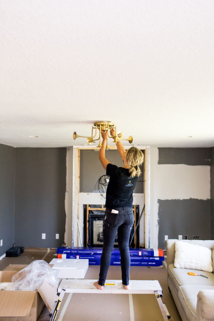
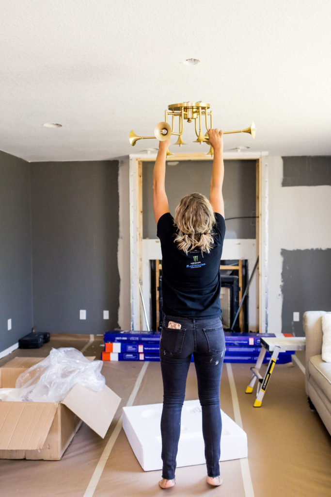
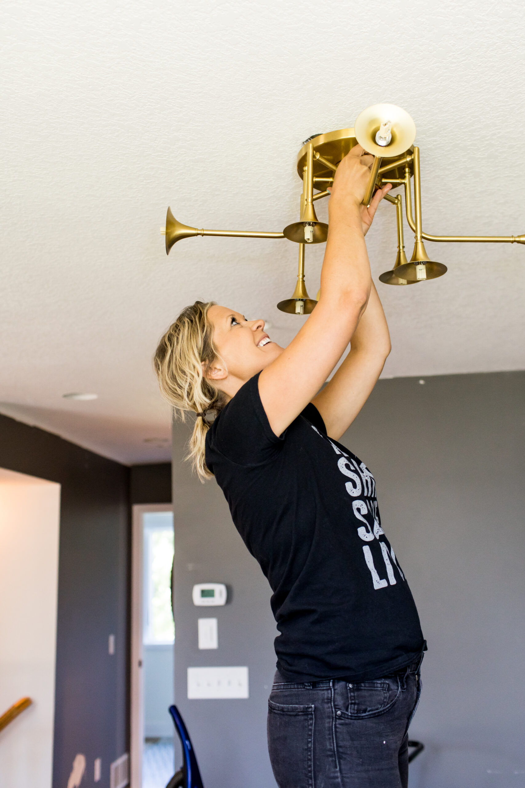
As you can see previously, our living room had a ceiling fan, which we never used, so we knew that we wanted to replace the fan with a fun and different semi-flush light. Our ceilings aren’t overly tall in this area either, so we also had to be cautious about what style of light we wanted to incorporate.
Semi Flush Fixture
After debating between a handful from Hudson Valley Lighting, we ended up choosing their Fleming semi-flush fixture in aged brass.
We were on the hunt for something different, a statement piece, yet also wanted it to flow with the overall design in the space. With the ceilings only 8′ high, we had to be cautious about the size to make sure that it didn’t overpower the living room.
Last fall, we landed our eyes on this glorious light from Hudson Valley, and we knew it would be perfect for our living room space.
Picture Lighting
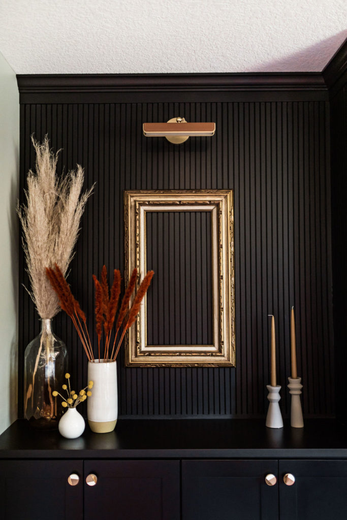
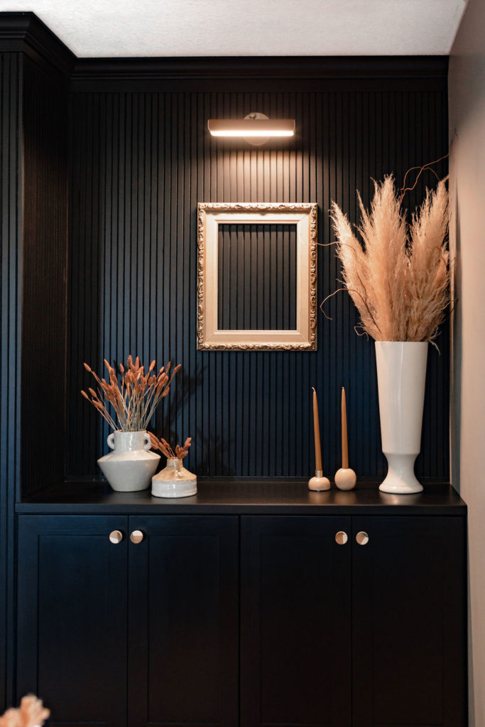
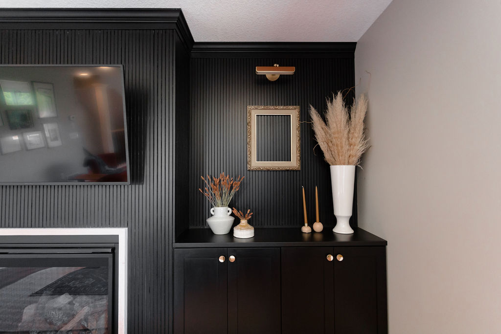
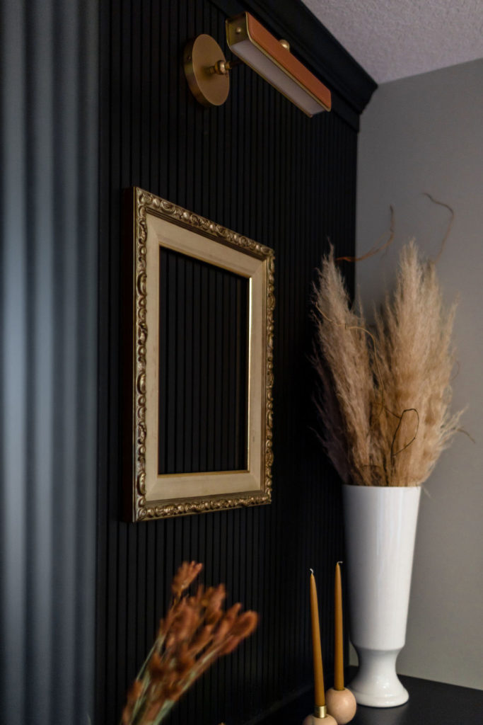
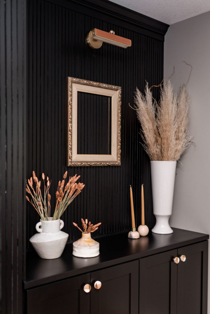
And let’s chat about the picture lighting on the slat wall! This is a fun story and one we didn’t decide on until the end of the project.
Initially, we weren’t going to be putting any lighting in this area. However, we had one heck of a time designing out this back wall.
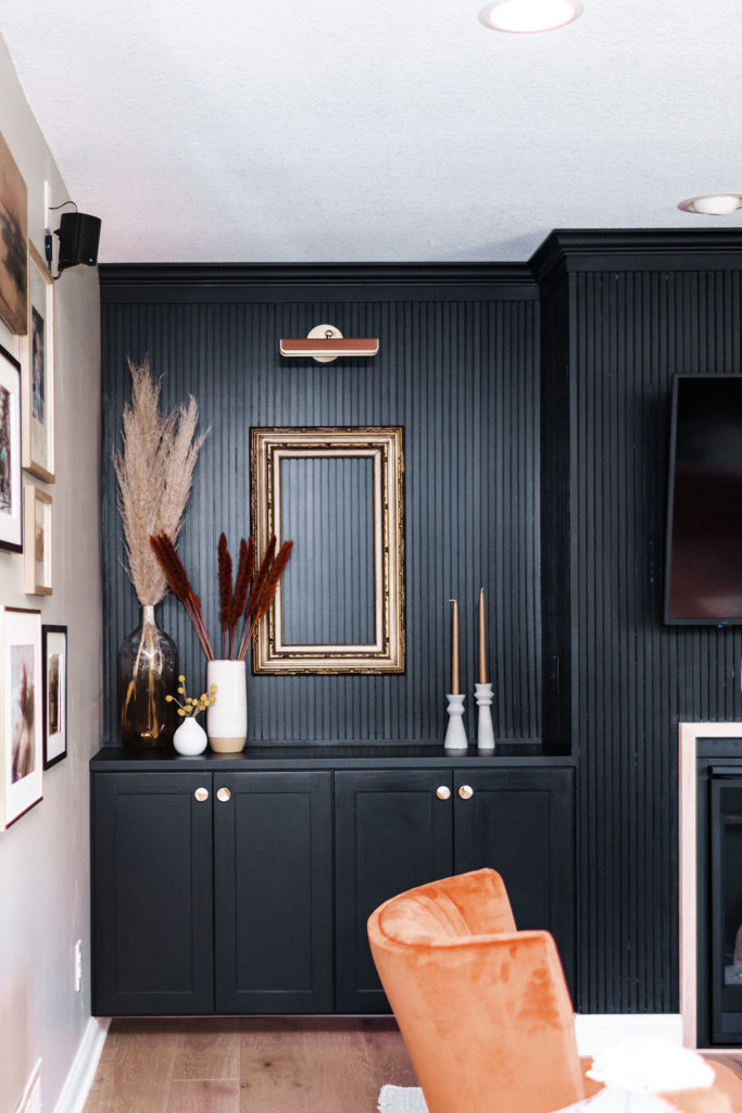
We were initially thinking we’d do floating shelves, but once Jamie axed that, I said I would be okay with that if we added in picture lighting and had some sort of art underneath (which we haven’t found yet and are using vintage frames as placeholders).
Jamie was down with that idea, so sourcing lights for this area was the next thing we had to do! I had a few different options that we were debating on, we put a poll on Instagram, and this wonderful guy named Eric Jensen from Jenson Lighting reached out.
He said how he noticed we’d been talking a lot about bringing leather and gold elements into the space and how about these Alora Valise Picture lights that incorporated both of those elements.
The power of Instagram and building relationships! They were absolutely perfect and something we hadn’t seen before and knew they would fit perfectly in our home, and they did.
Paint Selections
Then it was painting party time! Since we bought this home three years ago, I think we’ve repainted this room at least five times.
Since it’s a smaller, cozier space, I wanted to do something a little bit moodier. But Jamie wouldn’t let me go too crazy with colors, so I kept trying to go with a deeper gray, to play off of the gray and white color scheme we have in the kitchen and dining room which are adjacent to our living room.
However, I kept hating them! For some reason, they all felt too blue or too blah. In the end, we decided to keep it simple and carry the same paint colors that we have in the rest of the home.
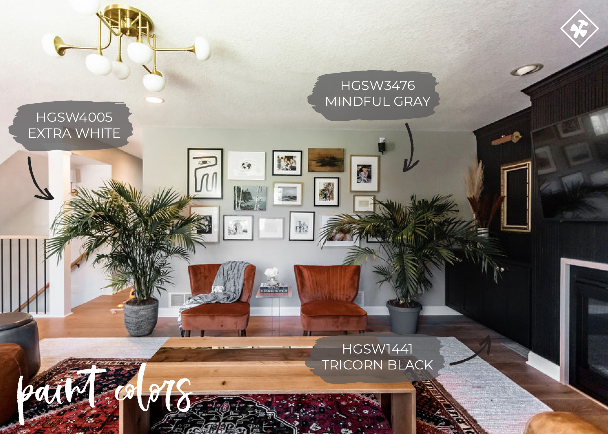
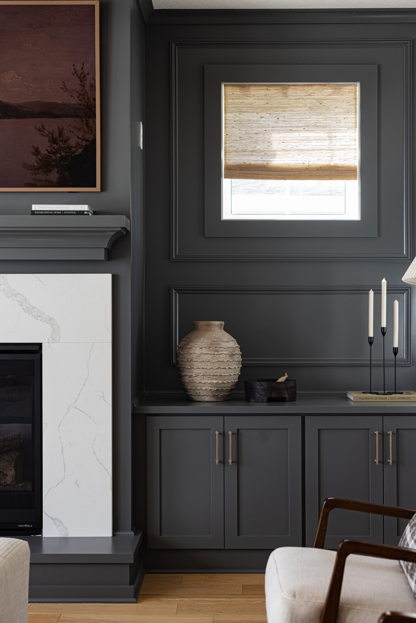
We did the slat accent wall in Tricorn Black, just like we have for all of the window trim and interior doors throughout our home. And then we did the walls in Mindful Gray and the trim in Extra White.
Once we finished, I was banging my head on a table, wondering why we didn’t just do that in the first place. Keeping it simple sometimes is always the way to go.
Cabinetry
Then we sat under construction for what felt like five years, but it was a good five months. Designing this wall is what really put us at a standstill.
We didn’t want to rush into anything just to get the living room done, yet we wanted it done, but we also couldn’t agree on anything.
The one thing we could agree on is that we both wanted something different. Jamie wanted no floating shelves; I wanted them.
He wanted cabinetry; I didn’t. But after a lot of conversations and putting them into our design program to weigh our options, we came up with eight different options.
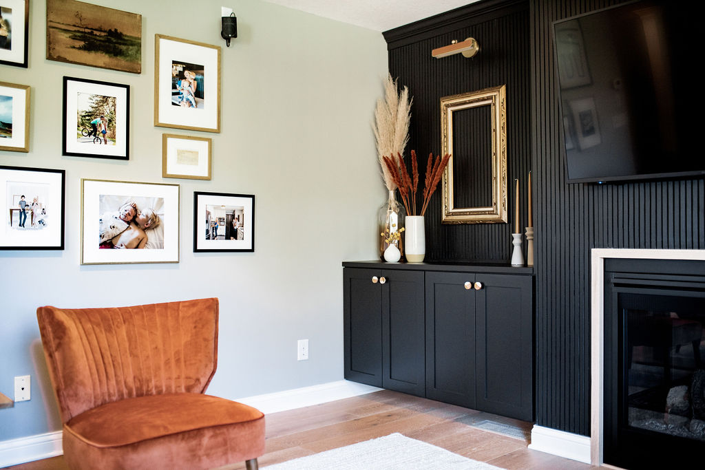
We agreed on a slat wall, no floating shelves, but then adding picture lighting, incorporating cabinetry to hide all the cords and crown, but having them floating to maintain that clean look.
I’m glad we went with the cabinets in the end and skipped the floating shelving as it’s nice to now hide the TV and internet cords in them. I think because we do so much floating shelving and also because we have them in our kitchen and in our basement,
Jamie was over-incorporating more floating shelves into our home. And he also doesn’t like “stuff” just to have it.
He already told me that I have too much decor on these simple two shelves…ha! But it’s staying.
And I have to say; I do like that we were able to bring larger decor items into this room on these shelves, which wouldn’t have been able to happen had we had 2-3 floating shelves above the cabinets.
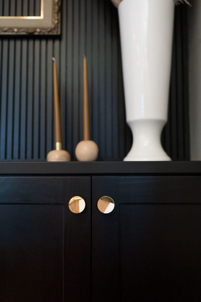
Hardware
One of the smallest, yet most impactful selections for any space is the hardware! And something we debated over for some time.
We were debating between gold, leather, or wood hardware. Being we ended on leather picture lighting, we decided to incorporate white, gold, and wooden knobs and loved how they pulled the space together.
You can find the exact knob we used here. And in the end, we thought, this was something simple and inexpensive we can always swap out later down the road if we want to change it out for leather or some other hardware.
Here are a few of our favorite selections of hardware as well:
- 50 Favorite Hardware Knobs & Pulls for Under $10
- Top Gold Cabinet Hardware
- Our Favorite Wooden Cabinetry Hardware
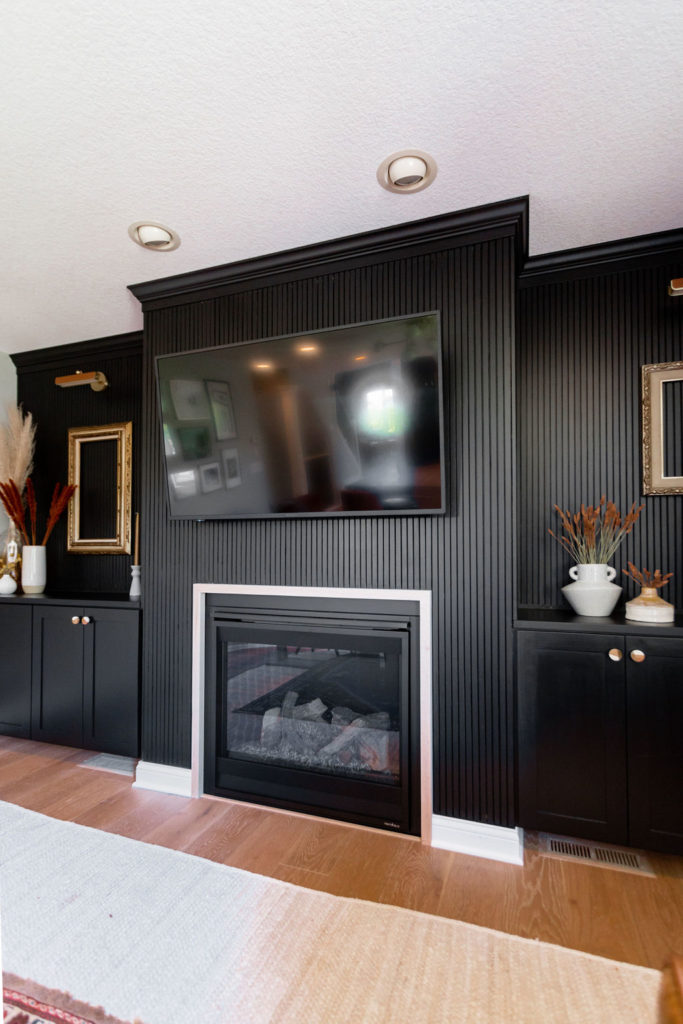
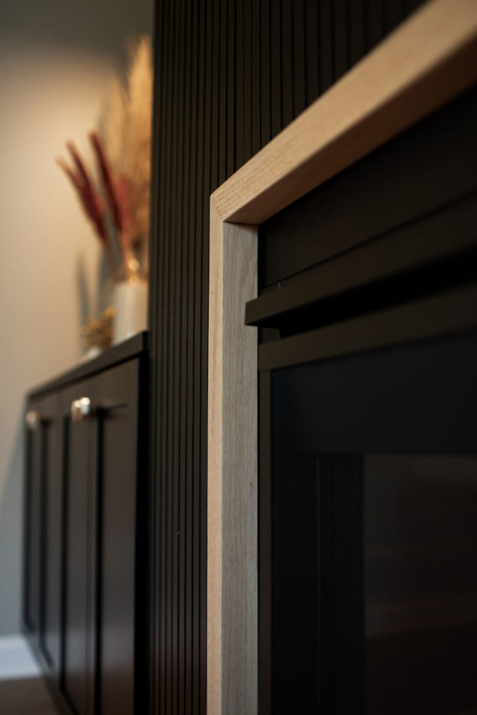
Slat Wall
The slat wall was my absolute favorite! I am so glad we ended up going with this decision.
Originally we were thinking of shiplap, being we have that in our piano room. But both of us are over shiplap.
Jamie then was thinking of some sort of wainscoting or paneling, but again, we’d done that and seen it.
One of my favorite things about Jamie and his creative mind is that he is always thinking outside of the box and gets bored doing the same old thing. He loves a challenge in his work, and that’s why I always tell him, our clients are so lucky to have him work in their homes.
Nothing will ever be unoriginal!
So we kept racking our brains for something that we could do that would involve wood detail, that we haven’t seen a ton of, yet would look classy. After hours of brainstorming, we decided on doing a vertical slat wall.
A slat wall is technically used for display fixtures and is one big panel. So we thought we’d have some fun, take it vertically, do individual boards, and make them smaller.
Almost gives the visualization of one big black accent wall yet be able to see the texture.
And then we got to work, and let’s just say…it wasn’t as “fun” as we thought it’d be…haha! This project was VERY TIME-CONSUMING.
Jamie put in a good 50 hours of hard work on this wall. And it took Jamie a good two weeks to even look at this wall and appreciate all of his hard work.
But hey, we really do think you should do it too!! Haha! But seriously, it was worth all of the blood, sweat, and tears.
We have a full blog post with a tutorial of what went into this wall so that you can DIY it too.
Furniture
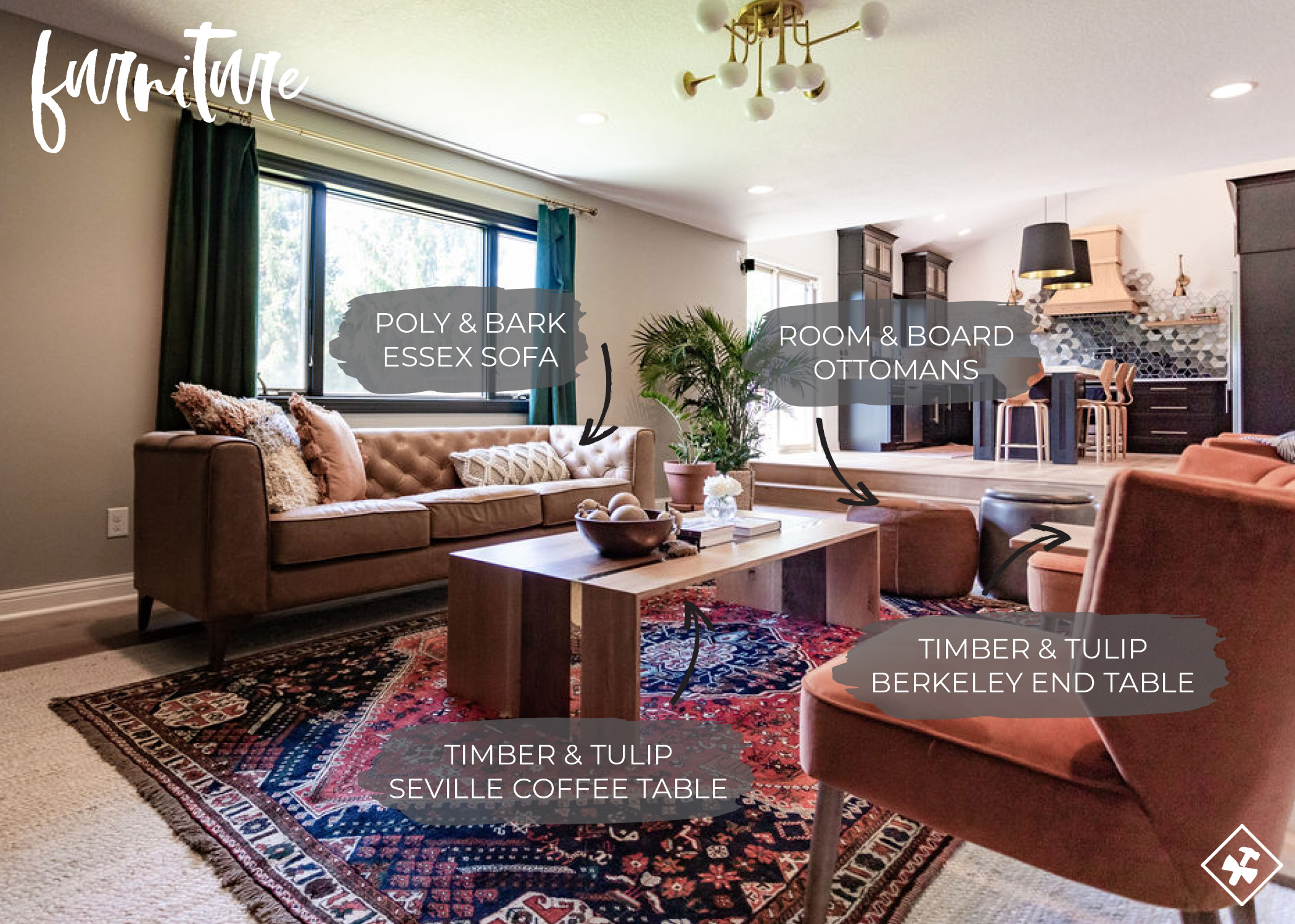
Couch
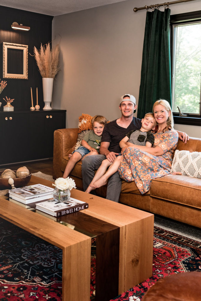
Bringing all of the furniture together was another major hurdle for us, especially during COVID, when all the stores were closed. The one thing we knew we wanted was a tan leather sofa.
We found a handful of different options, in all different sizes and at all different price points, but we kept coming back to the Essex Sofa from Poly & Bark in color, Cognac Tan.
The perfect price point for what we wanted to spend, was big enough for our family yet not too big, and we knew it was a good brand as we’ve purchased from this same brand for our client’s homes.
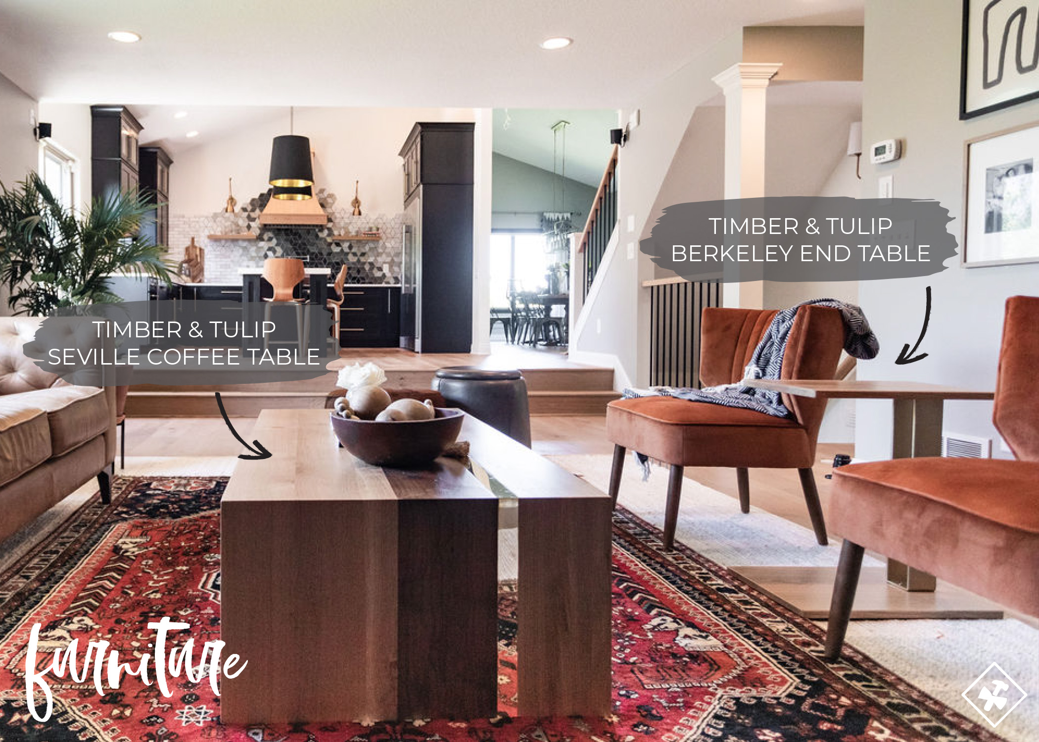
Coffee & End Table
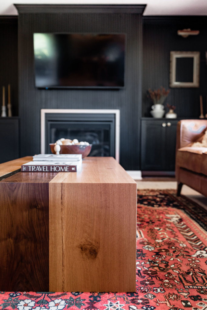
Then we also knew we were going to incorporate some fabulous new products from our dear friend Brianne, designer and owner of Timber & Tulip, and her new furniture line!
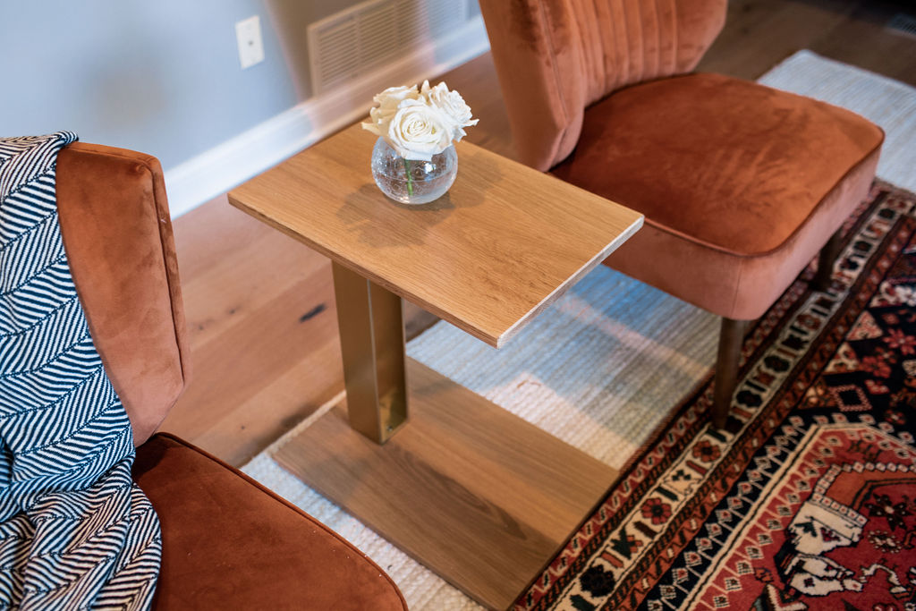
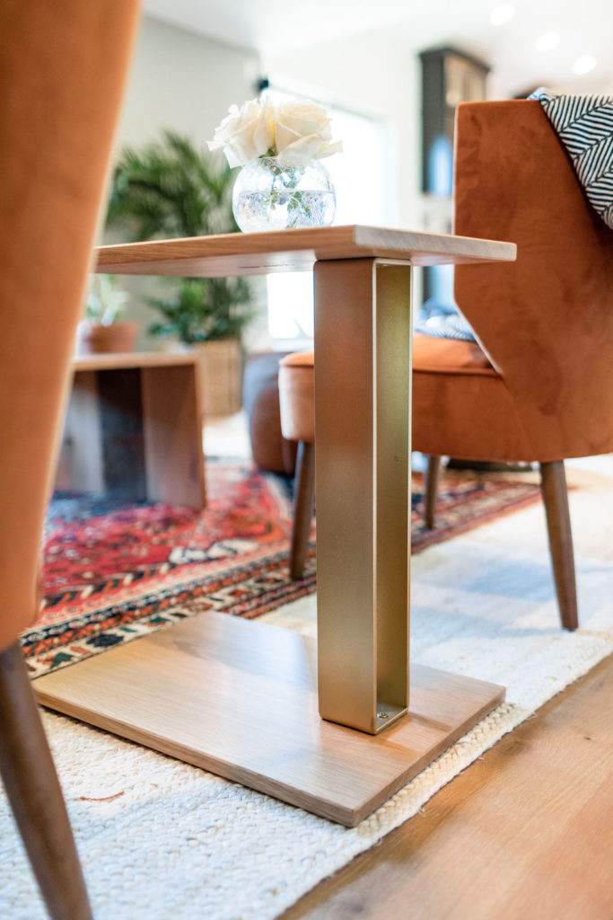
The Seville coffee table, I mean… HELLO! Complimented with their end table was perfection, and we knew it would work perfectly in this space as it had all of the elements we were looking for.
For an extra pop of style, the brass inlay brings this already gorgeous table to the WOW level.
Jamie has been super impressed with the level of craftsmanship in these tables. And they’re practical; we can set a drink on them with our feeling a bit worried. And best of all, they’re giving you all 20% off with code “c2s20.”
Rugs
Having heard so many great things about Kentucky Rose Designs, I knew I wanted to incorporate one of her rugs in this space. Antique, handmade, vintage rugs are what Gretchen, the owner of Kentucky Rose Designs, is all about, and I immediately not only fell in love with her Instagram but her as a person.
Through emails, we were able to narrow down the style and size we needed, and she got sourcing. Once she sent me this exact rug, I knew it was perfect.
And then she recommended layering it with an off white jute braided rug underneath. And even better, I found this jute rug on major clearance!
It was perfect and loved how the print didn’t overpower the room by adding in the jute rug to the piece.
Decor
All of the decor within this space came from our friend’s new boutique called Foxwell Shoppe. And if you are local here in the Twin Cities…RUN.
This place is absolutely adorable, and I could have bought the entire store had my wallet allowed.
The style of the boutique is the exact style of our home, and everything we pulled from this shop fits perfectly! I don’t have links to each of the selections we bought, so you will have to go their Instagram and shop their page.
Or, let them know whatever that “thing” is in construction2style’s home, and they will be more than happy to help you find it.
Chairs
The rust slipper chairs, now these were something we weren’t going to incorporate (and still want something different) within this space. Like most furniture, chairs are also so hard to find for us.
When you want comfort, style, functionality, and affordable, it makes it a bit of a challenge, and we’re still on the hunt for something else, but these will do for now.
And a huge thanks to Revel & Flourish for supplying all the greenery!
We actually had these in our office, and then one day, they made their way into our front entry, and now here they are in our living room. Don’t get me wrong; we love them…we just wanted something a bit cozier to cuddle up in within our living room for family movie night.
So the hunt is still on!
Ottomans
Does anyone recognize these from our lower level? As you know, we’re constantly shopping in our house and moving things around from room to room, and now I want two of each of these ottomans because they fit perfectly in our lower level bar area and our main level living room.
Both of these ottomans are from Room & Board. And the Dodd Leather Storage Ottoman is not only stylish but functional and practical.
I’m not one that likes to have our toys out in our home, so this is where they are kept, and the boys know that this is the only amount of toys allowed in the living room, whatever fits in the leather storage ottoman.
And this Cowhide Round Ottoman, come to momma! Room & Board also has a larger version, and I’m already saving up for it.
I’m obsessed and keep finding myself going back to it. After all, I keep moving this piece from one room to another, which is a sure sign we need two.
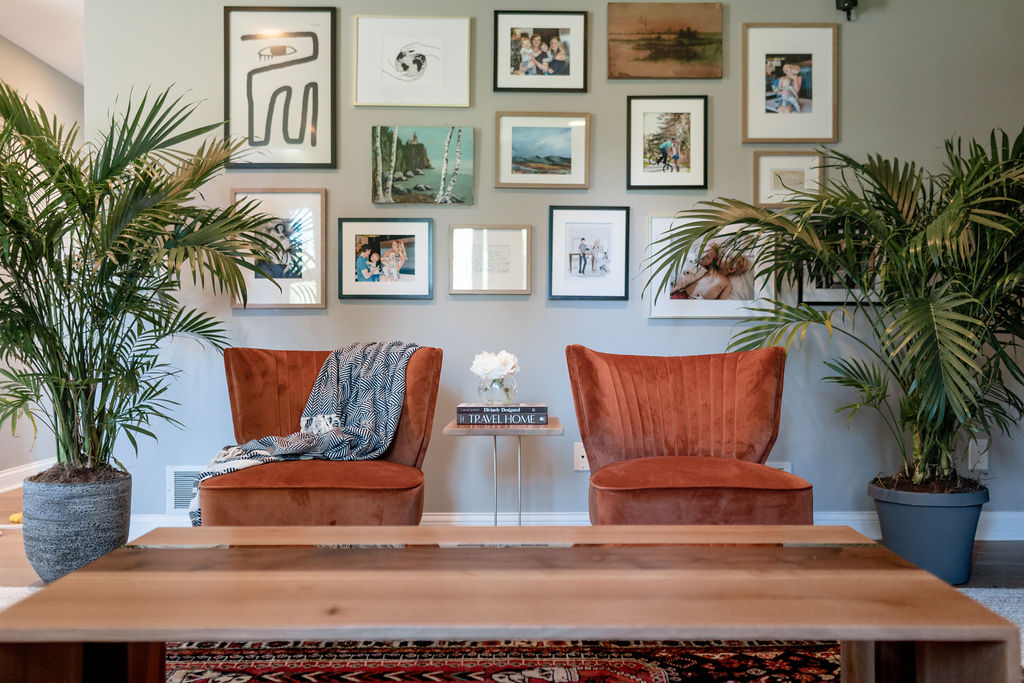
Gallery Wall
And lastly, the gallery wall! Who loves a good gallery wall?!
We had a gallery wall here before, but I knew I wanted something different, not as traditional, but a little bit more fun and eclectic.
I wanted it to be a mixture of artwork, makers, and creatives and also showcase our family. We wanted to ensure all of it had meaning and purpose and told a story.
We refreshed this space in 2017 by painting the fireplace white, and the walls gray and updating some of the decor like adding in a gallery wall. We loved how it looked, but also over the last couple of years, we’ve really been honing into our personal style, and this was not it.
And once again, thanks to so many of you we put a question up on Instagram asking about your favorite artists and makers and the answers came flowing in. We put a full blog post together with these resources, Your Guide to Creative Gallery Wall Artwork, and used a lot of these artists within our wall.
My personal favorite was my Grandma’s artwork and recipe cards with my dad’s handwriting and Jamie’s Grandma’s.
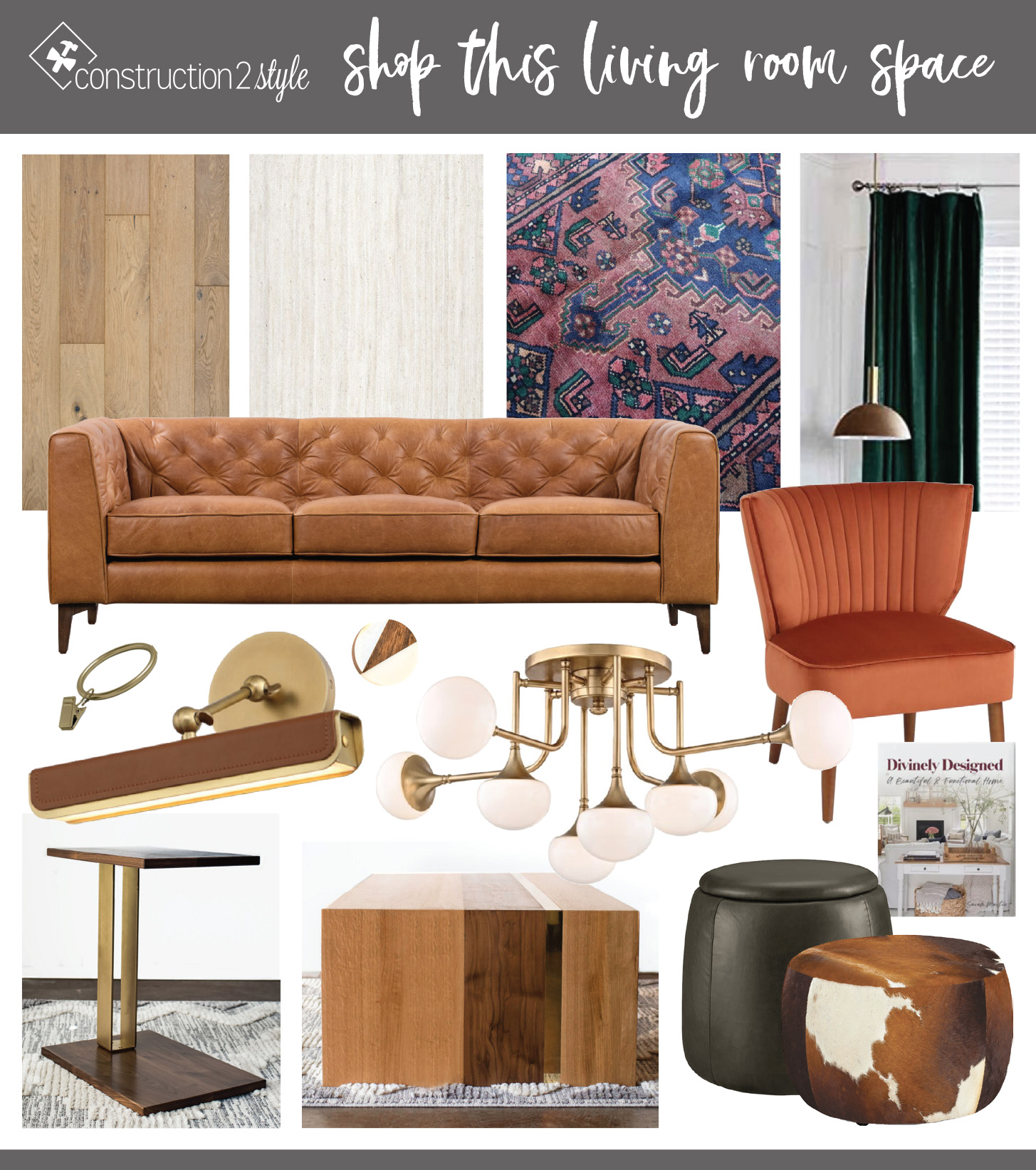
Shop Our Living Room
- Off White Jute Braided
- Vintage Rug
- Forest Green Velvet Curtains
- 2″ Curtain Clips
- Leather Sofa
- Cabinetry, custom-built by c2s
- Cabinetry Hardware
- Picture Lighting
- Semi-flush Fixture Light
- Fireplace
- Slipper Chairs
- Coffee Table (Use code: “c2s20” for 20% off)
- End Table (Use code: “c2s20” for 20% off)
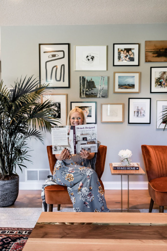
- Divinely Designed Coffee Table Book
- Art
- Decor
- Cowhide Round Ottoman
- Dodd Leather Storage Ottoman
- Hardwood Flooring
Disclosure: There are affiliate links within this blog post. This adds no additional cost to you, just supports our small business. XO

It has been a great, cozy environment to entertain. Thank you for the complements
Thumbs up! Really nice design and the living room after it was remodeled is really simple and clean. You really give a lot of details in this article. I might grab some coffee in here.